Investors have been watching the Federal Reserve and interest rates closely for the past several months. Well, actually more like the past several years.
But maybe they should be watching copper prices for clues on where interest rates are headed.
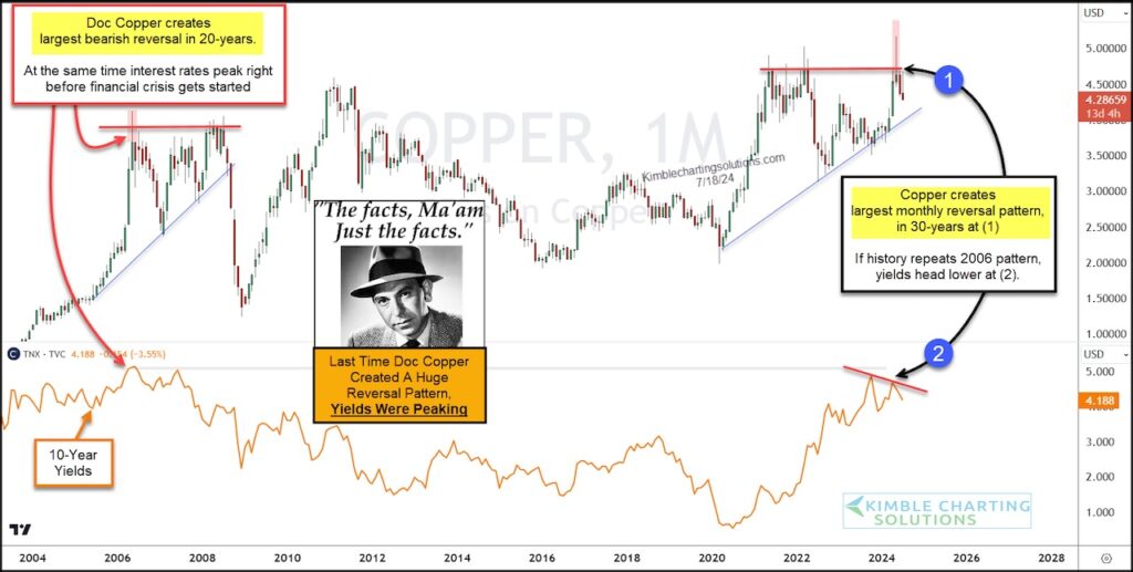
“The facts, Ma’am. Just the facts.” – Joe Friday
Today we look at a long-term “monthly” chart of Copper versus the 10-year treasury bond yield (interest rates).
As you can see, in 2006 good ole Doc Copper created the largest monthly reversal pattern in history at the same time that treasury bond yields (interest rates) were peaking. And this was right before the start of the Great Financial Crisis!!
Fast forward to today and you can see that Doc Copper has created its largest monthly reversal pattern in 30-years at (1). If history repeats then we should see interest rates head lower at (2).
Will yields repeat again? Stay tuned!!
Copper “monthly” Prices vs. 10-Year Treasury Bond Yield Chart
Note that KimbleCharting is offering a 2 week Free trial to See It Market readers. Just send me an email to services@kimblechartingsolutions.com for details to get set up.
Twitter: @KimbleCharting
The author may have a position in mentioned securities. Any opinions expressed herein are solely those of the author, and do not in any way represent the views or opinions of any other person or entity.
: Creating Bullish Divergence?")


 and Semiconductors (SMH): Concerning Price Pattern?")


