This article talks through a recent piece of investing analysis I did on expected returns. For clarity when I say expected returns I mean a reasonable estimate of what an investor’s returns might be over the medium term (next 5-7 years) based on maths and economics.
The reason investors look at this sort of thing is mostly for asset allocation modeling purposes; i.e. performing mean variance optimization or other forms of quant-driven portfolio construction across multiple assets.
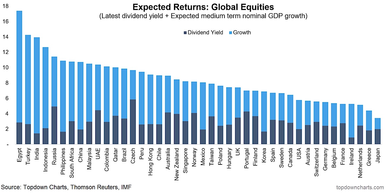
But if nothing else, it at least presents an insight into the relativities across the assets – in this case we look solely at global equities with generic simple expected returns across countries.
So forget the actual numbers per se and notice the distribution.
The first thing you will notice is that most of the countries down the left hand side are emerging markets – and for the most part the growth vs yield split is heavily tilted towards growth. This partly reflects generally higher real GDP growth as well as generally higher inflation.
This leads into the methodology. Over the long run, equity returns can basically be broken down into yield (the dividend component) and growth. Setting aside for a moment the swings in valuations (which are notoriously hard to predict), growth is basically going to be made up ofzc earnings growth, and most of the time the best proxy for earnings growth for the market in aggregate is nominal GDP growth. Over the long run you’d expect that companies in aggregate can only grow as fast as the economy they operate in (there will be outliers on both ends of the spectrum, but at the aggregate level it’s about right).
While this approach doesn’t take into account valuation, the yield component i.e. the latest dividend yield, does contain some valuation information. That is, toward the top of a market cycle the dividend yield will be lower (and higher at a market bottom).
It’s important to note that the chart shows (generic) local currency projections, and as anyone who has invested offshore will know, currency (whether hedged or not) can have a massive impact on realized returns (this is something we’re working on as part of building out a broader set of expected return inputs).
A couple of other observations on the analysis I will mention is that I also looked at how the expected returns line up against historical volatilities – and for the most part it’s what you would expect. The countries with higher expected returns generally experienced higher volatility in the past. But also of interest, I compared expected vs historical returns, and for the majority of countries, future expected returns were lower (in some cases much lower) than historical returns. This reflects a common theme, which many people have talked about – the challenge of lower future expected returns. It’s precisely this kind of challenge that makes getting more intelligent, informed, and innovative about investing increasingly important.
For more on the analysis, click through to request a copy of the latest edition of the Weekly Macro Themes report in which this chart appeared. Thanks for reading.
Twitter: @Callum_Thomas
Any opinions expressed herein are solely those of the author, and do not in any way represent the views or opinions of any other person or entity.


