This post was written with Craig Basinger.
Few would disagree that there is a lot to worry about these days. Venezuela appears to be on the edge of collapse. North Korea tensions have been on the rise, only to fade in part thanks to rising civil unrest in the United States.
If you thought the U.S. government was dysfunctional during President Obama’s two terms then you may be in for some big surprises on how dysfunctional things could get. Don’t worry, debt ceilings extensions almost always go smoothly. The next one is coming up in September.
And yet, despite all of these headwinds, the markets continue to perform pretty well. The S&P 500 (INDEXSP:.INX) made a new high earlier this month as did the MSCI EAFE index (NYSEARCA:EFA). The TSX has not done as well. After peaking in February, it is now roughly flat on the year. Overall, a pretty pleasant market.
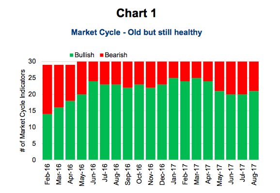
Political risk and uncertainty still matter for the markets, but underneath the noise there are some strong fundamentals that have helped the market weather these political headwinds. This positive fundamental backdrop is very evident in the indicators we use in our Market Cycle framework. Currently 21 of our 30 indicators are positive, strong evidence that the current bull market should continue in the near term. This does not rule out a correction (something we have not seen for some time), but it does indicate that a cycle-ending bear market is very unlikely at this point.
Market Cycle
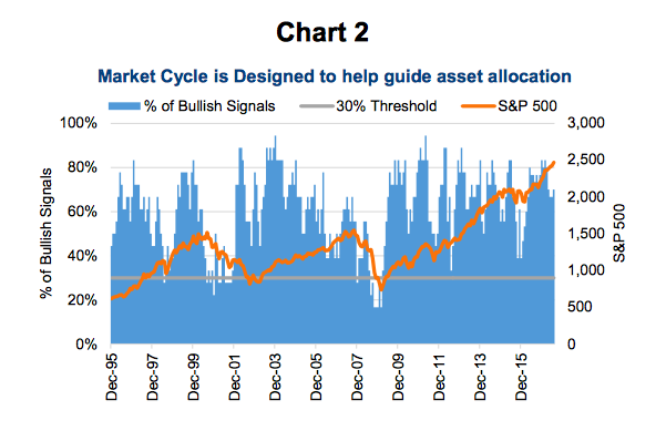
There is no way to know with certainty when the current bull market, which started in early 2009 and is in its ninth year, will come to an end. And there is no one indicator that has proven itself for signalling turning points in the cycle. With this humble and grounded view, we created the Market Cycle framework. It combines a variety of signals, each having provided some efficacy in signalling turning points in the past. We believe this approach has a greater chance of uncovering a turn in the market than any one or two indicators. It is essentially an asset allocation tool, diversified across disciplines and models.
The good news is 21 of the 30 remain bullish on the market. These indicators cover many disciplines including economic data, interest rates, market valuations, earnings and technicals.
There are some areas of weakness, including the Fed raising rates, yield curve flattening, some commodity prices moving lower and valuations. Added to this is some deterioration in the U.S. economic data, namely consumer confidence, car sales and home sales. Many more indicators are positive, however. These include manufacturing data globally and in the U.S., strong earnings and sales growth, credit expanding and leading indicators are rising, to name a few. While 21 out of 30 is not a good grade in school, it is a healthy score based on our framework. We become more concerned when the number of positive indicators drops below 30%, or below 10 positive signals.
How We Use the Market Cycle
Traditional asset allocation based on investors’ long term objectives and risk aversion is the cornerstone of the investment industry. And while this approach may have some short comings, we believe the benefits are far greater. And lest we forget, it has helped so many investors over the past decades create wealth, fund their retirement years and sleep at night. We don’t believe anyone should abandon this approach but believe the Market Cycle approach can add value along the way.
We use the Market Cycle to tilt our allocations along the long term targeted mix and help guide when it’s best to get into the market or wait.
Tilting your asset allocation even 5 to 10% can add considerable value over time. We use our signals to adjust the asset mix in our Managed Portfolio service and in our balanced portfolio mandates, such as Connected Wealth Diversified Income. For example, when we started to see the number of bullish signals decline we trimmed our overweight equity and became more conservative in May. If we saw our indicators continue to drop, especially below the 30% threshold, then we would tilt further towards being defensive.
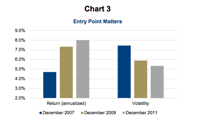
Our indicators can also help guide when it is a good time to put new money into the market, or to wait. Let’s say that your long-term return objectives, risk aversion and other factors indicate that a 60% equity / 40% bonds mix is the most appropriate allocation. Using TSX, S&P 500 and Canadian bond ETFs, we calculated the return and risk at three different entry points. The longest timeframe, with an entry point in December 2007 entry point, has almost 10 years invested but returned less than 5% annualized. The investor who got in two years later did much better with less risk.
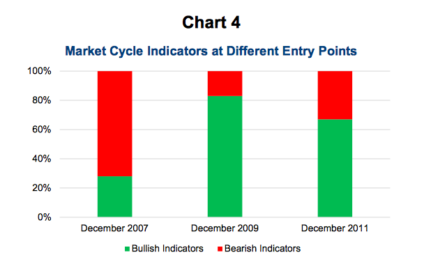
The last chart shows the percentage of market cycle indicators that were bullish and bearish at those three entry points. We aren’t claiming that this is a fool proof system, but it may be best to wait until the bearish indicators are dominating or rising when it comes to putting new money to work.
Conclusion
With 21 of the 30 in the green, we believe the market cycle has room to run. The economic data in North America and globally continues to be encouraging and companies are posting some very impressive profits these days. This has even helped soften the valuations a bit. If wondering about new money, we would probably wait for more signals to turn positive. Seasonally, adding in August / September / October can be a little risky. On the more opportunistic front, should we see a correction with Market Cycle indicators still predominantly bullish, that could prove a good entry point. We have not seen a correction for the S&P 500 in almost 600 days … That’s a pretty long time.
Charts are sourced to Bloomberg unless otherwise noted.
Twitter: @sobata416 @ConnectedWealth
Any opinions expressed herein are solely those of the authors, and do not in any way represent the views or opinions of any other person or entity.

