July 1 Stock Market Outlook & Technical Review
Here’s a look at some key stock market indicators and emerging themes that we are watching:
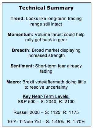
2016 Is Not Just 2015, Redux – With the S&P 500 Index up marginally at the mid-point and a broad trading range still intact, 2016 looks little different than 2015 on the surface. Digging slightly deeper, however, some relative trends from 2015 have reversed in 2016, and this bodes well for the S&P 500 Index heading into the second half of 2016.
Broad Market Strength Not Dissipating – One big difference between 2016 and 2015 has been better support from the broad market. Not only has this not faded in the wake of the Brexit vote, but breadth has actually improved. Advance/decline lines have hit new highs and we have seen back-to-back days of 9-to-1 upside/downside volume on the NYSE.
Sentiment Not Showing Universal Fear Post-Brexit – The VIX surged as it became clear that the UK voted “Leave.” Short-term sentiment composites showed pessimism quickly becoming excessive and that helped fuel a bounce in stocks. That pessimism is now fading, and other sentiment data this week showed investors actually turning more bullish in the wake of the UK vote. Investors July market outlook is improving.
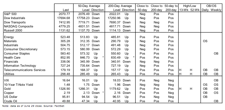
Stock Market Indicators – Indices & Sectors (click to enlarge)
S&P 500 Index
Heading into the holiday weekend, we’ll try to keep the market commentary brief and let the pictures do the talking.
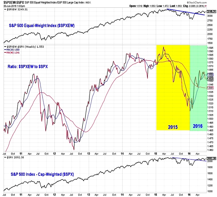
The ratio between the equal-weighted S&P 500 Index and its more ubiquitous cap-weighted counterpart moved steadily in favor of the cap-weighted index in 2015. We’ve seen the opposite this year, with the equal-weight version outperforming. This reflects a change in trend. It also reflects a broader rally participation this year than last.
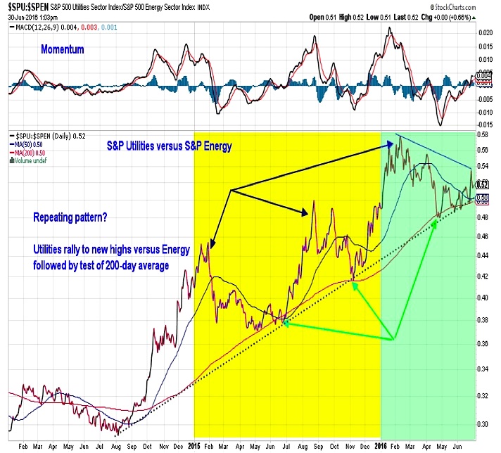
Utilities have been trending higher versus Energy for two years, and the pattern has been pretty consistent – new relative high followed by a test of the trend-line. That has played out in 2016 as well, although the ratio has lingered close to the trend-line longer than in previous tests.
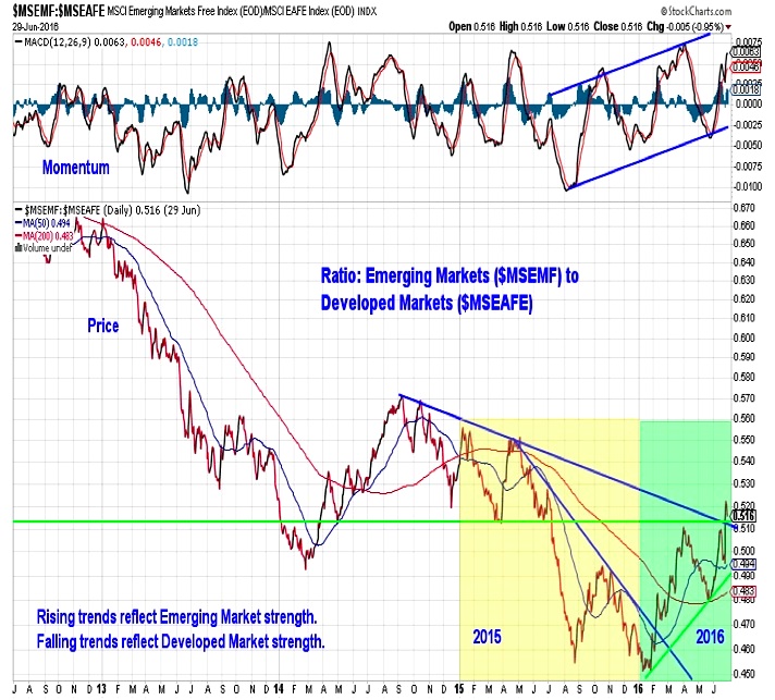
Emerging Markets vs Developed Markets
Developed markets had the upper hand in 2015, but it is emerging markets that have been leaders so far this year, breaking through a relative down-trend early in 2016 and sustaining the rally though the first half. Now the emerging markets to developed markets ratio is poking above resistance while momentum continues to build to the upside.
continue reading about market breadth & sentiment on the next page…

