In April 2014, I was honored to write a post for the “Market Masters” series right here on See It Market. In that post, I offered that investors could get a unique and valuable perspective on stocks and various markets by simply inverting their charts… And reduce investor bias at the same time!
For quick reference, here’s that post: “How Standing On Your Head Can Reduce Investor Bias”
Today, I’d like to revisit this technique on the 4 major U.S. stock market indices. But before I do so, let me share an excerpt from that post to better help you understand how this can be helpful:
I’ve found that inverting a chart can sometimes give a valuable fresh perspective and help overcome any preconceived notions, also known as investor bias.
The interesting field of behavioral finance has documented the often-harmful biases that we all share as investors. One of these is “recency bias.” For example, no matter how hard you and I try, we tend to think that what has happened recently in the market will continue in the future. Even financial pros are guilty of this type of investor bias.
So with the stock market slumping of late, and sentiment all over the board, I thought it would be good to zoom out on the major stock market indices, then flip the charts upside down.
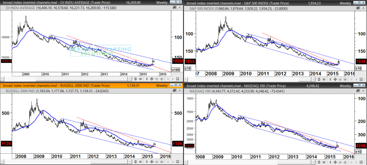
In the series of charts below (click image to enlarge), I have include flipped charts for the Dow Jones Industrial Average (DJIA), the S&P 500 (SPX), the Russell 2000 (RUT), and the Nasdaq 100 (NDX). And each chart goes back to the 2008-2009 bottom (which is a top with the charts upside down).
There are some key takeaways here. Investors need to understand their timeframes. If you are a short-term trader, then zooming out this far may not be fitting. But for active investors and trend followers, it’s always key to understand the dynamics of the longer-term trend.
Clearly, the short-term trend in the markets has been lower and it’s sharp turn bears monitoring. But the move has yet to do any significant damage to the longer term trend (as you can see by flipping the charts upside down).
Is it concerning? Without a doubt. And this is why we need to stick to our investing systems and plans to manage that. But note that we haven’t seen a breakout to the upside on the inverted charts to warrant a long term trend change just yet (this would equate to break to the downside) .
Again, this is from a 50,000 foot, 6 year view of the bull market. That doesn’t mean that you shouldn’t buckle up for the coming weeks. Always best to keep an open mind.
Thanks for reading and have a great week.
Twitter: @KimbleCharting
Any opinions expressed herein are solely those of the author, and do not in any way represent the views or opinions of any other person or entity.


