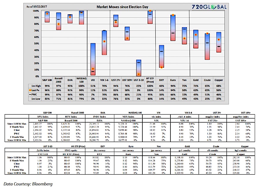
On March 10, 2017, 720Global introduced the Trump Range Chart. Developed to see several different markets on one page, this unique chart provides a composite perspective of many instruments at once.
Given the large post-election market gyrations across many asset classes, our concern was, and still remains, that those moves are transitory, reflective of extreme and possibly unwarranted optimism regarding the ability of the new administration to pass bold economic initiatives. For a broad discussion of the harsh economic landscape Trump faces, our cause for doubt, please read The Lowest Common Denominator: Debt.
Unbridled Enthusiasm
On May 17, 2017, the S&P 500 (INDEXSP:.INX,) fell 1.82% on rumors that President Trump had tried to persuade former FBI Director James Comey to influence the FBI investigation into potential Russian interactions with the Trump campaign. This resulted in the largest equity market decline since March 21st, when healthcare legislation was being challenged and produced a surge in volatility as well. Outside of these two days, optimism has run rampant as witnessed by the daily gains and recurring all-time highs in many major equity indexes. As a result, equity volatility as discussed in Volatility: A Misleading Measure of Risk, has reached lows only seen on four other days since 1990.
Two important points: First, valuations are reaching levels akin with those preceding memorable market crashes and are concurrent with still weaker economic growth and a Federal Reserve (Fed) that is hiking interest rates. Secondly, at current valuations, prudence demands a defensive posture but watching the markets move higher when hunkered down in a conservative position is both frustrating and humbling. This counter-intuitive dynamic is always present in markets at points of extremes. Most move comfortably with the herd while only a few have the fortitude to break away from the misguided pack.
Clouds on the Horizon
It is growing more obvious by the day that the administration lacks the ability to enact much of the economic legislation that generated the surge of optimism reflected in post-election stock indexes.
As market participants who like to support assertions with data, we also prefer to talk about events in terms of their probabilities. We think about the current situation this way: since the election, the S&P 500 has gained 13% at its highs on May 16. Corporate earnings have improved, but economic growth has proven weaker than expected and the Fed has been more aggressive in raising rates than most thought last November. Therefore, we believe a large majority of the gain stems from non-domestic forms of liquidity emanating from Europe and Japan and a belief that Trump will be able to pass much of his economic agenda. Given the hostile political climate in Washington, the probability of Trump executing his plans is certainly lower than the market suggests. On what logical basis should the probabilities of passing aggressive, pro-growth legislation remain unchanged?
Markets/Range Chart
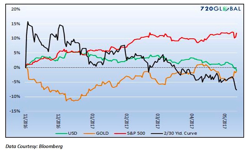
Despite these important considerations, the stock market exhibits little fear. The performance of other asset classes contradict the stock market. The graph below charts the percentage moves since the election of the S&P 500, Gold, U.S. Dollar and the 2year/30year Treasury yield curve. Despite widening significantly in the days following Trump’s victory, note that the yield curve is now flatter today than where it was on election-day. This is not a vote of confidence in the higher growth/reflation outlook that has bolstered stocks. The U.S. Dollar has also reversed the entirety of its post-Trump gains and gold is nearing breakeven over this period. While most investors pay close attention to stock prices and possibly bond yields, this analysis highlights other asset market signals that warrant attention.
The chart above uses 4 pm closing prices for each day. The Range Chart, below, uses intraday prices including the extremely volatile night of the election. Below the summary is a user guide for the Range Chart.
How to read the range chart
The data in the Trump range chart above is shown in a format that is quite different from what is commonly used to illustrate market changes. This format provides an easy way to view relative performance across a broad number of indexes and securities. It is intended to be a meaningful supplement and not a replacement to the traditional charts most investors review on a routine basis.
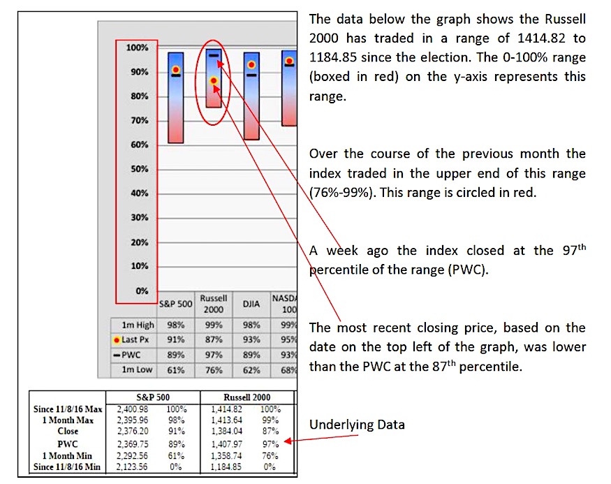
The base time frame captured by the graph reflects the market move for each index or security since Election Day, November 8, 2016. This change is represented by the 0% to 100% on the left hand axis. The 0% level reflects the intra-day low of the security since November 8 and the 100% level the intra-day high. For more clarity on the prices associated with the range, see the table below the chart for each respective index.
The (red/blue) bar reflects the price range of the past month relative to the base time frame. The black “dash” within the 1-month bar reflects the previous week’s closing level (PWC) and the red dot highlights the closing level on the “as-of” date in the top left corner.
The diagram below isolates the chart and data for the Russell 2000 to further illustrate these concepts.
Get more of my thoughts and research over at 720Global. Thanks for reading.
Twitter: @michaellebowitz
Any opinions expressed herein are solely those of the author, and do not in any way represent the views or opinions of any other person or entity.

