 The S&P 500 (SPX) is trading exactly where it was last week when I commented on See It Market about how the technical picture still looked bullish, even if lofty prices made many of us nervous. In this follow-up post, I’d like to illustrate how the bullish scenario hasn’t changed in spite of a fair amount of selling this week.
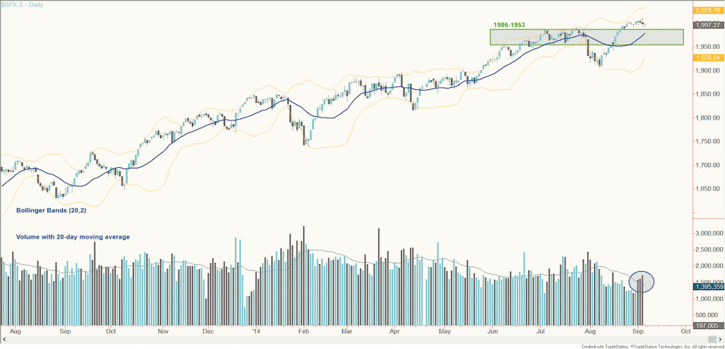
Let’s start with the price structure. SPX has consolidated since August 25th just above a demand zone at 1986-1953. By this I’m referring to two sources of demand that make the range a likely place to attract buying if tested:
- The first is by those who sold short in June and July and are now sitting on paper losses; many in this group would probably jump on the chance to buy back around breakeven if stocks dipped.
- The second is by those ready to put new capital to work – amid a strong trend and record high prices – and anchor to an area in which a lot of buying and selling took place in the past.
See the chart below for reference.
S&P 500 (SPX) Daily Chart
Additionally, the 20-day simple moving average is at the high end of the demand zone. This is the average price SPX traded at over the past 20 sessions, on a rolling basis. It’s common for price to revert to this level, often consolidating there for a time, before making its next advance to higher highs. Granted, it’s by no means a perfect benchmark: if you blindly bought every time the S&P 500 came back to this average you’d lose money (I’ve done a lot of programming to test that strategy; it works in some environments but hasn’t over the past year). It does, however, add another layer of technical support when considered in the context of the demand zone.
I generally avoid reading too much into volume. There are usually multiple interpretations about volume activity and, in my experience, there simply aren’t any patterns that work or tell the same story in every situation. With that understanding, the most we can say about the spike in volume over the past three slightly down sessions is that some supply was taken out of the market, and some new buying took place. My only point in including a paragraph about volume is to suggest you don’t look too deeply into potential implications.
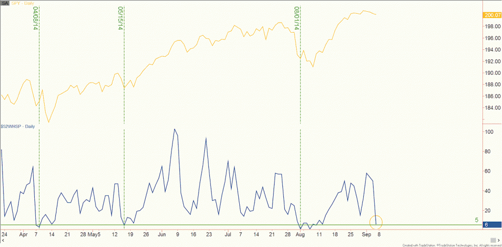
One piece of internal data that does interest me is the number of 52-week highs among S&P 500 components. Look closely at the accompanying chart. The orange line is price. The dark blue line is the number of 52-week highs. I’ve looked at this indicator throughout this cyclical bull market. Except for cases in which a larger correction was taking place, dips beneath five usually preceded a meaningful advance in the market soon after.
SPX vs # 52 Week Highs
Keep in mind, that this should be treated as an indication of time, not price. There have been plenty of instances in which price tumbled down quite a bit more before the market righted itself. Suffice it to say, you can monitor this indicator and the five threshold, in conjunction with SPX testing the 20-day moving average or the 1986-1953 demand zone, when looking to time buying the next dip.
To give some perspective, consider that a stop loss beneath 1953 would translate to risk of around 2% based on the current market. I don’t see this as a green light to go out and buy immediately; indeed, it would be nice to see price fall to the 20-day average and into the demand zone, suggesting more selling had been absorbed. But it does help to have a gauge of what the risk on a long trade would be. And keep in mind it usually helps to leave some room with a stop loss – SPX is notorious for violating support decisively just before it starts an ascent to new highs.
The most important takeaway is that there isn’t any indication that the rising trend has changed, and that means focusing on long opportunities.
Follow Chris on Twitter: @ChrisBurbaCMT
No position in any of the mentioned securities at the time of publication. Any opinions expressed herein are solely those of the author, and do not in any way represent the views or opinions of any other person or entity.


