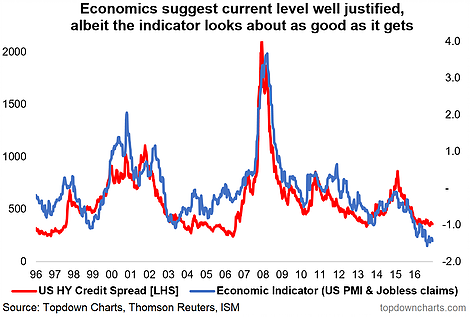
Chart #5 Likewise, US HY credit spreads are anchored by solid macroeconomic cycle dynamics… in other words, “expensive” can stay expensive for the time being.
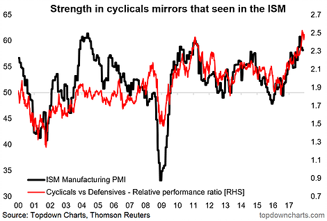
Chart #6 US cyclical stocks are closely keeping pace with the very strong ISM manufacturing PMI but the relative performance ratio looks very stretched, likewise absolute and relative valuations.
This is a key area to keep on top of as the new bull market in America (and globally) has been driven by solid outperformance by the cyclical stock sectors.
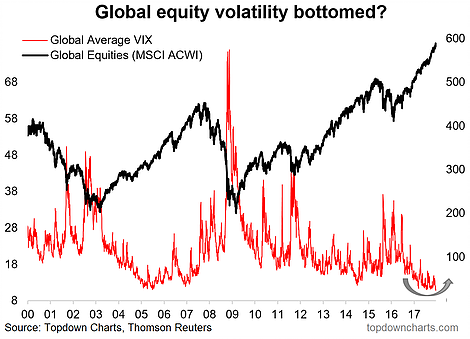
Chart #7 An open question for 2018: will the second great moderation continue? Or will global equity volatility reach a turning point?
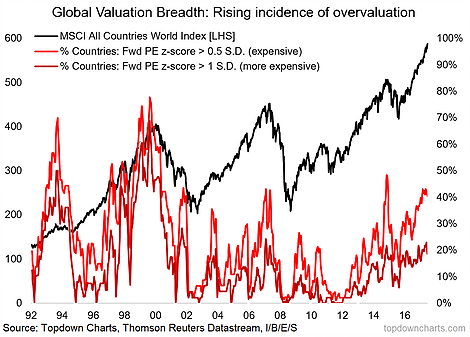
Chart #8 One issue (along side the themes of a maturing business cycle and a turning of the tides in global monetary policy) is a rising incidence of overvaluation across markets (and assets). It’s not at previous extremes yet, and valuation is not by itself a reason for markets to fall, but it is an important fact to incorporate and reflects increasingly optimistic expectations on the growth outlook.
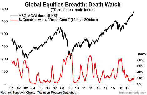
Chart #9 Global death-cross watch: a nice & novel chart which tracks the proportion of markets which have a “death cross” (i.e. the 50-day moving average passing below the 200 day) across 70 countries. This is probably the most comprehensive breadth view of global equities and a key early warning chart (i.e. this indicator usually turns up leading into a correction – like it is now).
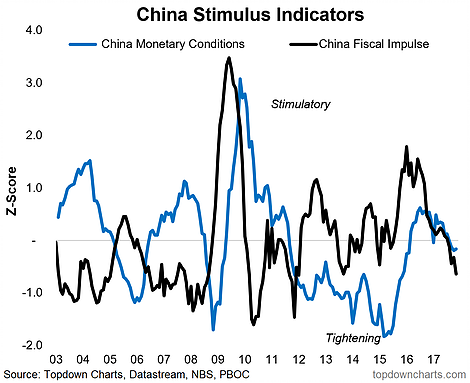
Chart #10 Last but certainly not least is China. A number of the big tailwinds (property, exports, stimulus) that helped China avoid a recession in 2015/16 are starting to turn. The fiscal/monetary policy stimulus indicators in this chart helped us pick the upturn in China before most others caught on, and I think this will be a key one to monitor when thinking about the outlook for China in 2018 and beyond.
These charts were featured in the 2017 End of Year Special Edition – click through for a one-off free download of the full report.
Twitter: @Callum_Thomas
Any opinions expressed herein are solely those of the author, and do not in any way represent the views or opinions of any other person or entity.

