I noted in this week’s Top Trading Links that it feels like Groundhog Day. It’s been tough trading over the past several weeks because it seems like every weekend is the same story. Here’s an excerpt:
It’s like Groundhog Day. The stock market has pushed back to the highs, the VIX has pushed back to the 12s… Incredible.
Will this week be any different? Well, we need to keep an eye on stock market breadth (more on that later), but…
The most interesting nugget from last week was how the indices held support until bears rolled over… yet again. The big hint of a rally came as a confluence of factors came together on Thursday morning
- Growth names did their own thing, acting independently for the first time in awhile.
- The market reversed a large pre-market loss.
- Any slight down tick after the market started higher got bears talking loudly… and the rip kept going.
But even though the bears suffered a defeat last week, a lot of stocks and groups are stuck range-bound trading below the falling 10 day moving average and above flatter longer term averages. As well, many are at a technical support level under the 20 and 50 day moving averages. Some of these setups are starting to remind me of William O’Neil’s textbook short setups.
The Indices
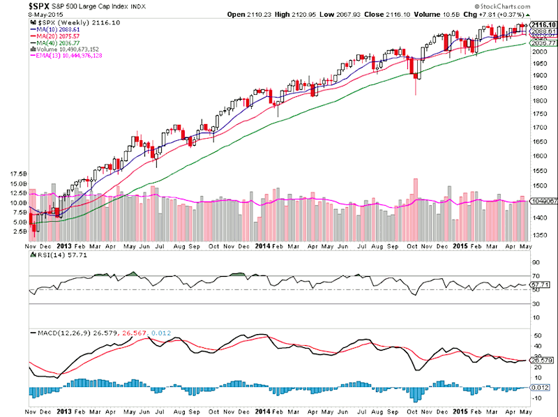
Check out the S&P 500 Index (SPX) weekly chart below. It sure looks like it wants to pop, doesn’t it?
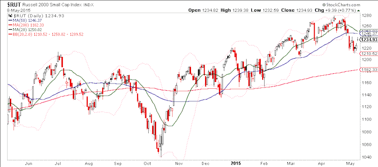
But, it doesn’t look like the small caps and the Russell 2000 Index (RUT) got the memo. Note how the divergence between the RUT and SPX indices is widening. The Bulls need small caps to get going.
It’s worth noting that the S&P 500 and long-term Treasury bonds have traded in the same direction since Tuesday. It appears that the market is concerned about rates rising.
To sum it all up, it seems like investors probably have enough momentum to inflict more pain on bears, especially with so many bears convinced of a breakdown. If we do breakout to new highs, the larger question will be: Do we have enough energy to sustain a broad breakout in the indices.
Stock Market Breadth and Internals
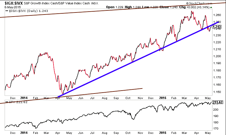
One ratio that I like to check in on is the growth to value ratio (S&P 500 Growth vs Value Indices). I’ll be watching the trend-line here closely. Again, the action in growth stocks have really tipped the markets hand of late.
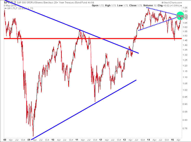
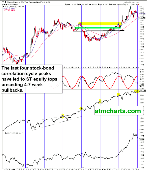
The stocks to bonds ratio is also at a critical level and point in time. This chart measures the S&P 500 ETF (SPY) vs the 20+ Year Treasury Bonds ETF (TLT).
For a few years now the market has followed this stocks-bonds correlation trading cycle. The last four times this cycle peaked we saw an equities peak, most recently coming in September. Perhaps the cycle is losing it’s effectiveness… or maybe not. Investors should know soon.
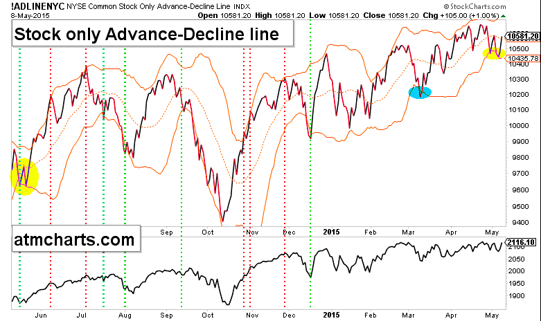
Early week action could tell the tale for stocks. Note the stock only A/D line at the vol envelope median line. Note the similar pattern in yellow back in 2014. Could this stock market breadth indicator be setting up for a move higher?
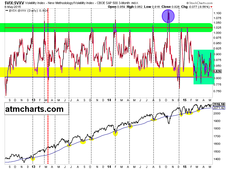
This low was not a true washout – we’re still in this phase of less fear. Check out the implied volatility term structure.
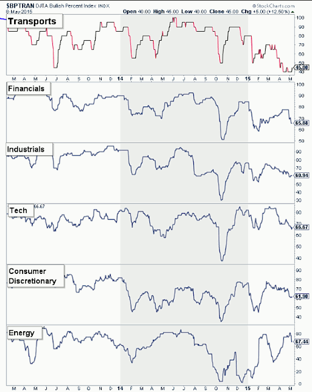
Point & Figure charts also show that stock market breadth is pulling in across many risk-on sectors.
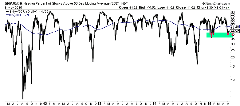
Investors could make the argument that breadth via Nasdaq %stocks over the 50 day moving average is bottoming. Let’s see how the Nasdaq performs this week.
The market looks like it wants more upside but we still don’t have a clear signal from price and stock market breadth. I think patience and discipline will pay off for traders in the coming days. Thanks for reading.
Follow Aaron on Twitter: @ATMcharts
Read more from Aaron on his blog.
No position in any of the mentioned securities at the time of publication. Any opinions expressed herein are solely those of the author, and do not in any way represent the views or opinions of any other person or entity.

