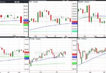
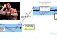
It is worth keeping in mind how the last two weeks have played out in the global markets. In this week’s SIM Linkfest “Top Trading Links“, I noted that there has been a sense of calm in the blogosphere. It’s weird because all quarter there was a sense of caution… and that kind of disappeared after the Fed.
That tied in quite interestingly with the fear that had built up on a micro level while the S&P 500 was putting in it’s second tightest quarterly range since 1950. Something’s got to give eventually. Economically sensitive sectors like the Transports and Semiconductors have traded poorly while a more speculative biotech sector has traded off sentiment and blasted to new highs. We’ll see how long this can continue. Perhaps this type of action will be a theme for the year. But then there’s Greece… man, the global markets have gotten interesting.
Greece is what it is. The apathetic sentiment towards the situation leads one to think that the market still has some “pricing-in” to do. We’ll have to wait and see how this affects heavily indebted parties… perhaps that will be down the road.
Okay, let’s review some macro charts for the week ahead.
MACRO
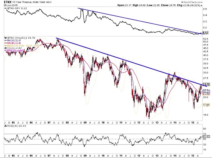
Bounces in treasuries continue to fall short of technical targets, suggesting weakness. We’ve got one giant piece of evidence to watch in the treasury market.
The 10 Year Treasury Yield (TNX) is testing a MAJOR resistance line:
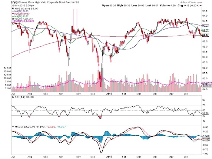
Also, High Yield Corporate Bonds (HYG) are testing the 200 day moving average.
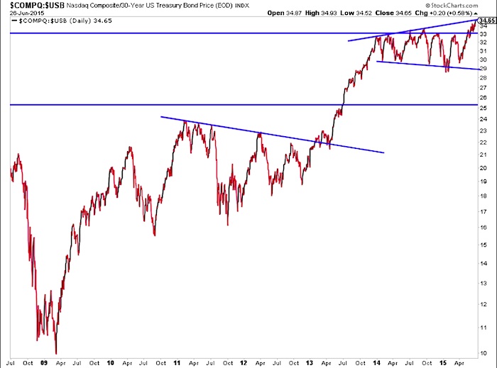
The NASDAQ ratio to 30 year treasury bonds is testing a major boundary line. With this in mind, it would be shocking if stocks outperformed bonds this week.
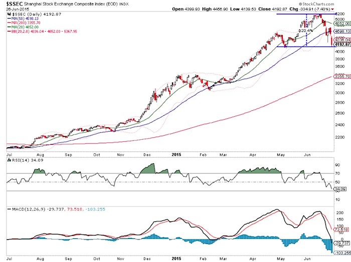
The Shanghai Composite has dropped roughly 20 percent in less than two weeks and is testing its May low. Even though we are at a support area, there are no signs of a sustainable low for Chinese stocks. This could make for an ugly outside month. And this pairs with the situation in Greece and an ugly looking German DAX chart.
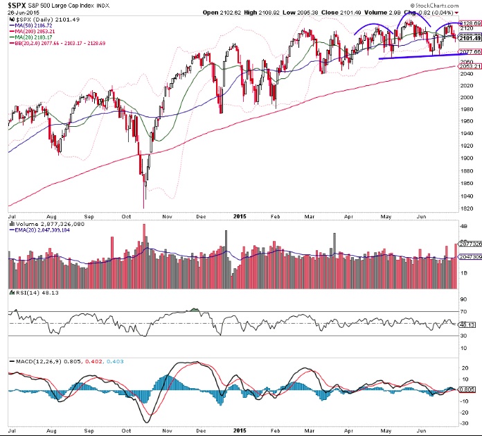
Is this a topping pattern in the S&P 500 right at the major Fibonacci extension level? When it’s nearly impossible to read the future, it’s good to have a level that we can trade against – and it’s worked well all year.
MARKET BREADTH
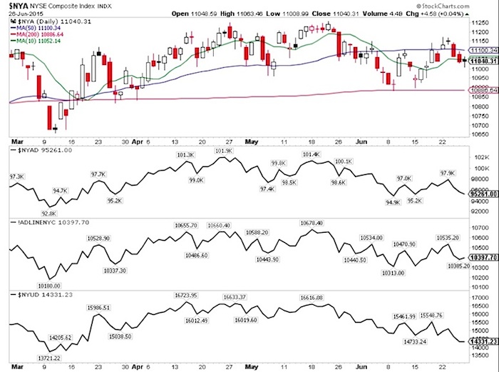
Breadth on the S&P 500 continues to deteriorate. Moves to the upside have been quite limited. Focusing on the NYSE Dashboard we can see that the Advance-Decline lines are still inline with price, but volume has been deteriorating.
SECTOR WATCH
Here are a few sectors to keep an eye on this week: Semiconductors, Biotech, and Banks.
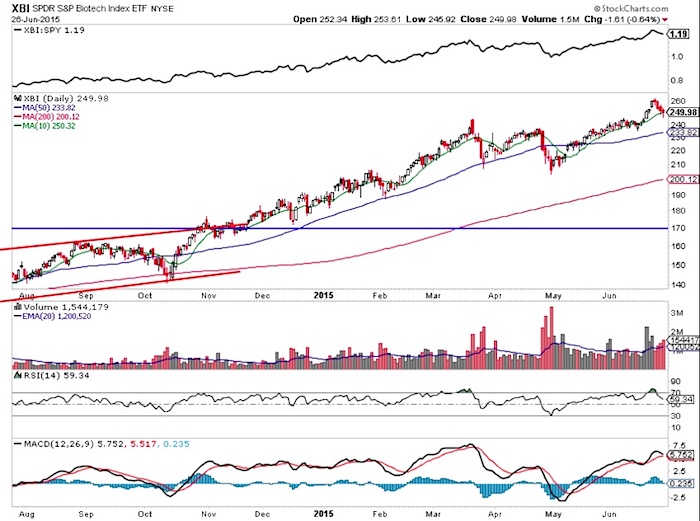
The SPDR Biotech Sector ETF (XBI) should tell us a lot about the market early in the week.
It’s looking more and more like deal frenzy in the semi sector has marked a climactic top in the group. The Semiconductors ETF (SOX) has started to lag the market and is selling off aggressively. The rising 200 Day moving average is just 3 percent away.
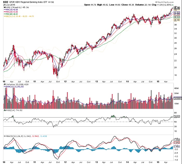
The Regional Banks ETF (KRE) is indicating that select regional banks may be a place to fish as the market corrects.
Thanks for reading.
Twitter: @ATMcharts
Read more from Aaron on his blog.
No position in any of the mentioned securities at the time of publication. Any opinions expressed herein are solely those of the author, and do not in any way represent the views or opinions of any other person or entity.

