 As Q2 2014 drags on, the S&P 500 (SPX) has broken higher after a 10-week consolidation, but the list of conundrums traders are faced with hasn’t diminished at all. How low will the VIX go? Do bonds have it wrong? Will large caps eventually succumb and catch down to the still-obstinately lagging small caps? Others undoubtedly spring to mind. Amidst the din, one I continue to hear more of as time wears on: “How does the S&P levitate in the green for the year at all-time highs when so few of it’s components seem to be involved?”
The popular – and seemingly unquestioned – rejoinder to this is that a small group of hulking market cap behemoths at the head of the line are throwing their cap-weighted clout behind the S&P so heavily that the remaining 95% of companies could slough off into ruin and the S&P would still trudge forward. But is that really the case?
The question is more involved than it might seem.
As most (at least modestly dedicated) students of the market know, the S&P 500 is a capitalization-weighted index. So, huge companies like Apple (AAPL), Exxon Mobil (XOM), Microsoft (MSFT), Johnson & Johnson (JNJ), General Electric (GE) and Google (GOOG, GOOGL) have a disproportionate amount of pull on how the index fares in virtue of their massive size. Like our solar system, the S&P is composed of a few major celestial bodies that figure highly in the firmament, emitting huge market capitalization gravity wells that exert a defining influence. Many other lesser lights cluster around, often revolving in their industry or sector around these giants, far more numerous in number but singly (and cumulatively) negligible in impact.
Before heading further down the path, consider a couple of basic stats about the S&P itself:
- The aggregate market cap of all 500 stocks: $17.64 Trillion.
- The aggregate market cap of the largest 50 stocks by market cap: $8.21 Trillion or 46.55%.
Given that, it doesn’t take much analytical acuity to figure out where the argument that a small but outsized minority at the top of the roster are shoving things around derives from.
So far, so good; but did you know – like many indices these days – the S&P 500 (since 2005) is a float-adjusted capitalization-weighted index? Not only is the index a weighted composite of it’s 500 constituents, but each company’s weight of the S&P’s aggregate market cap is further modified by the percentage of outstanding shares that are available to trade publicly before the index is finally calculated (interested in learning more? Read all about the S&P’s methodology here and their valuable reference on index math here). In the end, float-weighting includes about 97% of all outstanding shares – not a huge disparity, but not immaterial either. Suddenly the question of sorting out which stocks are driving the benchmark’s performance becomes a little more complicated.
As it turns out, float-adjusted market cap weighting or no, this echelon of companies at the top of the pile isn’t primarily responsible for the S&P’s performance. So what is?
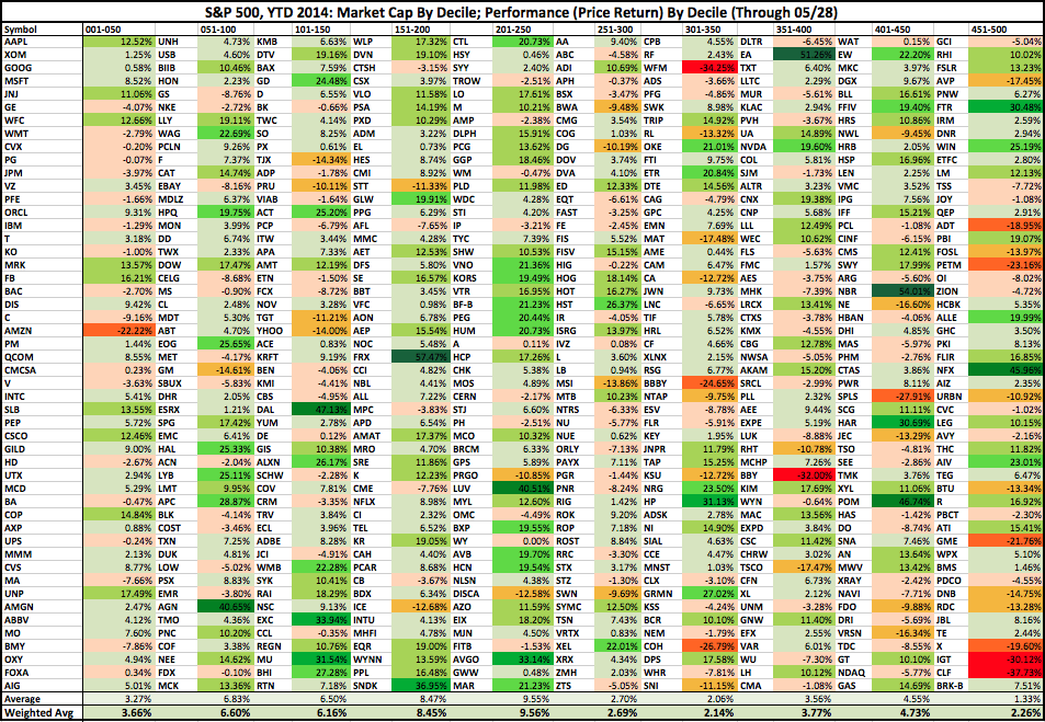
The short answer: the middle of the pack is performing best in 2014 YTD. In fact, the performance of one particular cohort with a middling rank by market cap boasts a return nearly triple the S&P’s so far this year (this excludes dividends).
The longer answer: in the table below, you’ll find the S&P split into 10 deciles, sorted top-down by market cap (i.e. AAPL first, and so on) and broken out into performance deciles. At the bottom, you’ll notice two averages (both float-adjusted): the first is the equal-weighted average performance of that decile, while the second is the weighted average (this is the one S&P uses to derive the benchmark’s value and performance). Interestingly, the difference between these two factors is more apparent among the top and bottom constituents, but all but disappears in the middle cohorts.
S&P 500, 2014 Year-to-Date: Market Cap and Performance Deciles (click image to zoom)
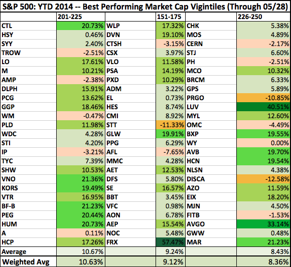
Narrowing this view of performance further, here are the three vigintiles (that’s 1/20) of 25 stocks that have performed best:
S&P 500, 2014 Year-to-Date: Three Biggest Performance Vigintiles (click image to zoom)
How about zooming in one more level? Why not. Constituents 218-222 – VNO, KORS, VTR BF-B, PEG – are the strongest centile (1/100) at an average 15.55% average YTD return – almost 5 times the S&P’s overall performance.
At more than 35% by weight, the performance of the bluest of the blue chips – appropriately – is right in line with the S&P’s overall YTD return. Meanwhile, cohort 151-250’s general outperformance is offset by 251-350 and 451-500’s laggardly behavior.
All things considered, there is something to the generic logic going around that the largest companies are doing more than their fair share, though. The weighted YTD average performance of the top 250 S&P components comes in at 5.3%. And the bottom half? 3.03%. As for those doing the heaviest lifting to keep the index aloft over the past weeks? Look right down the middle.
Twitter: @andrewunknown and @seeitmarket
Author holds no exposure to securities mentioned at the time of publication. Commentary provided is for educational purposes only and in no way constitutes trading or investment advice.
Any opinions expressed herein are solely those of the author, and do not in any way represent the views or opinions of any other person or entity.


