Unless you’ve been hiding out in a cave or on a distant planet, you know the stock market has been in a bull market since early 2009. To add perspective, the S&P 500 has tacked on a whopping +217.87% from March 2009 to the February 2015 high! It would be natural for one to think the bull ride may be coming to an end. But is it? Let’s briefly touch on some past posts and charts and see what the numbers said then versus now. As always, we’ll include links back to the previous articles for reference.
First, to get a general view of the stock market as a whole, refer back to my February update post. In that post I highlighted the following:
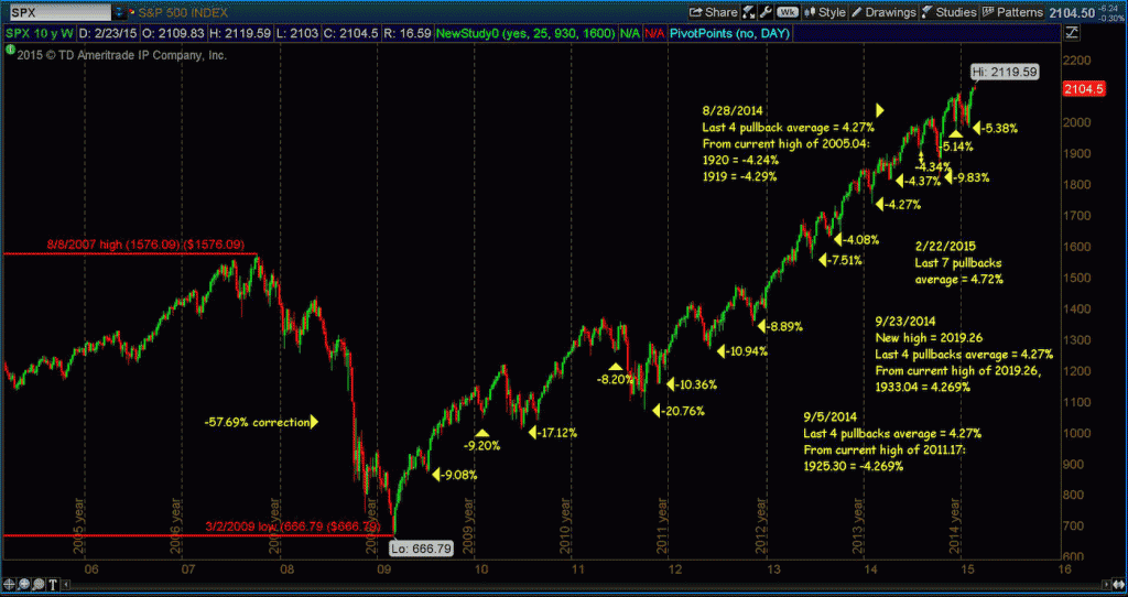
- An S&P 500 correction in September-October of 2014 of 9.83%. That’s close enough to 10% for me!
- Two pullbacks of 5.14% and 5.38%.
- The average of the past seven pullbacks was 4.72%.
The shallowness of the pullbacks indicates strength to me, i.e. The bull ain’t done!
The following chart highlights stock market pullbacks and corrections during the bull market. Note that the chart is identical to the one I posted in the February update other than it includes the new high of 2119.59 which was put in this past week.
S&P 500 Corrections and Pullbacks – 10 Year Weekly Chart
In my December update post, I shared eight charts, 2 each of the Dow Jones Industrial Average (DJIA), NASDAQ Composite (COMPQ), S&P 500 (SPX) and the Russell 2000 (RUT). In each series, I used a ten year weekly chart to show the breakout above the 2007 stock market highs and a one year daily chart showing current resistance levels… or what I deemed “make or break” levels as volume returned and the “Santa Clause” rally began to wind down.
Since the time of that post, each major stock market index has indeed made new highs; the Dow +0.77%, the NASDAQ +3.61%, the S&P 500 +1.24% and the Russell 2000 +1.54%. These are gains to the current highs , not current price.
In January, I shared what a 10 percent correction would be from the “then” current highs. None of the indices came close to a “correction,” but the pullbacks were as follows:
- Dow Jones Industrial Average pullback = (4.75%)
- NASDAQ Composite pullback = (5.23%)
- S&P 500 Index pullback = (5.03%)
- Russell 2000 Index pullback = (5.74%)
Now that we find ourselves in the first trading week of March 2015, let’s see if the bull market is still raging or could there be a pack of bears hiding up ahead.
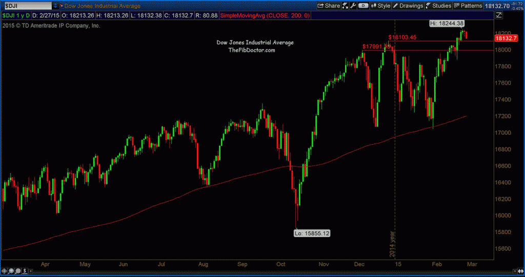
Starting with the Dow Jones Industrial Average (DJIA), you’ll see in the 1 year chart below that there were two areas of major resistance; one at 17991.19 and one at 18103.45. Price has cleared both levels and they are now support.
Dow Jones Industrial Average – 1 Year Daily chart
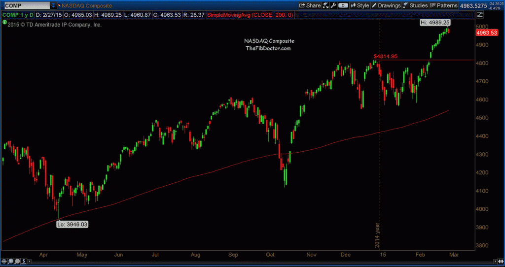
Next you’ll see the NASDAQ Composite only has one level that I consider important in the context of this post, support at 4814.95.
NASDAQ Composite 1 Year Chart
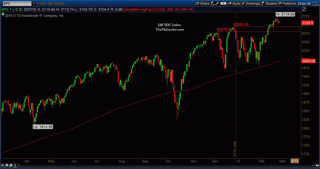
Moving on to the broader view of the market, the S&P 500 shows us two levels of resistance that have been cleared and are now support: 2079.47 and 2093.55.
S&P 500 Index – 1 Year Daily chart
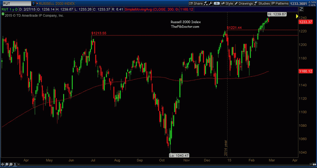
And lastly, the chart of the small cap index (the Russell 2000) highlights two levels of resistance which have been cleared and are now support: 1213.55 and 1221.44.
Russell 2000 Index – 1 Year Daily Chart
It is worth noting that each index does have open gaps from February that are below the aforementioned support levels. It is not at all unusual to see price come back to close a gap and then push back above its previous support.
Thanks for reading and always use a stop loss order.
Follow Dave on Twitter: @TheFibDoctor
No position in any of the mentioned securities at the time of publication. Any opinions expressed herein are solely those of the author, and do not in any way represent the views or opinions of any other person or entity.

