The S&P 500 (symbol: SPX) spent the month stretching from mid-July to mid-August moving sideways in a pitifully small range measuring less than 2% – in fact, except for the 4 sessions it spent some time above 1700, that range narrows to barely 1%. This late summer quiet gave the SPX 50 Day Moving Average (5oDSMA) time to close the yawning gap that opened up with the S&P’s blistering +9.57% advance off its June 24 pullback low to the early August 1709.67 all-time high.
Now -3.35% (peak-to-trough: -3.73% – a shallow pullback in a market season of shallow pullbacks) off that level, the index has closed below its 50DSMA for 3 consecutive sessions.
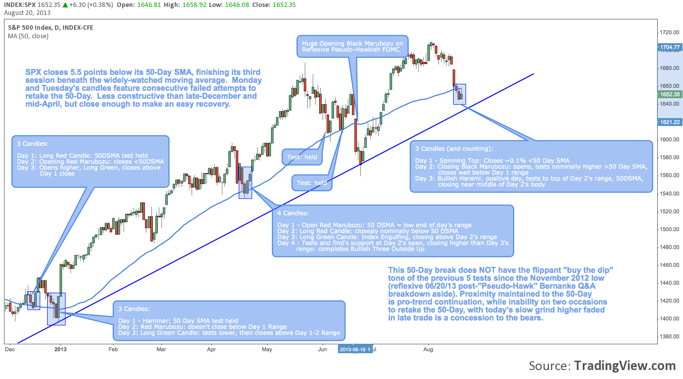
Since its the November 2012 corrective low, five of the six daily closes below this benchmark moving average have been well-bought: to wit, SPX has ended the two sessions following a close below the 50DSMA an average of +2.42% higher (the sixth, outlying example is discussed in some detail below).
Is it time to set aside deliberation, heeding the steady refrain that has emerged (and been quickly vindicated) on each of these occasions to “buy the dip”?
S&P 500 (SPX) – Daily: 50-Day Simple Moving Average Pullback Analysis (since November 2012)
Taking that question as our departure point, let’s have a quick look at the candlesticks characterizing each of these 50DSMA pullbacks. Breaking these multi-candle structures into their component parts gives a vital feel for the bounce that coalesced at each test – and some subtle hints as annotated on the chart below suggesting this seventh test since November 2012 might be different (click image to zoom):
Twitter: @andrewunknown and @seeitmarket
No position in any of the mentioned securities at the time of publication.
Any opinions expressed herein are solely those of the author, and do not in any way represent the views or opinions of any other person or entity.


