 Like clockwork, the S&P 500 ran out of gas at the top of the price range that goes all the way back to February. As a technician, I have been trained to make a call on the market, generally up or down. Maybe the toughest call of all is sideways. Why? It just doesn’t happen that often for an extended period of time, but as I have discussed in many research letters over the past few months, there are and remain a lot of technical crosscurrents that in the end equal a flat price for stocks. I have written so many pieces on the good and the bad concerning technical market conditions that I almost feel like it’s a cop out. But based on the lack of price direction by the “500”, it has certainly been appropriate.
Over the past week, I have touched on a number of reasons that the S&P 500 may be at another inflection point. I will review them here.
1. A measured move based on the size of the recent double bottom targeted the 2,126 level.
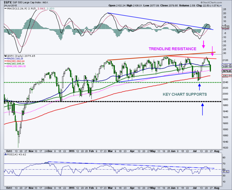
2. Trend line resistance off the peaks since May comes in at 2,127. The most recent high in June sits at 2,130, while potential chart resistance from the May all-time-highs (ATH) is at 2,135. If that wasn’t enough, based on the current wave structure of the low since last week, this Major Wave 1 or Major Wave A could peak out right near the May highs of 2,135.
3. Last, but certainly not least, an initial Fibonacci extension based on the decline from 2007 to 2009 bear market, which came into play once the 2007 high was taken out, is a 1.618 extension, which targets the 2,135 area.
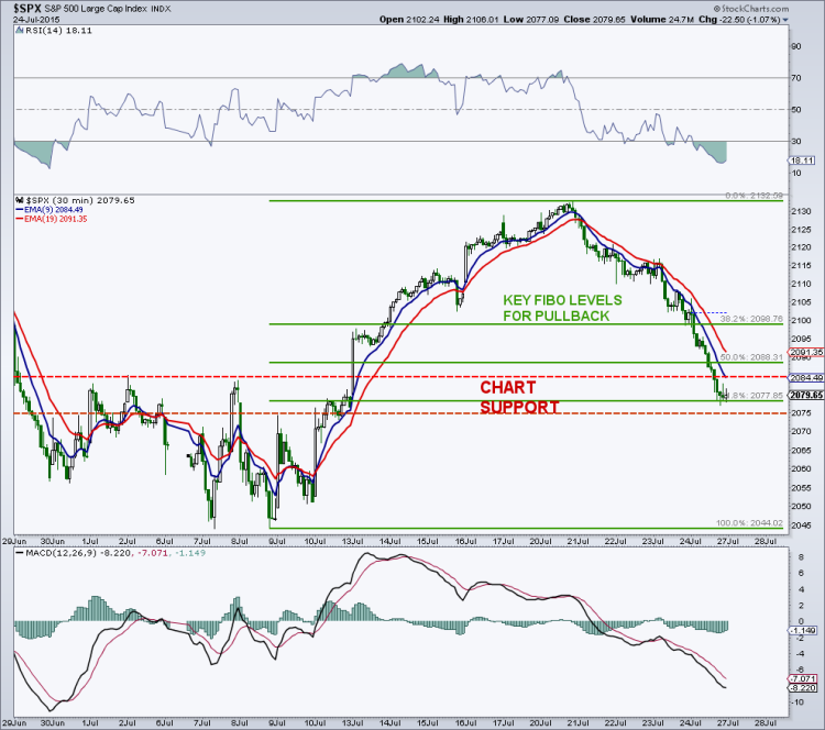
So the “500” basically stopped right below the all-time-highs (ATH) of 2,135 and has rolled over a bit. So if the “500” just completed its initial wave higher (Major Wave 1) off the July 8 bottom, I would like to see stocks hold any pullback (Major Wave 2) above the 2,075 to 2,085 breakout zone. Note that we closed today 2079.65, so Monday will provide an early test. Note that the 61.8% retracement off the 2133 highs targets 2,078. I think that area offers a decent risk/reward price point as the initiation of Major Wave 3 could be upon us.
S&P 500 Short-Term Fibonacci Chart
S&P 500 Macro Chart
So how does the S&P 500 get out of this range? First off, when the index runs up 60 to 80 points off the lows in a very short period of time, price gets overbought quickly and sentiment seems to run to jubilation from fear. This is not how the “500” will get out of this range, but may be part of the answer. If you are bullish, you want to see the “500” run to the top of the range, and then back off in a decent retracement. Things calm down, and then the “500” is sitting 30-40 points from a new high as the next wave higher begins. The index is then able to break to new highs before getting overbought, and before sentiment gets too frothy. So, a mild pullback here followed by a turn higher would, in my view, be the ticket for the ultimate range break.
Technically, a new ATH is generally bullish for an individual stock, a sector, an ETF and any of the thousands of indices out there. This is because every owner of that particular asset is in the black and there is no overhead supply (people with losses that will sell to cut losses or breakeven) to deal with. So a break above 2,135 on the “500” should be bullish, right?
Yes, at least in the short term and maybe the intermediate term, but not likely for the longer term. This of course is subject to change as is any forecast. This is where all the technical crosscurrents are relevant. Yes, the long-term trend in the “500” is undeniably bullish. And yes, some of the higher beta indices have broken out to new highs. And yes, every time the market goes down 3% fear rises like we are in a bear market. (I’m exaggerating here just a bit.) And yes, interest rates remain historically low so there are few investment alternatives for price appreciation and yield.
But there is an uglier side to the market that is being masked by the performance of the major indices. And that performance has been led by fewer and fewer stocks. Fortunately for the market cap weighted indices, the big guns, many higher beta mega caps, are responsible for the much of the heavy lifting here. See recent charts of Google (GOOG) and Amazon (AMZN) for examples of big beta stocks gone wild.
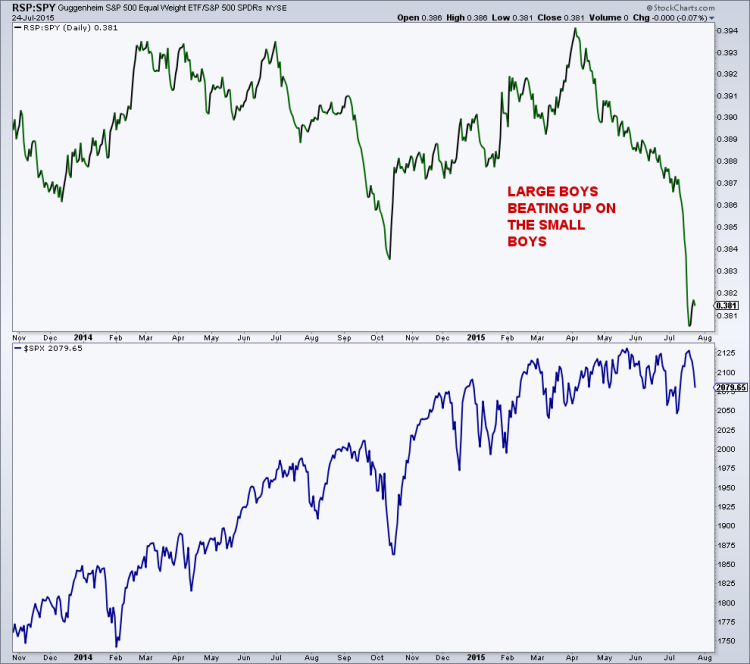
This can also be seen by looking at a relative performance of the equal-weighted S&P 500 vs. the S&P 500 itself. That relationship is showing a clear preference for the bigger cap stocks and the ratio (small vs. big) has been falling since April. And it has fallen off the proverbial cliff since the July 8th bottom. This relative strength line dropped below the level seen at the price lows in October, but this time it represents weakness in the smaller stocks vs. flattish action in the market cap heavy “500”, where as in October, small and large stocks both fell, but small fell harder than large.
Guggenheim S&P 500 Equal Weight ETF (RSP) vs SPDR S&P 500 ETF (SPY)
Thanks for reading and have a great weekend.
Twitter: @MarkArbeter
Author does not have a position in any mentioned securities at the time of publication. Any opinions expressed herein are solely those of the author, and do not in any way represent the views or opinions of any other person or entity.

