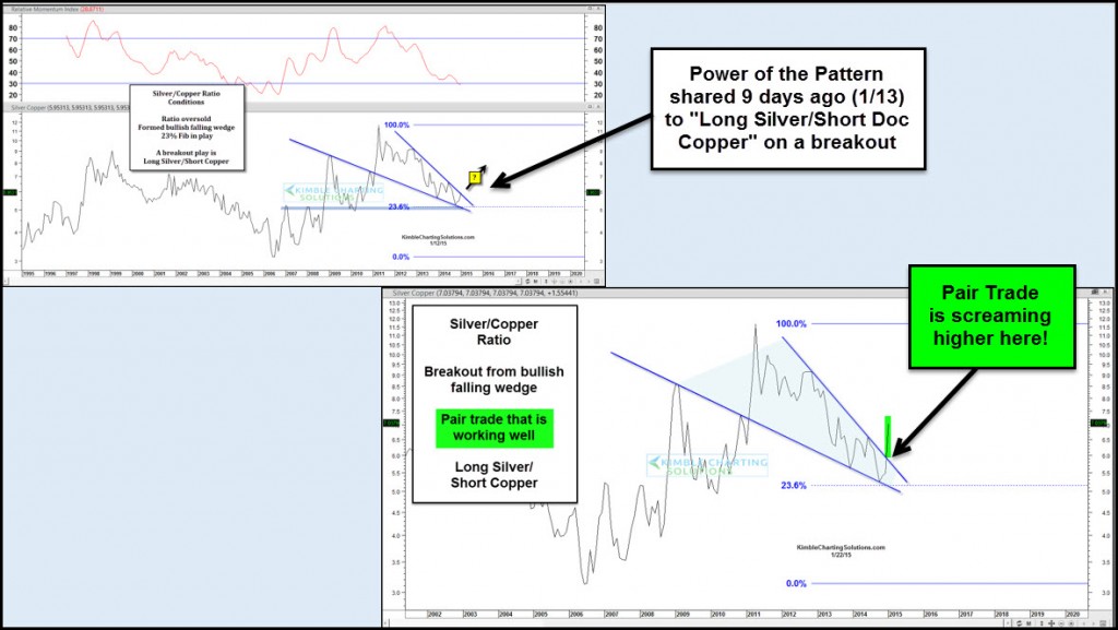
Silver has been setting up pretty well for a trade. I noticed this a couple weeks back and posted about a pairs trade with Copper (long Silver, short Copper). You can read that post here. Why was I interested in this trade? Well, in short, Silver looked like it was ready to move higher while Copper still looked week. And this was visible on the Silver Copper ratio chart.
The chart below provides an update on the Silver Copper ratio. Note that the upper left chart spells out the conditions in play on January 13. The lower right chart is the ratio chart and it shows the major breakout in this ratio. The Silver Copper ratio is heading higher, due to continued strength in Silver and relative weakness in Copper.
Note that the spread between the Silver ETF (SLV) and the Copper ETF (JJC) over the past 9 days is around 8%, so it’s probably best to remain nimble if looking for an entry here.
Silver Copper Ratio Chart – Update
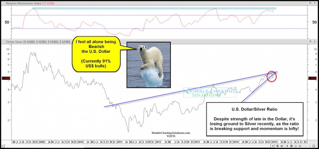
Silver has been pretty strong of late. How strong? Well take a look at another strong asset (currency), the US Dollar, pitted against Silver (see chart below). This ratio is actually breaking down as Silver showing relative strength to the US Dollar. We’ve seen the precious metals fail to see follow through buying over the past 2 years so be sure to keep risk on a tight leash and stay disciplined.
US Dollar Silver Ratio Chart
Thanks for reading. Have a great weekend.
Follow Chris on Twitter: @KimbleCharting
Author has positions in mentioned securities at the time of publication. Any opinions expressed herein are solely those of the author, and do not in any way represent the views or opinions of any other person or entity.


