The geopolitical backdrop in the Middle East is fluid to say the least, and this fluidity has helped the black fluid undertake what is looking like a potential upside breakout as the news/noise levels remain high.
But do you believe the hype?
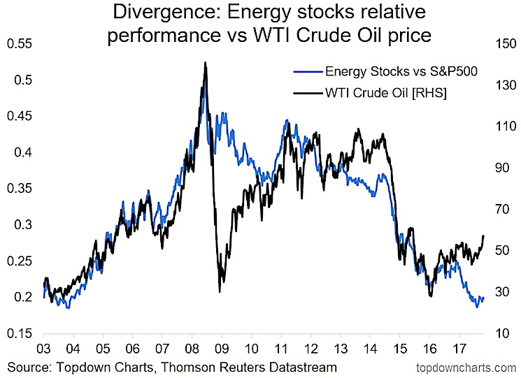
In this article we check out a chart that raises potentially more questions than it answers on the oil markets. The chart in question comes from the latest edition of the Weekly Macro Themes report.
The chart shows the oil price against S&P 500 Energy Sector (NYSEARCA:XLE) relative performance. At first glance it looks like energy stocks investors believe in a different story than oil traders.
Energy Stocks vs Crude Oil Divergence
There’s probably 2 main possible interpretations of this chart: a. Oil traders are right and the energy sector is overdue for some outperformance after a period of relative underperformance; or b. Energy stocks traders are right and the oil price breakout is a fakeout.
The answer will of course only be known in hindsight with the passage of time. But we as investors unfortunately can’t make use of hindsight or hope in investment strategy, so let’s review the weight of risks.
Looking across the rest of my indicators on crude oil prices I can see short-term negative seasonality headwinds, crowded long speculative futures positioning, bearish patterns in oil market implied volatility, US oil production at a record high, and of course the conflicting signals in the S&P500 energy sector.
That along with the point that geopolitical risk is a 2-sided coin with upside and downside risks, means to me the weight of risks based on what I can observe right now is to the downside. I have no edge in predicting or prophesying whether a large scale conflict may occur, but I do have a good set of charts and indicators across multiple variables and they tell me not to believe the hype.
Twitter: @Callum_Thomas
Any opinions expressed herein are solely those of the author, and do not in any way represent the views or opinions of any other person or entity.


