I have done several charts in the past looking at Palladium correlations, and specifically Palladium and it’s correlation to Apple (APPL). If you find correlations and price relationships interesting, do yourself a favor and spend some time starting from the beginning (which is at the bottom of the page in the link) and work through risk management and understanding the dynamics at play.
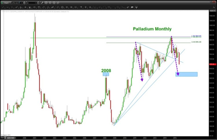
As of Friday June 26, 2015 Palladium has broken two major trend lines and the candle shown (a monthly) is strong and shows strength to the downside. It certainly appears that it will be heading to the old high in/around 2008 around 600 – for now. Note, Palladium fell like a stone during the last financial crisis. Is this an omen?
Palladium Long Term Chart
Last week, I provided an update on Apple stock (AAPL).
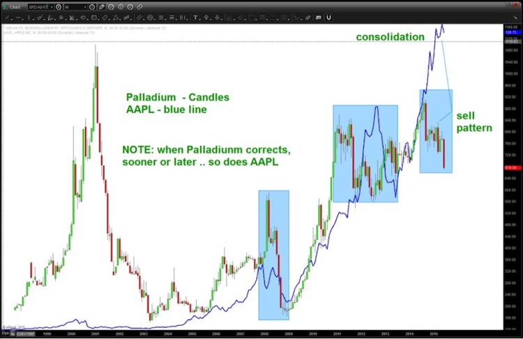
With Palladium correlations in mind, the most recent down move appears to be ominous for APPL. So the looming long term log trend line that has held it up will need to be monitored in the weeks ahead.
Palladium vs Apple Chart
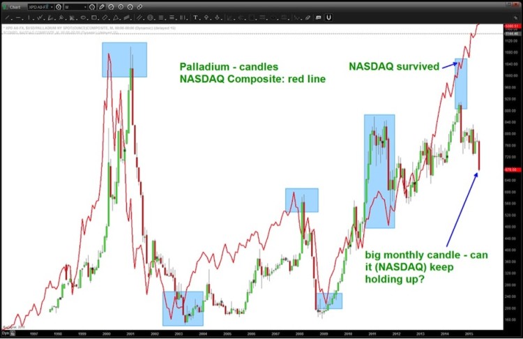
Now let’s cover another one of the interesting Palladium correlations: Palladium and the NASDAQ. Read another older post that I wrote on this and check out the chart below:
Palladium vs Nasdaq Composite Chart
The move (from a metals perspective) in Palladium has to be respected. And, if history is any guide, this amount of weight on Palladium has certainly caused a reaction from the likes of AAPL and the NASDAQ Composite in the past. Stay tuned.
Thanks for reading and have a GREAT week.
Twitter: @BartsCharts
No position in any of the mentioned securities at the time of publication. Any opinions expressed herein are solely those of the author, and do not in any way represent the views or opinions of any other person or entity.


