Technology is at the heart of our economy… the same way that industrials were 100 years ago.
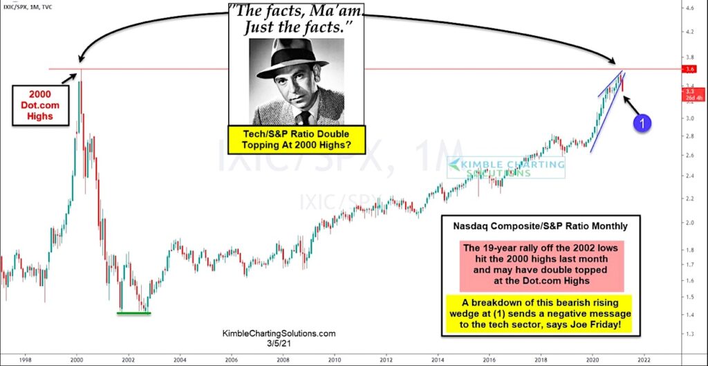
And that leadership has been present in the stock market for the past two decades. Today’s chart illustrates this… as well as a potential “pause” in that leadership vacuum.
Below is a long-term “monthly” ratio chart of the Nasdaq Composite versus the S&P 500 Index. Here you can see how technology stocks have led the broader market for the past 19 years!
BUT the performance ratio recently tested its 2000 highs last month and turned lower.
Here Joe Friday asks, “potential double top at 2000 highs?”
Perhaps… at a minumum this is strong resistance that is producing a bearish reaction for tech stocks. A breakdown of this rising wedge pattern at (1) appears to be sending a negative message to the tech sector. Stay tuned!
Nasdaq Composite vs S&P 500 Index Ratio Chart

Note that KimbleCharting is offering a 2 week Free trial to See It Market readers. Just send me an email to services@kimblechartingsolutions.com for details to get set up.
Twitter: @KimbleCharting
Any opinions expressed herein are solely those of the author, and do not in any way represent the views or opinions of any other person or entity.


