From Christine Hughes:
As you can see in the chart below, in the 2nd half of 2016 deflation fears faded and the yield curve moved higher (this is good). However, that’s since reversed and the longer term downtrend in the yield curve is still intact (bad news). Unless we see pro-cyclical, pro-growth policies pass through in Washington later this year we are on course for this economic cycle to end sometime in late 2018 (bad news). Unless we see pro-cyclical, pro-growth policies pass through in Washington later this year we are on course for this economic cycle to end sometime in late 2018.
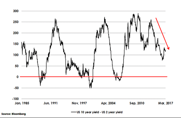
For a Refresher of why this matters: Understanding the Yield Curve:
Weather Report (Macro Forecast)
Top Dates To Watch in 2017 (source Bloomberg)
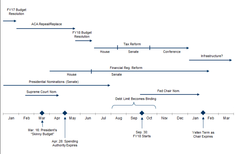
Debt Ceiling
April 1st there must be a budget proposal that has to be ready for review by Congress on the 15th and then, a month later (May 15th), the House considers the bills through June 10th and by June 15th it must be reconciled and by June 30th it must be finalized or the Government collapses. Keep that in mind as you look at the below chart of SPY.
Inflection Points:
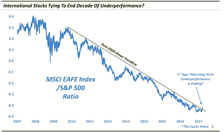
I have been writing just this past month, after being bullish from March/April of 2016, that expectations for the US Market are running ahead of reality and stock prices are vulnerable to a pullback. Where might that money go? Well bonds for one and international stocks for another which means…out of US stocks/indices:
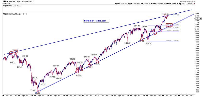
This could be a long year of snaking our way to this apex ~2500, and with it, my Stock-Bond-VIX ratio signals lots of volatility in between:
The Problem with Oil’s Crowded Trade
U.S. shale is MASSIVELY levered to oil. Their colossal debt load keeps them pumping out supply, placing a ceiling on prices. And that leads to contagion in HYG JNK LQD falling further.
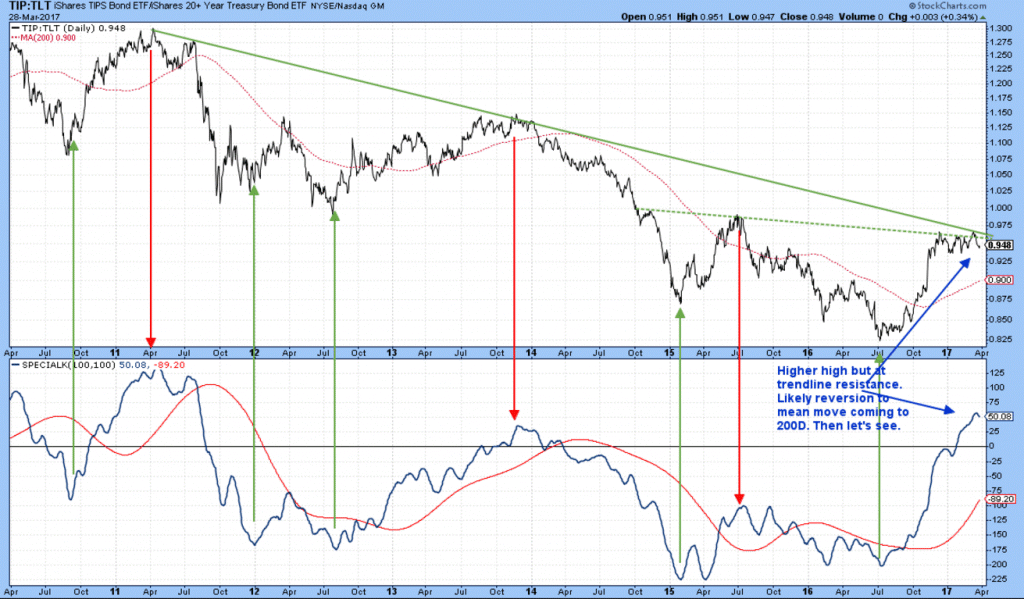
As for the Inflation Trade: To Be or Not To Be
This TLT:TIP ratio chart (h/t Martin Pring) represents when investors are feeling the need to protect their portfolios from inflation as they tend to bid up the price of TIPs against that of the deflation sensitive TLT. The Bond Market Commodity Relationship is at major inflection point: Above is bullish; Below is bearish.
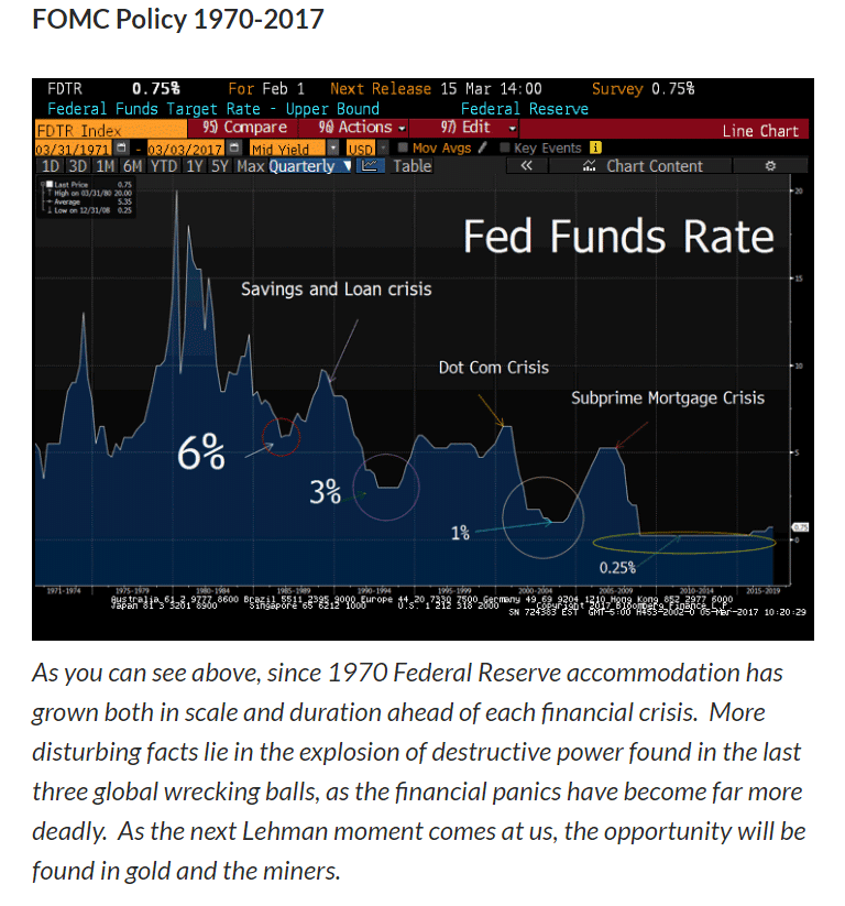
Why There Are Gold Bugs
Gold is sometimes a hedge against inflation, sometimes currency, sometimes commodity trade. If things ratchet up in a global crisis way, Gold is also a fear trade. Chart h/t Lawrence McDonald.
Friendly Sidebar: It’s easy to subscribe to my Free Fishing Stories/Blog for more insights like these. You are also invited to Come Fish With Me on any trading day!
Thanks for reading and Happy Trading.
Twitter: @SamanthaLaDuc
Any opinions expressed herein are solely those of the author, and do not in any way represent the views or opinions of any other person or entity.

: Creating Bullish Divergence?")


: Creating Bullish Divergence?")

