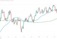
Over the past 2 years, market corrections have been driven to the point of extinction; but last week’s -3% S&P 500 performance has dared some to believe again.
Will the current S&P 500 pullback be business as usual; or has the hibernating bear been poked one too many times?
In this extensive video we analyze the S&P 500 and then break down its sectors, breadth and volatility across 40 charts to assess whether the recent S&P 500 pullback is almost over; or just the first leg down a larger drop.
To accomplish this, we follow a top-down process that begins 1) with a broad look at the technical conditions of the benchmark index itself before reviewing 2) it’s relative strength compared to other market caps, 3) how many of the S&P’s 500 components are participating in the current decline, 4) sector relative strength in the context of the 2009-2014 market cycle, 5) a technical overview of each sector, and finally 6) an examination of the S&P’s volatility by looking at the Volatility Index (VIX).
This is the first video segment I’ve produced (for See It Market or independently): aside from the length (!), I’m eager to hear any constructive feedback you have, along with any comments on what’s covered. Also, if you have any ideas or recommendations for future videos, please let me know below.
Trade ’em Well.
Twitter: @andrewunknown
Author holds no exposure to asset classes or securities mentioned at the time of publication. Commentary provided is for educational purposes only and in no way constitutes trading or investment advice. Sleeping Bear image courtesy of Fandango.com


