The “Fear Index”
The Volatility Index (VIX) is often referred to as the “fear index” since it tends to rise when market participants are concerned about future volatility in stocks. The charts below allow us to compare moves in the VIX during 2007-2009 and 2014-2015.
The purpose is to better understand the probability of good things happening relative to the probability of bad things happening in the stock market over the coming weeks and months.
Consolidation Speaks To Indecisiveness
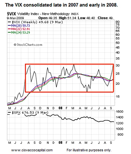
In the early stages of a new bear market, some market participants jump on the “this is not good” bandwagon, while others remain in the “this is just a correction” camp. As shown in the 2007-2008 chart of the VIX below, concerns about market volatility were still mixed in August 2008 with the S&P 500 trading above 1,200.
There is nothing magical about the moving averages shown; they simply help us smooth out some volatility.
A “Fear Breakout” In 2008
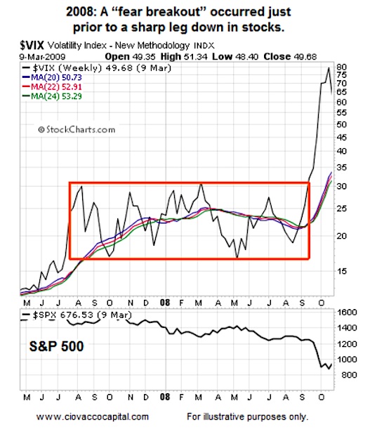
Concerns about stocks and the economy spiked in September 2008 as the VIX made a dramatic push above the orange box. After the breakout, the S&P 500 dropped like a stone. In short, fear spiked as the stock market dropped.
Fear Breakout Holds Into 2009
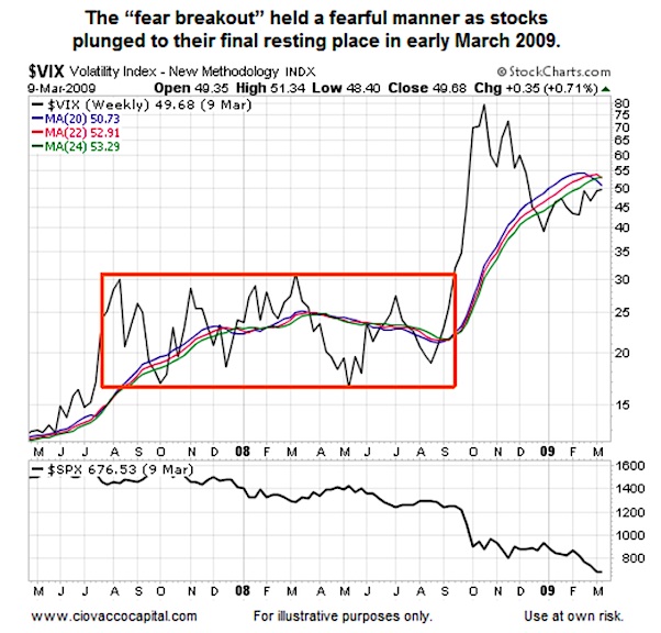
The Volatility Index (VIX) remained at elevated levels as stocks continued to destroy hard earned capital. During the entire drop in the S&P 500 from over 1,200 to the intraday low of 666, the the VIX held above the orange box (as we would expect).
Did The VIX Eventually Calm Down?
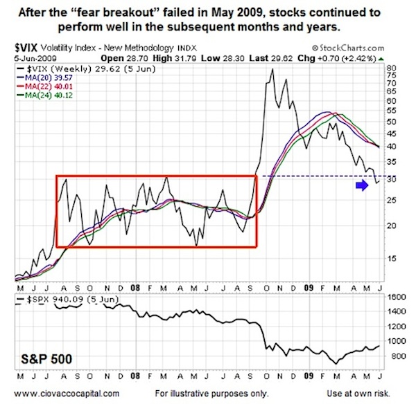
The answer to the question above is “yes”. After the “fear breakout” was given back in May 2009, stocks continued to push higher in the coming years.
continue reading about volatility in 2015 not the next page…

