A few weeks ago I wrote an article called “The Return of Volatility” in the midst of the February stock market correction. I highlighted the prospects of a change in market regime from one of ultra low volatility to a period of higher volatility.
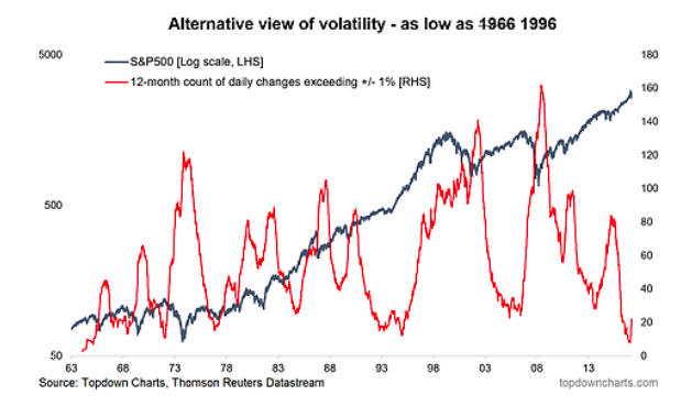
My view remains that we will likely see a sustained period of higher volatility for stocks, but due to a number of positive dynamics it may well be more similar to the late 1990’s than the pre-financial crisis period.
In other words, rising volatility with rising stocks.
Now that’s just looking at one asset class – stocks, or specifically the S&P 500. But what about other asset classes?
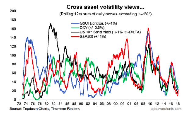
Curiously, this period of ultra low volatility for equities has been mirrored across the major asset classes. The second chart in this report shows how realized volatility for the US Dollar (the DXY), Commodities (GSCI Commodities Index), and the US 10-Year Government Bond Yield has dropped to very low levels. In fact there seems to have been a synchronization in volatility across asset classes.
But as I outlined in the presentation “Monetary Policy and Asset Allocation” as the global economic cycle matures, the tides are turning for global monetary policy. This is going to be a key driver of higher volatility across asset classes in the months and years to come. Monetary policy (traditional and extraordinary policy tools) was a force for volatility suppression over the past 10 years, and now that is changing.
The key points on the transition to a higher volatility regime are:
– Stockmarket realized volatility has turned up from ultra low levels.
– Ultra low volatility has been seen across asset classes, and volatility has become more synchronized across asset classes in the past 10 years.
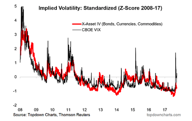
– Implied volatility has likewise turned up from ultra low levels.
– The changing global macro backdrop will reinforce a transition to higher volatility across asset classes as the business cycle matures and the tides turn in global monetary policy.
1. Alternative Volatility Indicator: This alternative view of volatility for the S&P 500 – the rolling 12-month count of daily percent changes exceeding 1% (up or down) – has reached a turning point. Since the low point of 8 in early January, which was a 50-year low, the indicator has risen to 22 days (with 2018 YTD seeing 15 days where the daily price change exceeded 1% up or down). As the history of this indicator shows there are times when realized volatility rises in the later stages of an old bull market, and times when it rises during the early stages of a new bear market.
2. Cross Asset Volatility: Taking a similar approach to other asset classes it’s intriguing to note how ultra low volatility has been a common trait across bonds, currencies, and commodities. What’s even more interesting is how synchronized realized volatility has become across asset classes, with the last 10-15 years standing in contrast to the experience of the previous years.
3. Cross Asset Implied Volatility:Switching from realized volatility to implied volatility for the final chart, this one shows in the red line the average standardized implied volatility score for Bonds, Currencies, and Commodities, and in the black the standardized implied volatility index (z-score of the CBOE VIX) for the S&P 500. Again we see implied volatility reach ultra low levels across asset classes. Although there does appear to be something stirring here, and this would make sense given the changing global macroeconomic backdrop (late cycle dynamics, return of inflation, turning of the tides in monetary policy).
Twitter: @Callum_Thomas
Any opinions expressed herein are solely those of the author, and do not in any way represent the views or opinions of any other person or entity.

