In case you missed it, gold has finally managed to stage a decent rally.
Through the turmoil and tumult of the trade war escalation, gold had been reluctant to move as US dollar strength kept a lid on things. However, there’s a few key moving parts that investors should be thinking about which could clear the way for gold to potentially embark on a new gold bull market.
The chart of today comes from last week’s macro themes report, where I covered the outlook for the gold price (I also covered Silver, but that’s a separate matter altogether!).
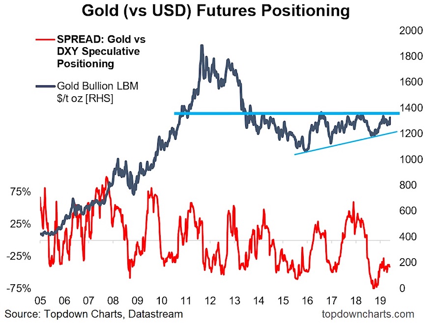
The chart shows the gold price, a couple of key lines which I’ll talk about in a second, and a slightly unusual take on gold futures positioning.
Gold Futures vs Gold / US Dollar Speculative Spread

Firstly, on futures positioning, what I am showing here is the difference between the standardized (vs open interest) net-speculative futures positioning in gold vs the US dollar index. The point of doing this is that we’re dealing with gold in USD terms here, so it kind of makes sense to bring in both the gold and DXY futures positioning to present a sort of 2-sided view on the situation. Satisfyingly, it actually results in a more bounded and intuitive signal as you can see in the chart.
On that indicator, it is currently presenting a contrarian bullish signal, and the higher low is confirming the higher low in price.
Now on to those interesting blue lines. Honestly, they should be pretty self explanatory, but let’s go through them.
The most important one is the thick blue line which denotes the major overhead resistance level (or zone… you could probably say the key level is 1380 but you could also say it’s 1370 or 1390). The bottom line is, that for gold to enter into a new bull market it needs to break through that zone/level. If and when it gets there, I can almost guarantee you that something critical has changed in the global macro system (I will talk about this shortly).
The other line is that upward sloping narrower blue line, which is basically (loosely) forming a multi-year ascending triangle. These formations are typically bullish, but they usefully set a couple of key lines in the sand (a break to the downside = bearish, upside = bullish). Those formations are useful in identifying major turning points and the beginning of new market regimes.
So we know a few things from this chart: positioning looks bullish, the ascending triangle is typically bullish, and the key line in the sand or line of departure for a new bull market campaign is that circa-1380 zone.
I’ve noted elsewhere that it’s probably worth treating it with benign skepticism until it actually does break out. A key reason for this is that you can clearly see a series of failed attempts to break through that key level. Indeed, some traders might even be tempted to fade the rally if it approaches that level. But I think you can have a degree of confidence in the assertion that if it does breakout it will likely just keep on going.
As for the macro picture, or what’s changed/changing. The path of the US dollar is obviously one of the major variables here, and on that note (as I mentioned in the Top 5 charts of the Week), the consensus is swiftly shifting to expect Fed rate cuts in the near term. Historically a transition from rate hikes to rate cuts has precipitated a correction and/or bear market in the US dollar.
A bear market in the US dollar would be more or less unequivocally bullish for gold. And in fairness, if something pops out that makes the US dollar rally – that’s probably going to be the major driver of downside risk for gold too.
So with rising uncertainty on the economic outlook, and a growing consensus for Fed rate cuts, a tired looking US dollar could well be the last line of defense for gold to break through.
Twitter: @Callum_Thomas
Any opinions expressed herein are solely those of the author, and do not in any way represent the views or opinions of any other person or entity.


