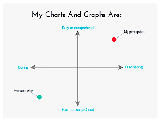
As I stated in the 2017 End of Year Special Edition report, no end-of-year recaps are complete without some investor humor… and for technical analysts that pour through data and charts all year, well, how about some chart funnies?
Each of these are are hand picked by yours truly. Sources are noted.
Here are 5 of my favorites. Enjoy!
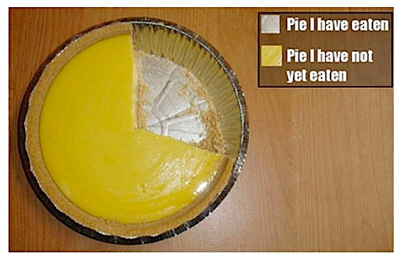
1. I don’t really use pie charts that much, but here’s one I always refer back to, especially during the festive season. (source)
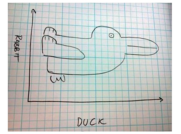
2. As often is the case, time series charts require a certain degree of interpretation, and often times the conclusion is in the eye of the beholder… (source)
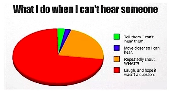
3. Christmas party conversations… (source)
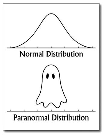
4. Sometimes it seems like the “paranormal distribution” provides a more accurate statistical description of financial markets… (source)
5. My worst fear… (source)
Thanks for reading and happy holidays!
Twitter: @Callum_Thomas
Any opinions expressed herein are solely those of the author, and do not in any way represent the views or opinions of any other person or entity.

