Investor preferences allow us to better understand the stock market’s risk-reward profile. In this exercise, we’ll look at a key stocks to bonds ratio at key turning points over the past 15 years and see how it compares to the current environment.
This Is What Risk-Off Looks Like
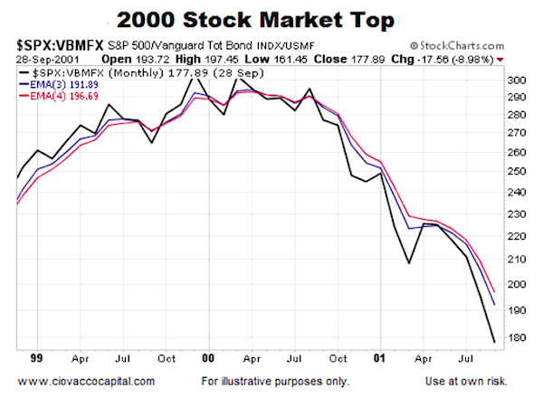
Go back to the 2000 stock market top. As shown via the chart below, when economic fear was high in 2000-2002, the performance of growth-oriented stocks (via the S&P 500) was weak relative to a diversified basket of defensive-oriented bonds (via VBMFX – Vanguard Total Bond Market Index). In the ETF world, VBMFX is very similar to AGG. In sum, the stocks to bonds ratio moved lower…
2000 Stock Market Top Chart
This is What Risk-On Looks Like
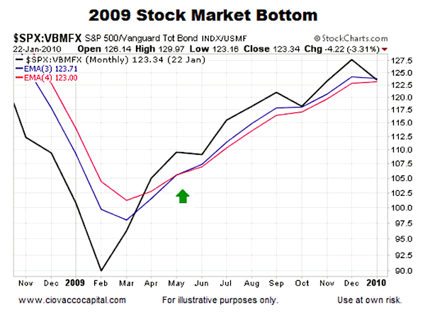
When fear started to subside in March 2009, equities started to outperform bonds, telling us the risk-reward profile of the general stock market was improving. And the stocks to bonds ratio followed through higher.
2009 Stock Market Bottom Chart
This Is What Today Looks Like
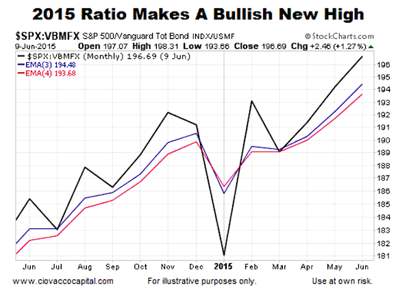
How does the same ratio look now?
2015 Stock Market Chart
Investment Implications – The Weight of The Evidence
Is the stocks to bonds ratio a perfect way to monitor risk? No, in fact there is no perfect chart or indicator. However, like many other investing inputs, the stocks to bonds ratio can assist us in making better decisions from a probability perspective. Our market model tracks numerous ratios, indicators, and data points, including the ratio shown in the charts above. As we noted on June 5, the weight of the evidence is still calling for some patience with our growth-oriented postions. When the facts change, we are happy to make any necessary adjustments. Thanks for reading.
Twitter: @CiovaccoCapital
Author may hold positions in securities mentioned for himself and clients at the time of publication. Any opinions expressed herein are solely those of the author, and do not in any way represent the views or opinions of any other person or entity.


