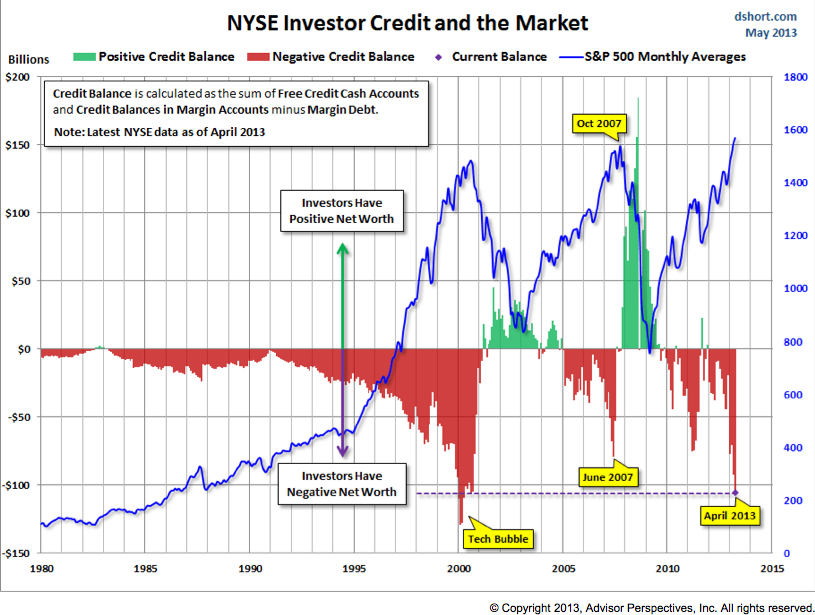
 Earlier this afternoon we noted Margin debt struck an all-time-high in April – and that the market’s net worth is plumbing levels last seen at the stupefying heights of the Tech Bubble.
So far, that hasn’t changed since publication; but the chart we included there from Doug Short has.
Here then is the updated chart showing nominal (i.e. not inflation-adjusted) NYSE Margin Debt and net worth (-$105.885B in April) overlaid with the S&P 500 (SPX):
To Doug’s credit, there’s no better chart out there encapsulating these relationships. The return to Tech Bubble-era negative net worth I mentioned previously is on vivid display here. Doug also makes a few important notes in his accompanying comments (along with inflation-adjusted margin debt charts of the headline measure well-worth checking out), listed here in my own words:
- Margin Debt is a leading indicator, but it is published on a lagging basis (for example, April’s data was published today).
- Extreme negative net worth readings (2000, 2007, and 2011) have preceded market tops by at least a couple months.
- The number of peak/trough occurrences in the series shown is too small to reliably issue a “definitive warning for US equities”.
As a result, this data has strategic (think medium and long-term) relevance and application (e.g. can be used in conjunction with sector rotation analysis, cycle analysis or formulating a longer-dated risk-defined options strategy). We benefit from keeping an eye on this measure (as we do with any other sentiment reading) by using it to keep up with a context that is rarely a the binary stuff of soundbites, but shifting risk-adjusted shades of gray in-between. Right now, those shades are darkening, as they have before: in each case in an environment when “it makes great sense to borrow”. As Doug concludes, then: ” We’ll want to keep an eye on this metric over the next few months”.

