Stock prices have reached what looks like a permanently high plateau” – Irving Fisher, New York Times September 3, 1929
One of the more infamous quotes from the roaring ‘20s came within two months of a market peak, which would not be surpassed again until the 1950s.
Between 1920 and September 1929, the Dow Jones Industrial Average rose over 18% on an annualized basis.
Economist Irving Fisher essentially declared that such outsized gains were the norm. As he discovered a couple of months later, that time was not different.
Today, with valuations as stretched as they were in 1929 and 1999, the calls for a lengthy continuation of the current bull market are growing to a crescendo. The sentiment is so extreme that some outlandish predictions on individual stocks and indexes are treated as gospel as opposed to the warnings they likely are.
Despite the high likelihood of poor returns over the coming decade, more and more stock analysts are telling us this time is different. One particular article caught our attention and is worth discussing to show how data can be used to support nearly any view.
4x by 2030
The Investor’s Fallacy by Nick Magguilli, states the following:
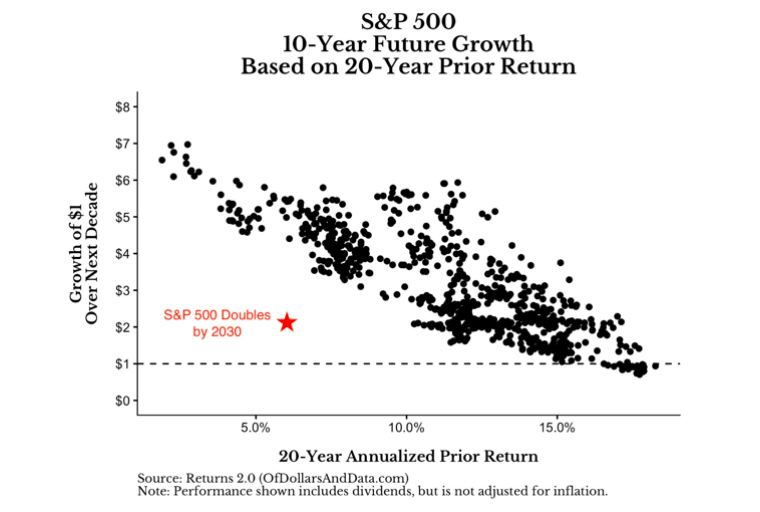
“And the crazy part is that the red star represents “only” a doubling over the next decade. If history were to repeat itself in some meaningful way, the S&P 500 would be 4x higher by 2030 than where it is today.”
Magguilli’s bold statement is based on an analysis comparing prior returns to forward returns. Correctly, he assumes that periods of lower than average returns are typically followed by a period of higher returns. We wholeheartedly agree; however, one must first understand that this method of forecasting returns is heavily reliant on the dates one assigns to prior and forward periods.
The article shows several charts using different periods. The intention is to show that 20 year prior returns have a stronger correlation with ten year forward returns than other date ranges. The graph below from the article highlights his findings.
Below the graph Magguilli states the following:
“Think about how insane this would be relative to history. If you are expecting anything less than a doubling of the S&P 500 by 2030, then you are suggesting that the red star above will be even lower on the y-axis than where I already placed it. If this were to occur, it would be unlike anything we have ever seen before in terms of growth over such a long time period.
And the crazy part is that the red star represents “only” a doubling over the next decade. If history were to repeat itself in some meaningful way, the S&P 500 would be 4x higher by 2030 than where it is today.
This statement seems crazy right now, but that’s what has happened historically. I understand that there is no law forcing U.S. markets to follow this trend indefinitely. However, if you are forecasting an awful coming decade for U.S. stocks, I have some bad news for you—the evidence is heavily against you.
We repeat- the evidence is heavily against you. We find not only the forecast crazy but his assertion that anyone bracing for a period of weak returns is an outlier.”
With that ringing endorsement to quadruple your money in the next ten years, it is worth highlighting two significant flaws in the analysis.
Flaw #1
One of the reasons that his forecast for the 2020s is so high is that the preceding 20-year period started in 2000 at the peak of a ten-year bull market and what was clearly an equity market bubble. The total annualized return (dividends included) from that peak to today is 5.30%, as shown below. If instead he had used 17 years as his backward-looking period, the start date would have coincided with the bottom of the dot com crash, and the total annualized returns over the past period would have been significantly higher.
Recall, from his graph, the higher the prior period return, the lower the forecasted return and vice versa. The graph below shows how a relatively small change in the start date makes a big difference in the analytical conclusion.
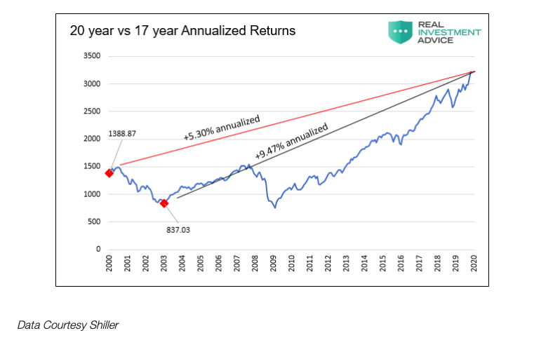
As we will detail below, when one uses a 17-year prior period starting at the market trough, the expected annualized return is only 10% as opposed to Magguilli’s approximated 16% return using a 20-year time frame. This is certainly not the end of the world, as 10% is still an above-average return. To put the two returns in context, the 6% annualized difference on a $100,000 portfolio results in a $182,000 difference in returns over the ten-year period.
Most analysts, ourselves included, like to use even numbers when conducting long term analysis. In this case, an even 20 years coincides with an important market peak. The lesson from the first flaw is that the start and end dates and associated index values are very important.
Flaw #2
“And though my process is limited by the amount of data that I have, I know that it’s not unreasonable.”
Despite Magguilli’s attestation, the amount of data he used could have been more robust. The second flaw in the article relates to the span of data used to assess correlation. We believe he is using approximately 60 years of data. While 60 years encompasses a lot of data, more data is readily available to make the analysis better. If we include data back to 1900, as shown below, the chart tells us something different about the future.
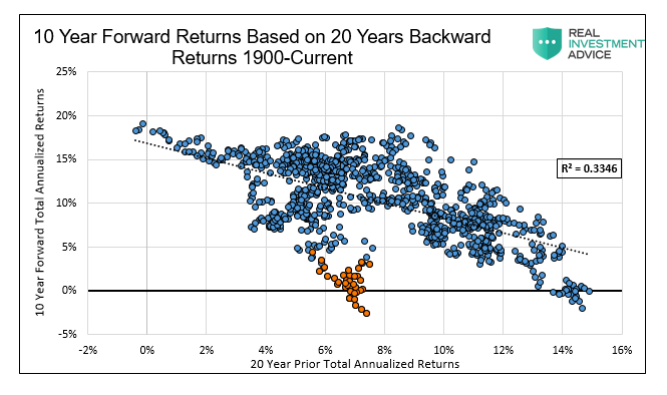
The first thing to notice is that R2, or measure of correlation, drops significantly from .83 to .33. It appears a primary reason for the loss of correlation is the performance from the depression era, as shown with orange dots.
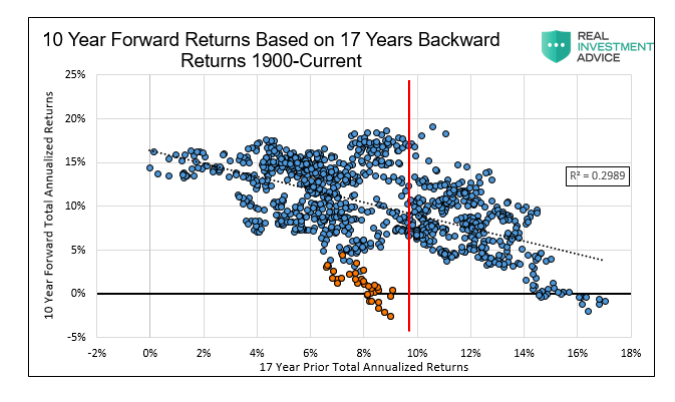
The following graph uses prior 17-year returns from 1900 forward. The red line highlights the current prior 17 years annualized return of 9.47%.
Data Shiller
The expected total annualized return for the next decade is approximately 10%, denoted on the chart above where the red line crosses the dotted regression line. More importantly, the range of possible returns is much larger than what Nick’s graph shows. Annualized returns could be as high as 18% but may also be as low as negative 3%. As it should, the risk-adjustment considering dispersion, or range of possible returns, raises a variety of other questions and concerns, among them, certitude in the original analysis.
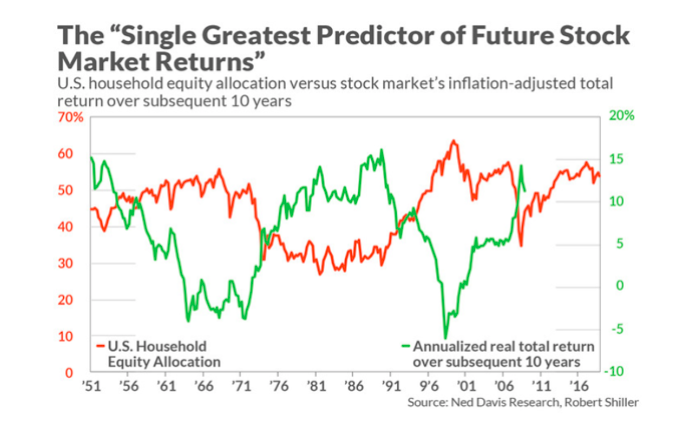
Your guess is as good as ours on where returns will fall over the next ten years. However, consider that in 1929 valuations were similar to where levels stand today across a wide variety of metrics. Many valuation-based forecasts predict returns of plus or minus a few percent annualized over the next ten years. The graph below, for example, shows that returns could easily be below zero for the next ten years.
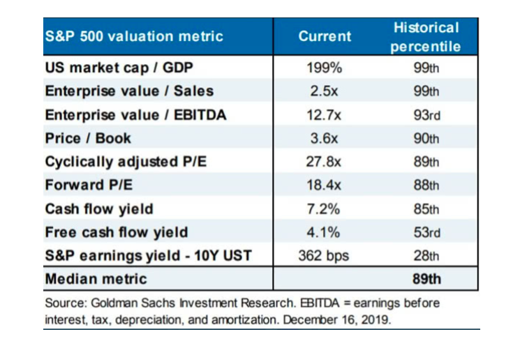
For further perspective on valuations, the following table contrasts current valuations versus prior periods.
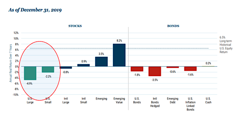
Additionally, the more rigorous and detailed analysis of Jeremy Grantham of GMO show 7-year projected returns which are not encouraging.
Summary
Maggiulli humbly states that he doesn’t know what the future holds, but the substance of the article suggests that you, dear investor, would be a fool not to buy and hold stocks for the next decade.
Although you cannot predict the future, you can prepare for it. What we do know is that we are well into a historically long bull market and valuations are in record territory. We believe that at this stage of the cycle investors should focus less on the potential rewards and much more on the risks. The primary reason is that market reversals are often sudden and vicious, especially from points of extreme valuation. As one example, after peaking on March 10, 2000, the NASDAQ composite wiped out 29% of its value in only three weeks and 37% in less than five weeks. Having been conditioned to “buy-the-dip” over the previous months and years, investors could not envision a lasting selloff despite the radical dislocation between market prices and fundamentals.
For those who have enjoyed the benefits of the surging equity market over the past several quarters, congratulations on a race well run, but do not forget the importance of risk management. Those who fail to heed signs of caution or are blinded by false confidence tend to lose what they gained. Remember, the objective is compounding wealth over the long haul and not keeping up with the S&P 500 index.
We hope this article encourages you to think about current circumstances and develop plans to hedge and/or reduce exposure if and when you deem appropriate.
That “high plateau” Irving Fisher thought we had achieved in September 1929 cost him his reputation andhis net worth. The cost of being prudent is not that expensive and, in part, depends on one questioning both bullish and bearish arguments.
Twitter: @michaellebowitz
Any opinions expressed herein are solely those of the author, and do not in any way represent the views or opinions of any other person or entity.

