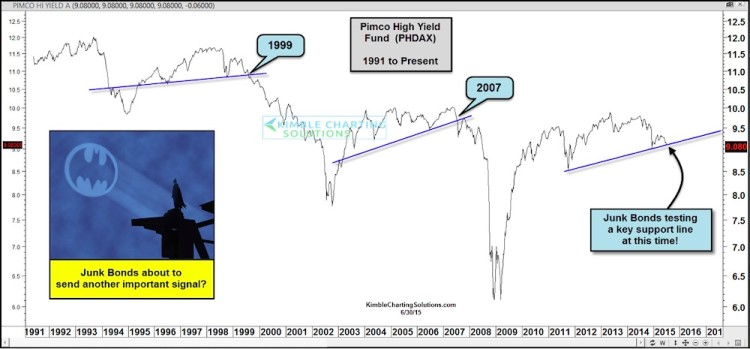
If there is one bonds chart that has signaled trouble in the past its the Pimco High Yield mutual fund (PHDAX). The chart below looks back over the past 25 years and highlights a couple notable bond divergences: 1999 and 2007. Those divergences became market “problems” when the high yield fund broke down below intermediate support. Once the high yield bond market broke support, the broad markets turned weak together.
Note that this scenario is playing out again, but support hasn’t broken. PHDAX is currently testing its 4 year support level and has been diverging against the S&P 500 for nearly a year. Will this bond divergence spell trouble? Watch that support line.
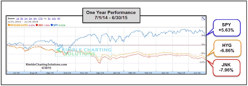
Now lets look at a couple of the most popular junk bond ETF’s vs the S&P 500. As you can see below, the Barclays High Yield Bond ETF (JNK) and iShares High Yield Bond ETF (HYG) have been ill for the better part of the past year. Will this bond divergence lead the market lower?
The chart below shows how high yield ETFs like JNK and HYG are diverging versus the S&P 500 over the past year. And the difference is nearly ten percent! In the past, junk bond divergences have served as a caution signal for stocks. Will it be different this time?
With the S&P 500 nearly flat on the year, it’s probably a good idea to keep an eye on the junk bond market. If it begins to fall apart, it may bring stocks lower with it. At the same time, I should remind you that no one indicator should be used in isolation. Trade safely and thanks for reading.
Twitter: @KimbleCharting
Author does not have a position in any mentioned securities at the time of publication. Any opinions expressed herein are solely those of the author, and do not in any way represent the views or opinions of any other person or entity.


