When looking at a stock chart of Goldman Sachs (GS), something doesn’t seem quite right.
After a steep decline during the August stock market correction, Goldman Sachs (GS) stock price made new 2015 lows in October. That setup came with a divergence and was good for a trade higher, but the investment banking icon hasn’t been able to fully recover. It’s still lingering in bearish territory under its 50 and 200 day moving averages.
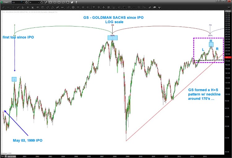
In the chart below, you can see that Goldman Sachs stock is sitting at an important juncture: It’s resting on its log trend line and sitting on neckline support of a bearish head and shoulders pattern.
Should $GS break below the red trend line from 2009 (and neckline at 170), I believe GS would be in trouble.
That said, this hasn’t occurred just yet so it could still find its legs and go higher (back towards my upper price target). But just not sure if that’s in the cards now.
Take note of the high-high cycle that has taken shape since the IPO. This balances out the chart very nicely. My thesis, for now is we are moving back down similar to the correction off the first high from the early 2000’s. A percentage correction of that magnitude would be a first target IF we see the trend line mentioned above break. That “percentage correction” ws roughly 50%… so the low 100’s isn’t out of the question.
Goldman Sachs Stock Chart (since inception)
Keep any eye on this one. Here’s what I’ll be looking for: First confirmation is a break (daily/weekly close below) of the red trend line and then the neckline around 170. That would likely put pressure on the bulls. Thanks for reading.
Twitter: @BartsCharts
Author does not have a position in mentioned securities at the time of publication. Any opinions expressed herein are solely those of the author, and do not in any way represent the views or opinions of any other person or entity.


