At Topdown Charts one thing we’re passionate about is creating new indicators, and sometimes that means applying old tried and tested indicators from one market to another. In this case we take the widely used concept of “market breadth” – most commonly used in the stock market, and apply it to the global sovereign bond market.
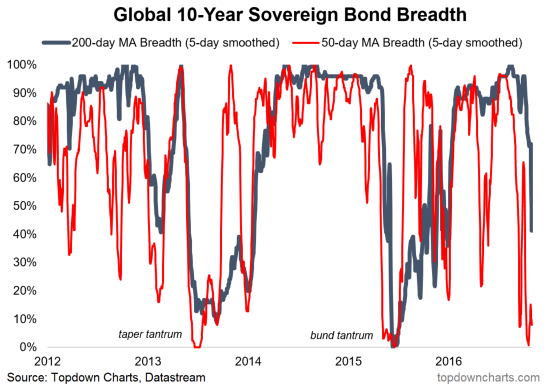
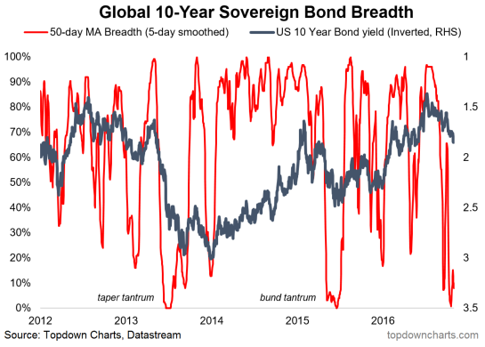
Specifically, the chart below shows 50 day moving average breadth (number of country’s 10-year government bond yields trading below their respective 50 day moving averages), and 200 day moving average breadth.
Since we’re looking at yields we look at the proportion of bonds trading below their 50 day moving average because yield moves inversely to price. So if every bond market in the world is crashing and yields are spiking then this reading will probably show up as 0%.
And that’s where it gets interesting…
The chart shows exactly that right now. Virtually all global sovereign bond markets are breaking down (yields are breaking up above their 50 day moving averages). Increasingly bond yields are also breaking through the slower moving 200 day moving averages too – something that often happens during a trend change.
But in this stubbornly trending market, it may well be just another tantrum in the long march down in yields. If so then when you see these indicators approach zero – just like with the stock market – it can be a good sign of oversold conditions.
Just like stock market 50 day moving average breadth, a good sign of an oversold market to buy is when breadth plunges towards zero and then turns back up again. So bond bulls should take note of this chart.
Either way, global sovereign bond markets are on the move, and this gory looking chart gives a good Halloween special view on the global bond markets.
Thanks for reading.
Get more of my research and insights on my blog. Thanks for reading.
Twitter: @Callum_Thomas
Any opinions expressed herein are solely those of the author, and do not in any way represent the views or opinions of any other person or entity.


