In this article I look at a 3 key charts on global equities that utilize market breadth techniques.
In this case we are looking at the breadth across country benchmarks – i.e. the main stock market benchmark of all countries where decent pricing data was available (70 countries in this case).
I talked about how we can use market breadth indicators to generate insights on the key trends in global equities in the article Global Equity Breadth Beyond Price, and here is another example of its application in real time.
There are probably two key insights:
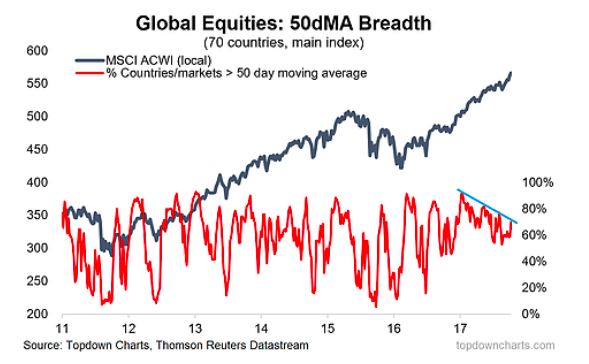
- I am seeing bearish breadth divergence i.e. higher highs on the MSCI All Countries World Index (which is shown in local currency terms, to avoid the distortion impacts of exchange rate movements) vs lower highs on the 50-day moving average breadth indicator.
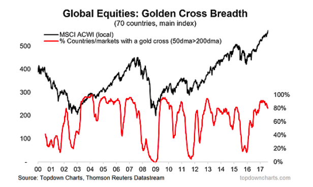
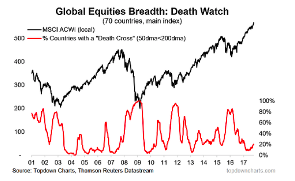
- I am starting to see less countries with a “golden cross” – and hence, more countries with a “death cross” i.e. the 50-day moving average falling below the 200-day moving average.
Essentially, these are both early warning signals for global equities. As with all early warning systems (whether smoke alarms, or missile launch detection), there can at times be false alarms, but the decision of whether to heed the alarm of course comes from verifying it against other information (e.g. valuations, economic cycle indicators), and also with reference to your ability to act on the alarm and the consequences of a correct alarm. Something to think about! Would love to hear your thoughts on the matter – either get in touch or post in the comments below…
We’re seeing ongoing divergence in Global Equities country market breadth on a 50-day moving average basis (i.e. higher highs in the MSCI ACWI vs progressively lower highs in the breadth indicator).
“Golden Cross Breadth” (i.e. proportion of countries with their 50dma above the 200dma) is rolling over, this can be an early warning sign.
Taking the flip-side of the previous chart, this one shows the number of countries undergoing a “death cross” – the opposite of a golden cross, where the 50 day moving average falls below the 200 day. It’s basically the same signal, but perhaps looks a little bit more interesting when presented this way…
Thanks for reading.
Twitter: @Callum_Thomas
Any opinions expressed herein are solely those of the author, and do not in any way represent the views or opinions of any other person or entity.

