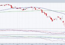
I want to take a moment to share a few charts that followed the Energy Sector’s ($XLE) decline and seemed to highlight where the ETF might bottom.
First we’ll look at a simple technical chart of the Energy Sector ETF (XLE), then follow it up with some ratio analysis of XLE versus some of the major components of the S&P.
As a pattern recognition guy, I believe ratio analysis is a powerful tool… even more so when combined with pattern recognition.
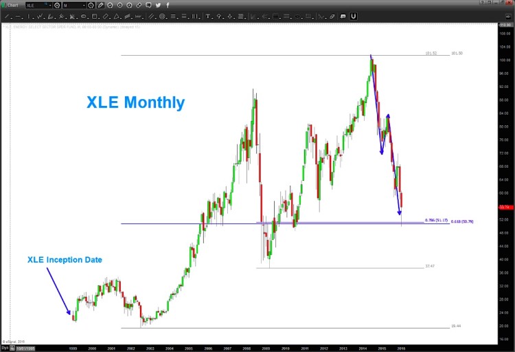
Below is a long-term “monthly” chart of the Energy Sector ($XLE) showing its price target (which was hit).
Energy Sector ETF (XLE) Monthly Chart
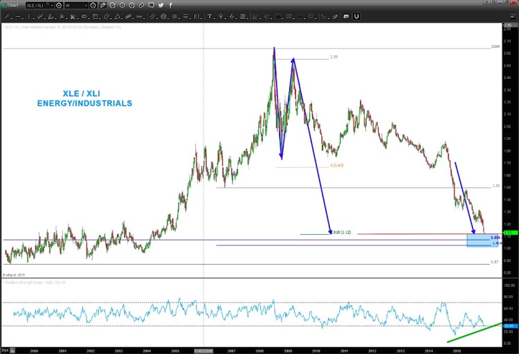
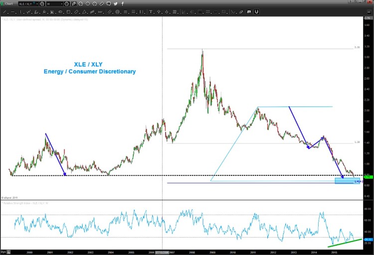
Next up are a couple of ratio charts that I shared a while back – XLE vs Consumer Discretionary (XLY) and XLE vs Industrials (XLI)… note that all of these patterns hit there price targets.
As well, Oil moved down to the 25-27 target area just before the big bounce in oil futures… note that the Loonie also got 500+ pips in two days.
XLE / XLI Ratio Chart
XLE/XLY Ratio Chart
To be honest, I’m not sure if we have a trend change at hand BUT it does appear that the energy sector has put in a “tradable” bottom that offers good risk definition (i.e. stops go around the lows).
Thanks for reading.
Twitter: @BartsCharts
Author does not have a position in mentioned securities at the time of publication. Any opinions expressed herein are solely those of the author, and do not in any way represent the views or opinions of any other person or entity.

