The financial sector is an incredibly important component to the economy and stock market.
So with the recent selloff and bought of stock market volatility in 2022, it seems like it’s worthwhile to check in and take its temperature.
Like the broader market, this year has been a rough one for financial stocks. But with many watching to see if the recent lows can hold (and a bottom form), it’s important to see what the Financial Sector ETF (XLF) looks like… on a long-term basis. That’s right, today we take a step back and look at the sector from a wide-lens macro technical view and provide a few insights.
Note that the following MarketSmith charts are built with Investors Business Daily’s product suite.
I am an Investors Business Daily (IBD) partner and promote the use of their products. The entire platform offers a good mix of analysts, education, and technical and fundamental data.
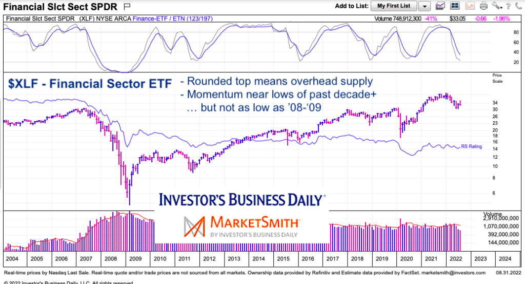
$XLF Financial Sector ETF “monthly” Chart
Below is a “monthly” chart of XLF. The nice thing about a monthly chart is that it really gives you a long term perspective and trend insights. So what do we see here?
First, the positives. The trend is higher. The recent decline saw momentum reach levels seen on the past 4 selloff lows. The down-trend may have been broken by August spike high.
Next, the negatives. The August spike high reversed lower and closed on the lows. Momentum is still falling and the worry is the potential for a selloff like ’08-’09. The recent top is “rounded” which tends to lead to a waterfall and often deeper selloffs.
For now, stay tuned to the recent lows. This is important support (and lines up with the 2017 and 2020 highs).

Twitter: @andrewnyquist
The author may have a position in mentioned securities at the time of publication. Any opinions expressed herein are solely those of the author, and do not in any way represent the views or opinions of any other person or entity.


