Chart patterns are no more than probability… sometimes they work and sometimes they don’t. As a chart pattern recognition guy, I use them to identify potential turning points (or trend changes). Today we’ll revisit the SPDR Financial Sector ETF (NYSEARCA:XLF).
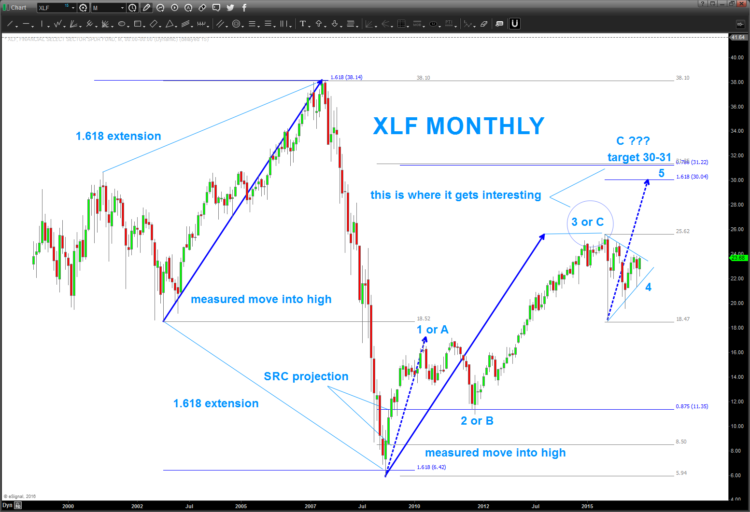
Back in June of 2015, we spotted an $XLF “SELL” Pattern. As you can see in the chart below, the “math” worked and stopped the Financial Sector ETF (XLF) in its tracks. It’s been over a year since we posted about XLF but believe we are back at a critical juncture. And a potential XLF breakout is on the line for bulls…
Why post this now and why is this a big deal?
Well, for those who follow the Bradley Model on Friday it started pointing straight down into the fall. And, as we know, Banks tend to lead us up and lead us down in the US Equity Market.
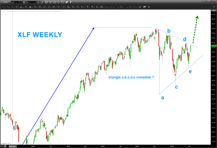
If this triangle is correct (I DO NOT know if it is) THEN I find it hard for the equity market to go down… And as mentioned an XLF breakout (or rejection) is on the line. For the Financials to breakout here, we will need to see some acceleration in the weeks ahead.
There is a ton of information on the charts below. Here are some things to notice:
- Note the 1.168 extensions at the high and the low
- If you want to do a more in-depth study of how THE PATTERN was calling to BUY the Banks in March 2009 (yes, at the height of the financial crisis) check out this post.
- Note how the high last June 2015 was a measured move copy of the high into 2007
Monthly & Weekly Charts – XLF
Thanks for reading and I’ll be watching this development closely.
Twitter: @BartsCharts
Author does not have a position in mentioned securities at the time of publication. Any opinions expressed herein are solely those of the author, and do not in any way represent the views or opinions of any other person or entity.

