It’s Friday, so it is time for my Chart of the Week!
As you know, I love data. Over the last month, I have been examining the Facebook situation and measuring how sentiment has evolved and its impact on consumer behavior.
Here’s the data. Enjoy!
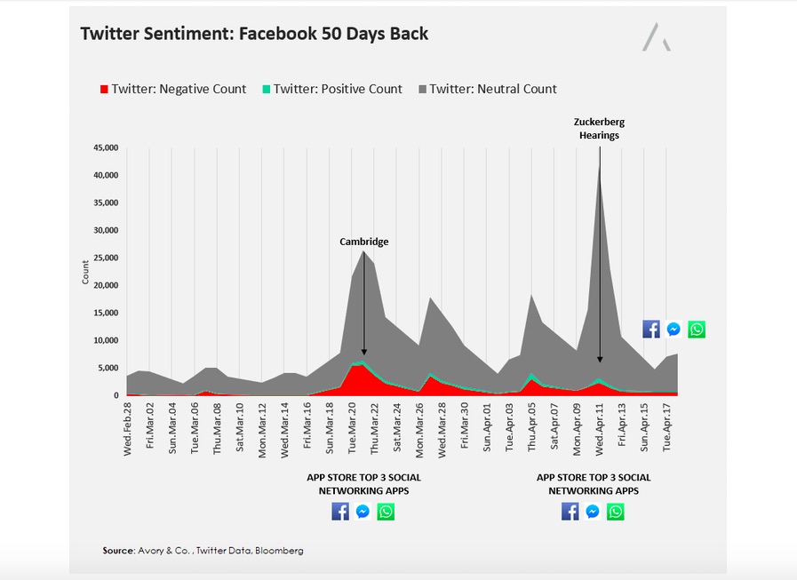
The chart below shows overall publication and Twitter sentiment regarding Facebook. Red is negative, green is positive, and grey is neutral tweets or publication headlines.
Notice when the Cambridge news popped, publication volume grew, driven mostly by negative commentary. However, you can see that publication and negative sentiment surrounding the brand quickly dwindled.
The second layer of data I collected was where the Facebook brands ranked in app stores globally. Pre-Cambridge, Facebook, Facebook Messenger, and WhatsApp were all in the top 3 of the social media category. Throughout that period and up until this writing, they all remained in the top 3.
As a reference point, during last years #DeleteUber campaign, Uber saw its app store ranking go from #10 to #20 during that five day period, while Lyft went from #49 to #2.
Disclaimer from author: THIS IS NOT A RECOMMENDATION FOR PURCHASE OR SALE OF ANY SECURITIES. AVORY & CO. IS A REGISTERED INVESTMENT ADVISER. INFORMATION PRESENTED IS FOR EDUCATIONAL PURPOSES ONLY AND DOES NOT INTEND TO MAKE AN OFFER OR SOLICITATION FOR THE SALE OR PURCHASE OF ANY SPECIFIC SECURITIES, INVESTMENTS, OR INVESTMENT STRATEGIES. INVESTMENTS INVOLVE RISK AND UNLESS OTHERWISE STATED, ARE NOT GUARANTEED. BE SURE TO FIRST CONSULT WITH A QUALIFIED FINANCIAL ADVISER AND/OR TAX PROFESSIONAL BEFORE IMPLEMENTING ANY STRATEGY DISCUSSED HEREIN.
Twitter: @_SeanDavid
Any opinions expressed herein are solely those of the author, and do not in any way represent the views or opinions of any other person or entity.


