We are in uncharted territory! On so many levels. As you will see in the charts below, many valuation metrics are stretched.
The nation’s debt load just rose to a new high. At 1Q15, the total credit market debt outstanding stood at $59 trillion. The current economic recovery is in its sixth year, yet real GDP has only managed an average 2.2-percent growth rate (quarterly at a seasonally adjusted annual rate). The economy is expanding, but monthly average hourly earnings of private-sector production and non-supervisory employees is yet to grow with a three handle on an annual basis. And the Fed is as easy as it could possibly be. ZIRP (zero interest-rate policy) has been in place for six and a half years now. Last but not the least, probably never before has investor behavior been so dictated or influenced by Fed policy – or a lack thereof.
It is perhaps fitting then that various valuation metrics are either in uncharted territory, or pretty close to it.
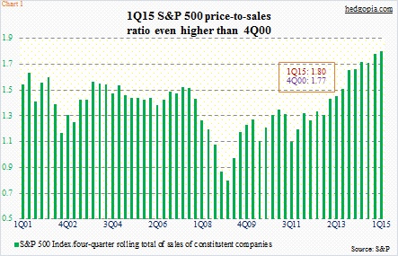
Take price to sales ratio. The correlation between sales for S&P 500 companies and U.S. nominal GDP is near-perfect. Nominal GDP remains suppressed. Earnings season after earnings season, one large-cap after another tell us how they are struggling with top-line growth. In 1Q15, sales per share for S&P 500 companies were estimated at $275.03, versus $289.37 in 4Q14 and $279.96 in 1Q14. In chart 1 below, a price-to-sales ratio is calculated using a rolling four-quarter total of sales. At 1.8, 1Q15 was higher than even 4Q00, which was at 1.77.
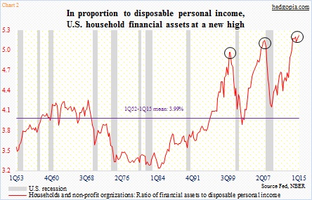
Records are meant to be broken – to repeat an oft-repeated phrase. At a time when central-bank activism is rampant, the primary force driving investor behavior/decision-making is whether or not the Fed has their back. Multiples and valuation metrics are secondary. Stocks have been pushed to all-time highs, but incomes have not followed. The ratio of household financial assets to disposable personal income reached a new high in 1Q15 – 5.22 versus 5.15 in 3Q07 and 4.97 in 1Q00 (Chart 2 below). An uncharted territory!
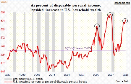
Several other valuation metrics are at highly elevated levels but are below prior highs. Household net worth has had quite a recovery in the current cycle, thanks mainly to record high stock prices. Net worth dipped to $55 trillion in 1Q09, and by 1Q15 had surged to $84.9 trillion. Disposable personal income rose from $10.9 trillion to $13.3 trillion during the period. As a result, net worth was 6.4x disposable personal income in 1Q15, second only to 6.6x in 4Q06, and past 6.2x in 1Q00. In other words, wealth is seeing a lop-sided recovery. Also of note is the fact that the red line dipped a little in 3Q14 before regaining the momentum the past couple of quarters (see chart 3 below).
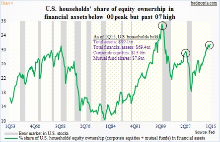
Chart 4 below shows the same trend. It shows U.S. households’ exposure to equities. Equities’ share in financial assets was 31.1 percent in 1Q15 – higher than 29.1 percent in 2Q07 but way lower than 36.8 percent in 1Q00. Back in the dot-com bubble era, in six months between 3Q99 and 1Q00, households’ equity ownership jumped 4.1 percentage points. Between the August 1999 low and the March 2000 high, the Nasdaq Composite surged 110 percent. In the next two and a half years, it then dropped 78 percent. These things happen when the scale tilts sharply to one side.
Are we there yet? Who knows? But with each nudge higher, risk will have risen.
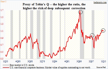
Tobin’s Q is another metric that has been screaming caution for a while now (Chart 5 below). Named after its developer, James Tobin, the ratio has total market cap in the numerator and replacement cost of all companies in the denominator. A lower ratio suggests there is value. The higher it rises, the more expensive is the price paid for the assets in question. In the chart, the market value of U.S. non-financial companies is divided by their net worth. In 1Q15, the ratio was 1.06, which has been under slight pressure since the cycle high of 1.09 in 2Q14, but substantially higher than 0.92 in 2Q07. Now here is the thing. The ratio surged as high as 1.64 in 1Q00. For bears, the ratio is already at nose-bleed territory. For bulls, the 1Q00 high is a reference point – meaning there is room to run still.
This is what makes the market. Right now, bulls are winning the battle hands down. For bears, it is just a matter of when not if. History is on their side. In due course, the excesses will be wrung out. But the risk they face is of timing. How long before the house of cards come tumbling down? How long before central-bank tailwind turns into a headwind?
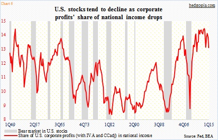
If Chart 6 (below) is an indication, cracks are beginning to show up. The red line is essentially corporate margins. Corporate profits (with inventory valuation and capital consumption adjustments) were $2.01 trillion, and have dropped for two consecutive quarters from an all-time high of $2.17 trillion in 3Q14. Nominal income made an all-time high of $15.36 in 1Q15. Corporate profits as a percent of national income peaked at 14.6 in 3Q13, and was 13.1 in 1Q15. As the chart shows, a sustained drop in the red line has more often than not been accompanied by grey bars.
The trend is not going the right direction, unless it reverses soon. For 2015, operating-earnings estimates for S&P 500 companies have come down from $121.31 just four months ago to $115.85 currently. As a result, the earnings bar is lower for companies to jump over. But at the same time, this also pushes up multiples. What happens when you tilt the scale too far in favor of one side? You lose the balance.
Be careful out there. Thanks for reading!
Twitter: @hedgopia
No position in any of the mentioned securities at the time of publication. Any opinions expressed herein are solely those of the author, and do not in any way represent the views or opinions of any other person or entity.

