On numerous occasions over the past year we suggested that U.S. equity valuations were expensive. Certainly the recent sharp rebound in share prices in the midst of declining earnings, lower earnings forecasts and slowing domestic and global economic growth has only strengthened our conviction.
In this article we compare equity valuations and the market drivers of 2013 to those today and outline why we think equities may be the so-called “bug in search of a windshield”.
Comparison
The year 2013 provides a good point of comparison due to its proximity to today as well as the same leaders, or at least people with similar mindsets, running the major institutions that dictate economic, monetary and fiscal policy. It is also a fitting point of reference because S&P 500 earnings were about the same then as they are today.
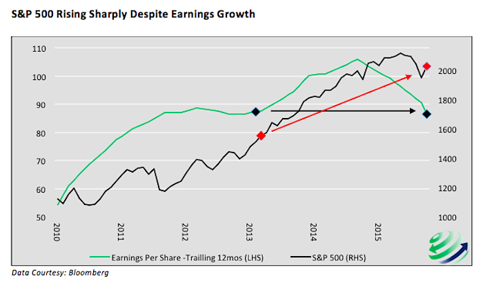
In the first half of 2013 earnings per share (EPS – as reported) for the S&P 500 (as provided by Standard & Poor’s) averaged $88.50 per share, almost $2 higher than EPS as of December 31 2015. The closing price of the S&P 500 on June 30, 2013 was $1,618. Today the index stands at $2,066, a 28% premium. To put it bluntly, investors today are paying an extra $450 per share for less.
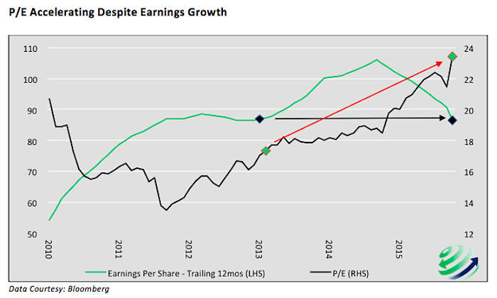
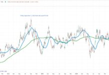
Given comparable earnings data but a large price discrepancy, the price to earnings ratio (P/E) is meaningfully higher today at $24.50, a 37% premium to the $17.80 P/E of June 2013. Before continuing it is worth stressing that the multiple in June of 2013 was not cheap on a historical basis. It stood 13% above the historical mean P/E dating back to 1900. The current P/E is 55% above the historical mean and surpasses 92% of all P/E data. Only multiples from the 2000 and 2008 bubble periods were higher than today. The two graphs below illustrate the comparison of 2013 and today. The arrows and diamonds are employed to help visually compare 2013 data points to current data.
Thus far we have compared prices, earnings and multiples from two time periods. While it provides a point of view, it offers a potentially flawed, one-dimensional comparison. One can easily make the case that the outlook today is brighter than in 2013, thereby justifying higher prices and earnings multiples. Therefore, to expand the assessment, the following factors are worth considering to better judge if the premium investors are paying today is worth it.
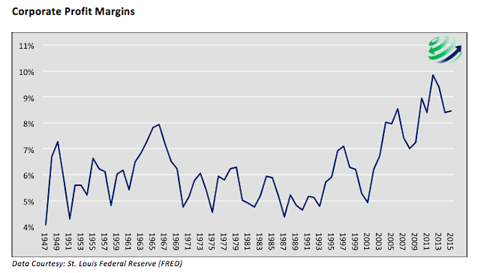
Profit margins – As graphed below, corporate profit margins (corporate profits as a percentage of GDP) rose to historical levels in 2013. However, since then the trend has begun to reverse and margins have been declining. The ability to grow earnings at a similar rate as in 2013, is less likely as profit margins decrease.
GDP growth – Real GDP averaged 1.50% annual growth in 2013 as compared to the slightly more robust 2.0% growth in the fourth quarter of 2015. The first quarter of 2016, however, gives us pause. While the preliminary first quarter GDP report has yet to be released, the usually reliable Atlanta Federal Reserve is currently forecasting a paltry 0.1% growth. In March of 2013 the Fed was forecasting average GDP growth of 3.15% in 2014 and 3.30% in 2015. Currently the Fed is less optimistic, predicting 2.15% for 2017 and 1.95% for 2018. Earnings growth is driven by and highly correlated to domestic and global economic growth rates. Given sluggish economic growth currently and the prospect for even slower growth in the future, GDP does not provide as bullish a backdrop as 2013.
Federal Reserve – The Federal Reserve initiated QE3 in late 2012 and executed it throughout 2013. During 2013 the Fed’s easy money policy increased the money supply by 40%, or over a trillion dollars. Currently the Federal Reserve is in a tightening mode having raised their target for the fed funds rate in December 2015 and forecasting two further rate increases in 2016. QE and other easy money policies provided a big boost to asset prices and, in many investors’ minds, a rationale for paying higher multiples. While we have no doubt the Fed may at some point reduce rates, enact a negative interest rate policy and/or resume QE, there is a big difference between the Fed related tailwinds that drove stock prices in 2013 and the headwinds of monetary policy stocks face now.
China – China’s exponential growth over the last 20+ years propelled global economic growth and, without a doubt, helped increase U.S. corporate profits. In 2013, reported economic growth in China averaged 7.7%. Since then it has trended lower and currently stands at 6.8%. Most economic forecasters expect this slowing trend to continue as China has largely exhausted many of the factors that created the prior year’s economic gains. As China’s growth slows, U.S. corporate profits are likely to suffer.
Dollar – A weak dollar tends to increase earnings of many U.S. corporations as domestic goods become cheaper to foreign buyers. Since mid-2011 the dollar has been appreciating. The move was gradual 2011 to mid-2014 but since then has become more pronounced. In 2013 the broad trade weighted USD index ranged between 99 and 102. Currently it stands about 20% higher at 121. While the dollar’s appreciation has stalled recently, the trend higher must still be respected and with that comes expectations for further retracements in corporate profits.
Summary
We laid out a few key factors showing that the outlook in 2013 was, in many respects, more favorable for corporate earnings than it is today. The question investors should therefore contemplate is why pay such a high premium today for something that in all likelihood is not nearly as valuable as it was in 2013? As we have emphasized on a few occasions, risk is not a number, it is simply paying too much for an asset.
Thanks for reading.
More from Michael Lebowitz – Bracketology: An Investing Lesson From The NCAA Tourney
Twitter: @michaellebowitz
Author holds positions in related securities at the time of publication. Any opinions expressed herein are solely those of the author, and do not in any way represent the views or opinions of any other person or entity.

