“Fed Officials Worry Economy Is Too Good. Workers Still Feel Left Behind” – New York Times 4/27/2018
This coming Friday the Bureau of Labor Statistics (BLS) will release the monthly employment data report. Consensus expectations from economists are for an unemployment rate (U3) of 4.1% which is nearly unprecedented in the last fifty years.
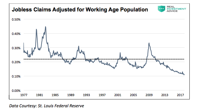
On April 26, 2018, the Department of Labor reported that a mere 209,000 people filed for initial jobless claims. This weekly amount was the lowest since 1969. The employment data point is the lowest in almost 50 years and remarkable when normalized for the number of people considered to be of working age (ages 15-64).
Low initial jobless claims coupled with the historically low unemployment rate are leading many economists to warn of tight labor markets and impending wage inflation. If there is no one to hire, employees have more negotiating leverage according to prevalent theory. While this seems reasonable on its face, further analysis into the employment data suggests these conclusions are not so straightforward. This was recently raised by the New York Times as highlighted in the lead quote above.
Strong Labor Statistics
The following chart highlights initial jobless claims adjusted for the working age population (ages 15-64).
As shown above, there is only one person filing an initial jobless claim for every thousand people in the workforce. This is less than half the average (dotted line) of the last 50 years. Further, when one considers seasonal workers that will always be filing claims, regardless of the health of the economy, this number may be reaching the lowest point conceivable. Regardless, the current low rate of jobless claims is unprecedented.
The U-3 unemployment rate, as calculated by the BLS, is also at a level that implies an incredibly strong labor market. Except for the year 2000 when it dipped to a low of 3.8%, the most recent reading of 4.1% is the lowest since 1969.
Adjusting Labor Statistics for Reality
The employment data mentioned above suggests that the job market is on fire. While we would like nothing more than to agree, there is other employment data that contradicts that premise.
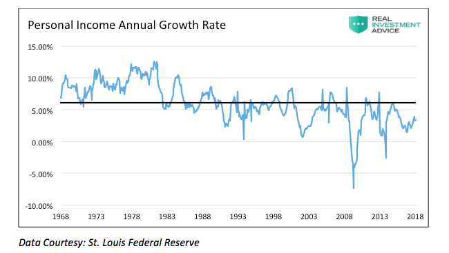
If there are very few workers in need of a job, then current workers should have pricing leverage over their employers. This does not seem to be the case as shown in the graph of personal income below.
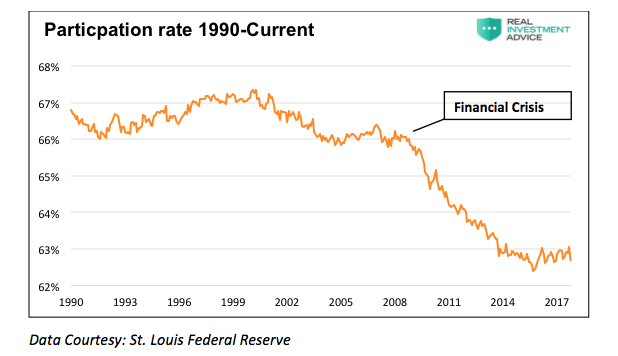
In addition to the weak wage growth, we are also troubled by another labor statistic, the participation rate. This indicator measures employed people and those “looking for work” as a percentage of those aged 16 and older. During economic recessions, the ratio tends to decline as unemployed workers get discouraged and stop looking for work. Conversely, it tends to increase when the labor market is healthy.
The participation rate graphed below shows that, despite nine years of economic recovery since the 2008 financial crisis, the participation rate has trended lower and clearly broken the trend from the prior 20 years.
Closer inspection of the BLS data reveals that, since 2008, 16 million people were reclassified as “leaving the workforce”. To put those 16 million people into context, from 1985 to 2008, a period almost three times longer than the post-crisis recovery, a similar number of people left the work force.
Some economists may be tempted to push back on this analysis by claiming the drop in the participation rate is attributable to a large number of baby boomers retiring. While it is true 10,000 boomers will reach age 65 daily from the year 2011 to 2030, we must also consider that 11,500 children a day will turn 16 during that same period. Not all 16-year-olds will seek work or be gainfully employed, but we must also consider that many baby boomers will stay in the workforce. According to recent Pew Research surveys, boomers do not believe “old age” begins until the age of 72. Taken together, this suggests the demographic explanation may not explain the inconsistencies found in the “full-employment” assumption.
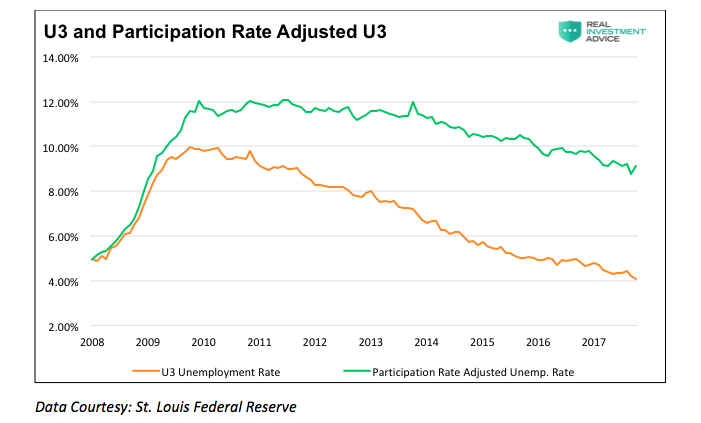
Why are so many people struggling to find a job and terminating their search if, as we are repeatedly told, the labor market is so healthy? To explain the juxtaposition of the low jobless claims number and unemployment rate with the low participation rate and weak wage growth, a calculation of the participation rate adjusted unemployment rate is revealing.
When people stop looking for a job, they are still unemployed, but they are not included in the U-3 unemployment calculation. If we include those who quit looking for work in the data, the employment situation is quite different. The graph below compares the U-3 unemployment rate to one that assumes a constant participation rate from 2008 to today. Contrary to the U-3 unemployment rate of 4.1%, this metric implies an adjusted unemployment rate of 9.1%.
Enter the Phillips Curve
The Phillips curve, named after William Phillips, is a simple measure describing the inverse relationship between the unemployment rate and wage inflation. The logical premise behind the Phillips Curve is that, as unemployment drops and workers become harder to find, workers can demand higher wages. Conversely, when unemployment rises, the supply of workers is greater, and therefore wages fall. The Phillips curve follows the basic tenets of the supply and demand curves for most goods and services.
Many economists and media pundits have pronounced the Phillips curve relationship dead as it relates to employment. They deem it an economic relic that has ceased to provide reliable results. Has a basic, time-tested law of supply and demand ceased to work in the labor markets, or are economists measuring the inputs incorrectly?
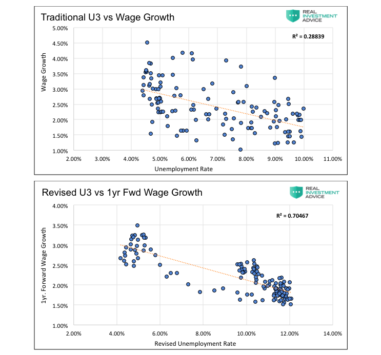
There are a large number of social and economic factors that affect wages and the supply of workers. I do not ignore those factors, but it is a good exercise to observe the Phillips curve relationship if one uses the more “realistic” unemployment rate (9.1%) shown above. Further, I substitute wage growth one-year forward for the traditional method of using current wage growth. The logic here is that it takes time for employees to apply the leverage they gain over employers to boost their income.
The first graph below shows the traditional Phillips curve as typically displayed (U-3 and recent three-month wage growth). The second is a modified Phillips curve which uses the adjusted U-3 from above and one-year forward wage growth.
Both graphs contain their respective R-squared (R²), which shows the statistical relationship between the two factors. The traditionally calculated Phillips Curve (first graph) demonstrates that only 28.84% of the change in wages was due to the change in the unemployment rate. Visual inspection also tells us the relationship between wages and unemployment is weak. It is this graph that has many economists declaring the Phillips curve to be irrelevant. The second graph, with our adjustments, is statistically significant as 70.47% of the changes in wages were due to the change in the unemployment rate. This graph visibly confirms that the Phillips curve relationship for employment continues to hold when more representative data is used.
Recently, Federal Reserve Bank of Chicago President Charles Evans stated, in relation to the Phillips curve, “We don’t have a great understanding of why it’s gotten to be so flat.” Mr. Evans, perhaps employment is not as strong as you and your Fed colleagues think it is.
If one believes that the laws of supply and demand continue to hold true, then the revised Phillips curve graph above argues that the unemployment rate is in reality much closer to 9% than 4.1%. To believe that the Phillips curve is useless, one must be willing to ignore a more rigorous assessment of labor market and wage data. The only reason economists and Fed officials voluntarily ignore this data is that it belies the prettier picture of the economy they wish to paint.
Summary
One of the main factors driving the Federal Reserve to raise interest rates and reduce its balance sheet is the perceived low level of unemployment. Simultaneously, multiple comments from Fed officials suggest they are justifiably confused by some of the signals emanating from the jobs data. As I have argued in the past, the current monetary policy experiment has short-circuited the economy’s traditional traffic signals. None of these signals is more important than employment. Logic and evidence argue that, despite the self-congratulations of central bankers, good wage-paying jobs are not as plentiful as advertised and the embedded risks in the economy are higher. We must consider the effects that these sequences of policy error might have on the economy – one where growth remains anemic and jobs deceptively elusive.
Given that wages translate directly to personal consumption, a reliable interpretation of employment data has never been more important. Oddly enough, it appears as though that interpretation has never been more misleading. If I am correct that employment is weak, then future rate hikes and the planned reduction in the Fed’s balance sheet will begin to reveal this weakness soon.
As an aside, it is worth noting that in November of 1969 jobless claims stood at 211,000, having risen slightly from the lows recorded earlier that year. Despite the low number of claims, a recession started a month later, and jobless claims would nearly double within six months. This episode serves as a reminder that every recession followed interim lows in jobless claims and the unemployment rate. I am confident that the dynamics leading into the next recession will not be any different.
Twitter: @michaellebowitz
Any opinions expressed herein are solely those of the author, and do not in any way represent the views or opinions of any other person or entity.

