Since 2012, we have been writing about the developing bearish trend in copper, and in subsequent years the pattern has unfolded mostly as expected. Now price is testing the first major support below its October break. Traders with a fairly long time frame might look for an opportunity to sell from a bit higher.
In the big picture, we believe copper prices are tracing a large three-wave corrective pattern down from the 2011 high (Elliott Wave). The first wave, labeled A, produced a fairly precipitous decline in 2011 and was followed by a lengthy consolidation in a triangle B wave. Now price is falling again in wave C, which should consist of five segments. We believe the most likely target area for the eventual low is near 1.91 based on Elliott wave patterns even larger than those shown on the monthly chart below.
Copper Prices – Monthly Chart
Setting aside the wave structure for a moment, note how well price has stayed within the boundaries of the channel on the monthly chart. With this month’s test of the center line of the channel, copper may see a relatively small bounce before resuming its downward trend.
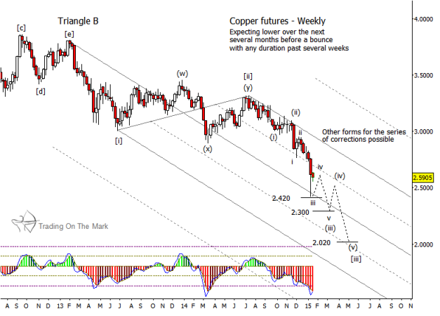
The weekly chart reflects our view that price is still in the middle part of the large downward C wave. In coming weeks and months, we should see a series of corrections to complete the middle wave [iii] of C. We expect the market to notice the support levels drawn on the weekly chart, although there is more than one path that price may take as it cascades through them.
Copper Prices – Weekly Chart
Keep in mind that Copper prices eventually should decline even farther than the lower supports shown on the weekly chart. After wave [iii] is complete, perhaps in the area of 2.020, we would expect price to trace a corrective wave [iv], followed by another downward push in wave [v] to the ultimate low.
Copper has traditionally been seen as a bellwether of trends in the global industrial economy, and we believe that relationship still holds. A further decline in copper prices would coincide with reduced demand for the metal by manufacturers. It also would represent an example of the price deflation that we expect to continue with certain commodities and with equities. We are seeing a similar phenomenon with oil prices. The pattern in the copper charts shown here suggests the world will see some large-scale economic adjustments during the next few years.
We hope this article is helpful in your trading. We make it our mission to provide charts and analysis that give traders the confidence to trade based on market structures. You can find posts about a wide range of markets on our site, Trading On The Mark, including our most recent bullish forecast for Silver (SLV). Thanks for reading.
Follow Tom & Kurt on Twitter: @TradingOnMark
No position in any of the mentioned securities at the time of publication. Any opinions expressed herein are solely those of the author, and do not in any way represent the views or opinions of any other person or entity.


