With another 4th of July past, stocks now formally enter that wretchedly inert season known as “The Summer Doldrums”. Ordinarily, this is the most uneventful passage of the annual cycle in major financial markets, and thus far Summer 2014 has epitomized this axiom of the trader’s almanac with a long list of straight-jacketed ranges across asset classes and record low volatility according to a host of measures.
But is there reason to suppose volatility may pick up again soon? I think so. A couple weeks ago we reviewed how several key markets had become unnaturally calm and poised to return to a period of range expansion, whether in the form of a continuation or reversal of their primary trends.
Amidst the quiet tedium of such small ranges I find it’s easy to forget that seemingly interminable periods of low volatility and range congestion are exceptions to one of the most basic rules of market structure: the pursuit of price discovery in any free and liquid market creates disequilibrium. Any semblance of parity between buyers and sellers is ephemeral. The current market – and by that I mean almost any market – is in a rare state of tightened, zombie equilibrium with buried volatility and dense consolidation patterns that cannot and will not last much longer. The most important task we can undertake as risk managers and stewards of capital is to thoroughly assess these markets, formulate base scenarios for what will follow once volatility returns and remain vigilant as we lie in-wait for expanding ranges and the opportunities they bring. So let’s take another look.
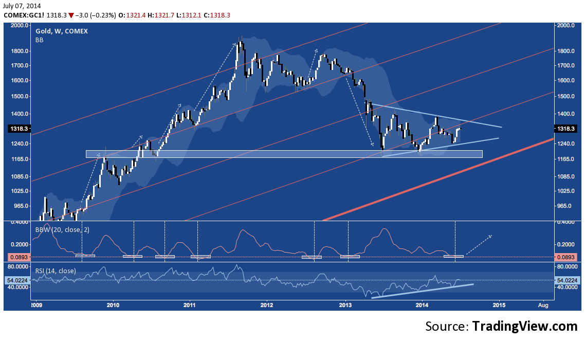
Gold (GC) – Weekly
Gold has built out a very uniform Symmetrical Triangle over the last year – right on top of a major support shelf going back to 2009 and 2010. As a resulting of the narrowing ranges this formation creates, volatility (as displayed by the bottomed-out BBW in the lower panel) is back at multi-year lows – a spot from which price has broken out into strong continuations and (in the case of 2012-2013) a reversal over the past 5 years. Moreover, now 2/3 to 3/4 to its apex Gold is entering the optimal breakout window for this triangle on a positively diverging RSI. Despite it’s crudity and abhorrent lack of a dividend (shriek), the barbarous relic is setting up for a significant breakout in the coming weeks.
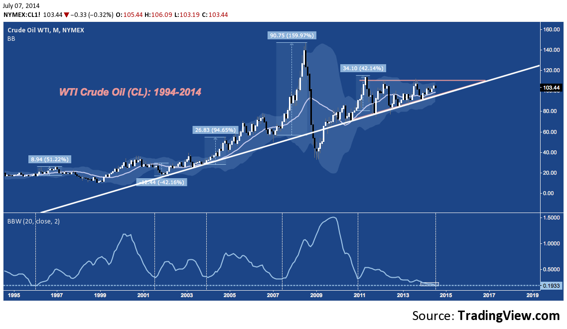
WTI Crude Oil (CL) – Monthly
Flipping over to the Energy complex, Crude Oil’s monthly chart is setting up similarly, but with even larger directional implications. The 2.5 year Ascending Triangle oil is oscillating through is also in its optimal breakout window, aligning with an ebb in volatility not seen in almost 19 years. The arithmetic chart below can be deceiving at first glance, but check out the percentage changes that accompany major bottoms in Bollinger Bandwidth (BBW) as trading ranges contract. In light of the massive narrowing chart pattern and mean-reverting nature of volatility, Crude – like Gold, and perhaps along with it – is poised to break hard in the near future.
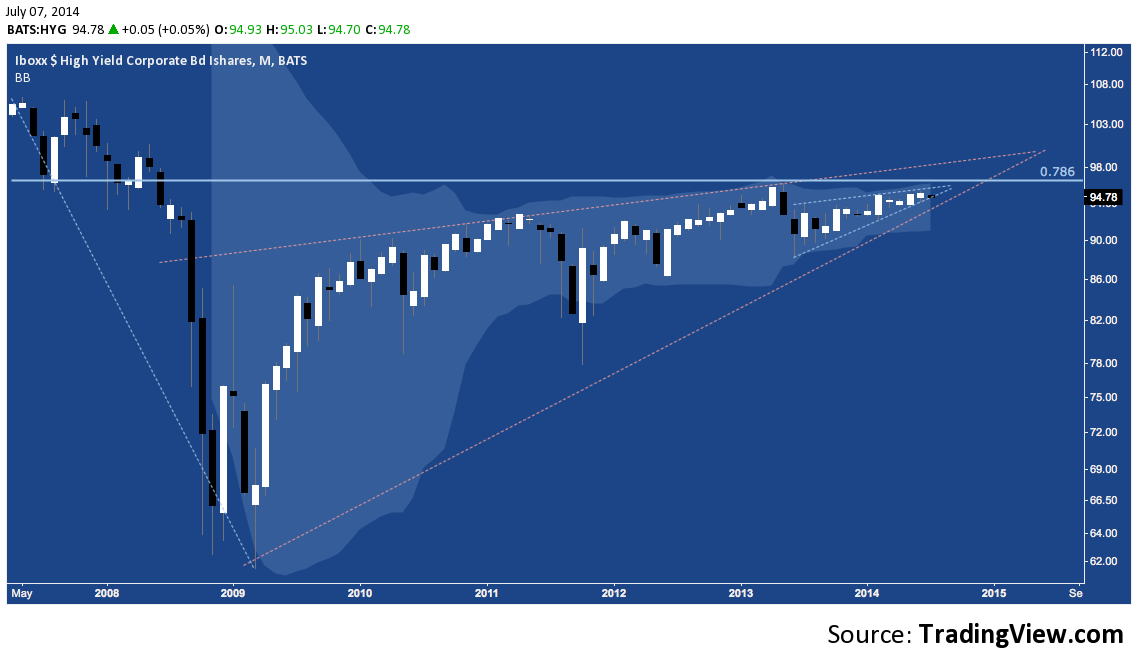
Turning our attention to rates, High Yield (represented here by iShares High Yield Corporate Bond ETF HYG) continues to taper in a fractal rising wedge-within-a-rising-wedge.
iShares High Yield Corporate Bond ETF (HYG) – Monthly
As the Bollinger Bands (the light blue cloud) attest, volatility here is also at a record low just as yields are testing all-time lows according to the BofAML High Yield Master Index:
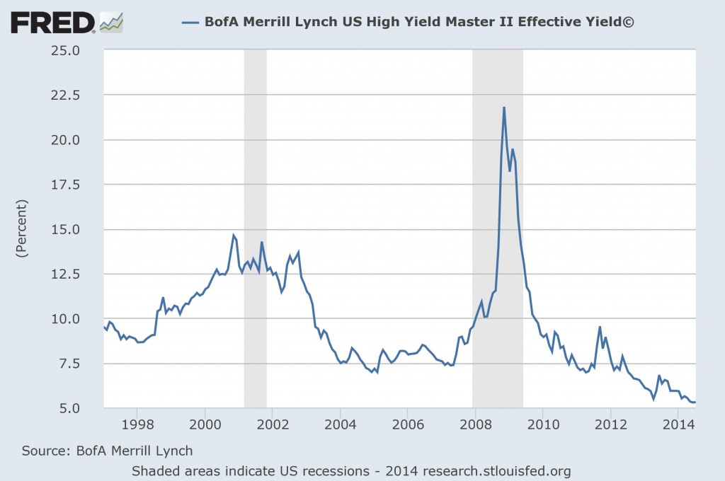
As July’s candle – which would prove the worst month for HY since August if it closed here – on HYG suggests, prices have turned modestly lower over the past few sessions and are now testing the lower wedge building since Bernanke’s oblique references to the Taper last May sent High Yield tumbling. Once the wedge-within-a-wedge on HYG breaks, a test of the higher or lower trend line of its 5-year wedge will quickly follow. And with rates plumbing all-time lows, it’s difficult to imagine that HY won’t aggressively sell off from here.
Turning to Treasuries:
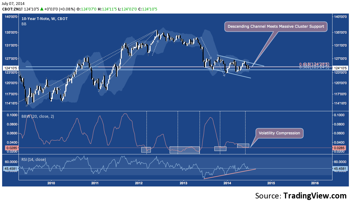
US 10-Year Treasury Note (ZN) – Weekly
The 10-year is in a year-long Descending Channel (and a 6-month long Symmetrical Triangle inside that) that is straddling major multi-year fibonacci cluster support near 124 (continuous). Much like Gold, ZN’s range is also very tightly wound and at a point which has resulted in major expansion over the past several years with a positive momentum divergence building on its RSI:
US 30-Year Treasury Bond (ZB) – Weekly
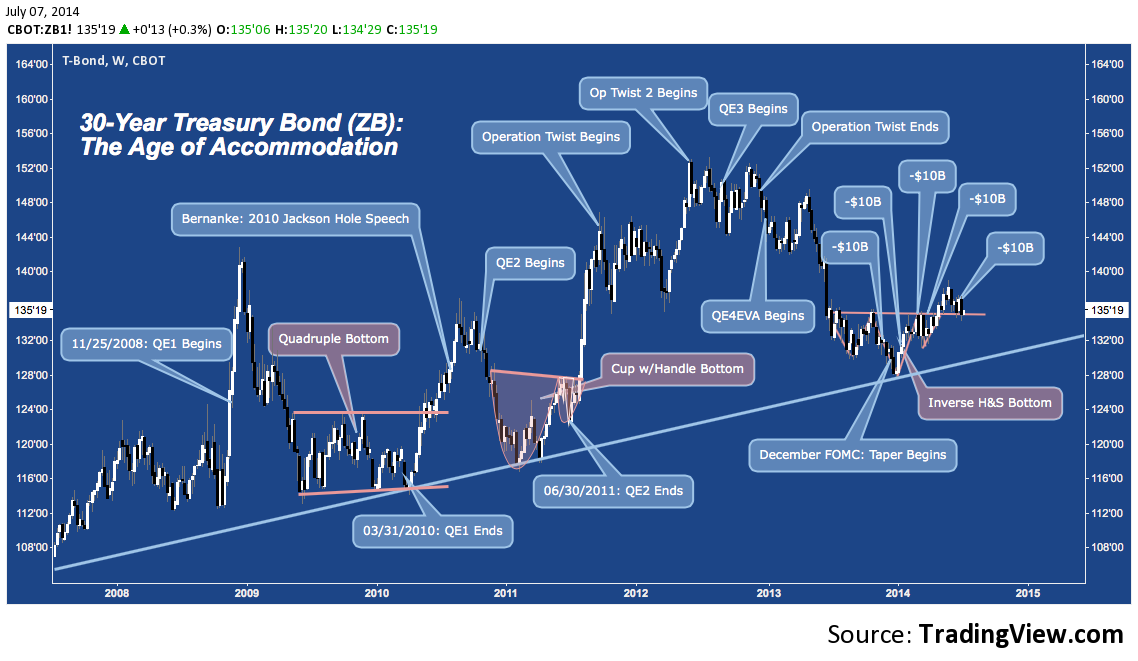
Contrary to the expectations of many market observers, the Long Bond didn’t sell off once the Federal Open Market Committee (FOMC) formally announced Tapering in December 2013 – in fact, the 30-Year dipped to major cyclical trend line support and bounced. To the surprise of some, a similar – counter-intuitive? – scenario unfolded with the conclusion of QE1 in early 2010, and QE2 in mid-2011. It’s plausible to suggest this year’s rally in US Treasuries is following suit, though the potency of the bull advance is moderated as the FOMC slowly turns the POMO flow off rather than go all-out with the full, dislocative cessation of asset purchases that took place with the end of QE1 and QE2. All three of these periods are characterized by simple reversal patterns, with the current Inverse Head & Shoulders Bottom seeing a characteristic breakout, followed by a pullback to the H&S neckline. The question now becomes whether the 30-year will fail or confirm near 134-135.
And in Equities, we see some remarkable uniformity in price as implied volatility on the S&P 500 (VIX), S&P 100 (VXO), NASDAQ 100 (VXN) among other other indices sits near or tests into new all-time lows.
NASDAQ COMPOSITE (COMPQ) – Monthly
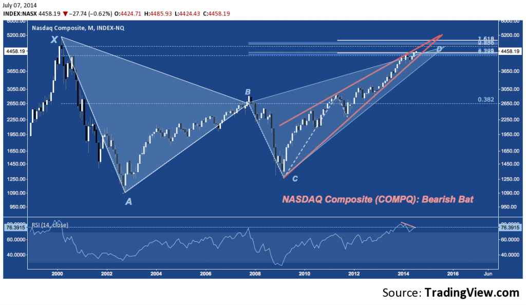
The NASDAQ Composite is stumbling over the first of two major fibonacci clusters near 4400 and 4600-4800 with the latter constituting the potential reversal zone for the Bearish Bat pattern that’s been building since the Dot-Com highs in 2000. Yes, the COMPQ has retraced all but 15% of it’s Late 90s mania phase, all within a rapidly narrowing Rising Wedge (orange) and on a negative momentum divergence at levels last seen in the halcyon market days of Q4 1999.
PHLX Semconductor Index (SOX) – Monthly
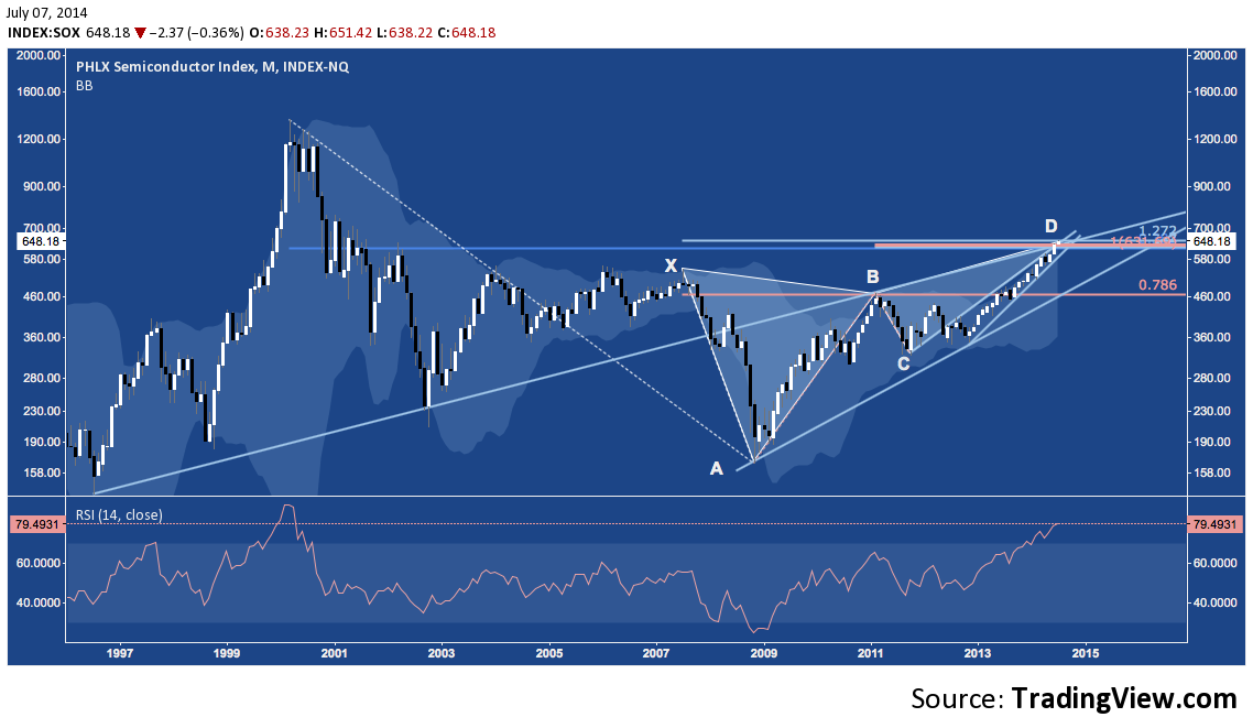
Among the major industry constituents of the NASDAQ, none have rallied so aggressively in 2014 as the Semiconductors. Now after a massive 300%+ gain off their late 2008 lows, it may be time for Semis to take a break. The PHLX Semiconductor Index (SOX) is at 1) massive cluster resistance around 630-675, 2) testing a monthly RSI of 80 (i.e. only more overbought historically during the brief psychotic break they suffered in late 1999-early 2000), 3) at 7-year Bearish Butterfly resistance (D), and 4) at a confluence of 5-year and 2-year rising wedge resistance.
This isn’t 1999, true: but just because the market isn’t entering the end-game of a storied speculative mania doesn’t mean it can’t undergo a major reset. Consistently picking tops is nearly impossible; but there is every incentive to pick out potential tops – like this one – and to exercise prudence around them.
S&P Midcap 400 (MDY) – Monthly
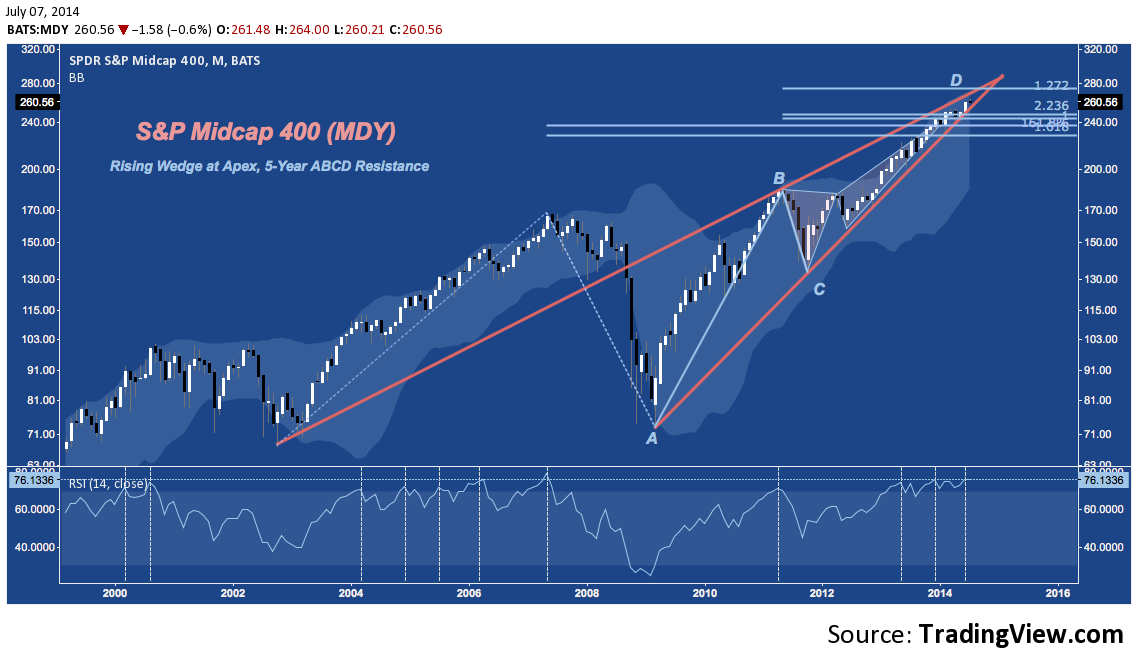
Midcaps are an oft-overlooked market cap but have at points been the star of the rally off the 2009 lows. The S&P Midcap 400‘s (MDY) chart only vaguely resembles COMPQ’s, above – until the 2007 high, that is; after which both indices have moved in near-lockstep. MDY is nearing the apex of it’s own Rising Wedge near 260. The index hasn’t been this consistently overbought since at least 1998.
Biotech (IBB) – Daily
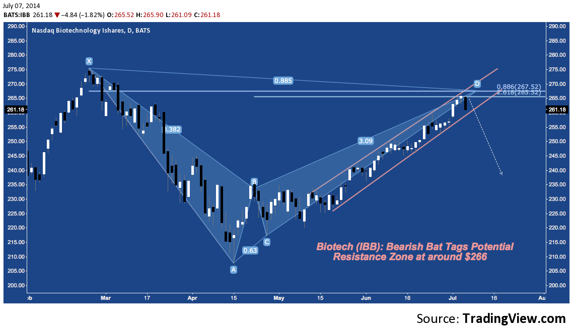
Back in February just before the industry topped I penned a post decrying the bubble that appeared to be developing in Biotech. The industry’s cap-weighted benchmark ETF IBB sold off aggressively into mid-April. After tangling with it’s 200-Day Simple Moving Average, IBB has rebounded higher over last 3 months, pushing through a narrow rising channel to put the finishing touches on a Bearish Bat harmonic pattern. After hitting $266 last Thursday July 3rd, IBB went on to shed -2.6% today in it’s single worst day since April 10, putting the ETF on an early track to end a 9-week winning streak.
Last Thursday’s high hit IBB’s Bearish Bat Potential Reversal Zone (or PRZ) at the 88.6% retracement of the February high. Should the ETF’s rising channel support fail near $260, the Bat suggests another major sell off has commenced.
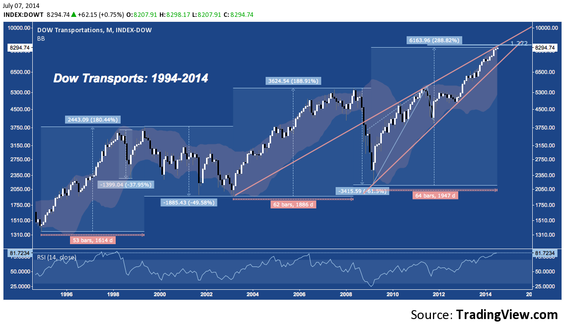
Another major theme of the current market is the impressive performance of the Dow Jones Transport Index (DJT). Since the 2009 bottom DJT is up almost 289%, falling short of the performance of the SOX but not much else. On an absolute basis, this 5-year run completely destroys the advances from 1995-2000 (180%) and 2002-2007 (189%). Not surprisingly, DJT is more overbought on it’s Monthly chart than it has been at any point since 1998 – right before an abrupt -38% drop that reversed into nominal new highs only to fade again into a -50% bear market that wouldn’t see a new high until mid-2006. Just like HYG, COMPQ, MDY, SOX and other markets, DJT is also at multi-year rising wedge resistance.
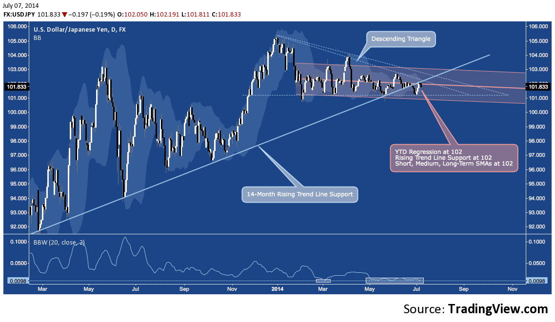
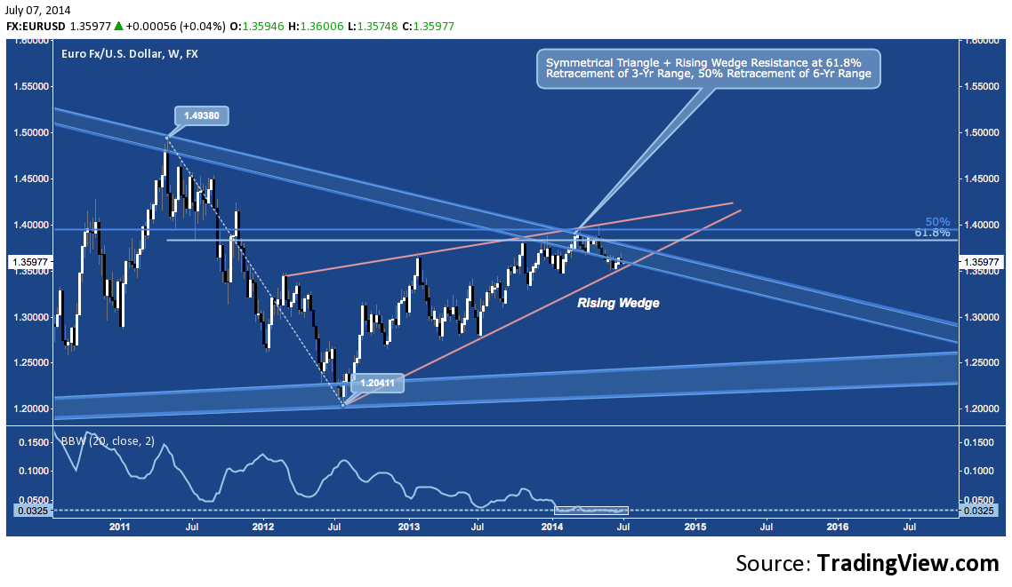
And checking in on Currencies, two Majors – and nearly 70% of the US Dollar Index (DX) – are on the cusp of completing major consolidation patterns in a context of record low volatility.
USD/JPY – Daily
The US Dollar/Japanese Yen (USD/JPY) has wandered sideways and down below 1.5 year rising trend line support and has entered the breakout window of 2014’s Descending Triangle. Assuming USD/JPY can ever break away from 102 again (which it has been stapled YTD), it’s record low volatility (represented here by the stubbornly low BBW at bottom) points to a major range expansion ahead for the pair.
EUR/USD – Weekly
Similarly for the Euro/US Dollar (EUR/USD) which continues to wind through it’s 2 year Rising Wedge on record-low Eurozone-era volatility. With long-term Symmetrical Triangle and fibonacci cluster and rising wedge resistance near 1.40, this benchmark currency pair is also building toward a major breakout and heightened volatility in the coming weeks.
What is the message of so many markets lining up together? Global Central Banks have sent yields and risk premia plummeting as capital has flowed aggressively into more speculative and inherently unstable asset classes in its search for yield. A function of this – and likely a consequence that none at the Fed, BoJ, BoE or ECB adequately foresaw – has been the complete evisceration of volatility.
Markets long ago willingly capitulated to the economic puts that Central Banks became an implicit party to with soothing overtures of doing “whatever it takes” to “foster financial stability”. Capital flows have lapsed into a somnolent state that has resulted in herding into a short list of assets, creating what are now exceedingly narrow consolidation patterns amidst the most broadly subdued risk environment in living memory.
But with the Fed’s Taper, the BoE’s attention turned toward potential tightening amidst the UK’s uneven recovery, the BoJ’s admission it is on track with existing stimulus to reach it’s 2% inflation objective (by any means necessary) and the ECB unlikely to introduce QE unless the EZ relapses into crisis, the Age of Accommodation is effectively winding down. Individual asset class and inter-market volatility has been honed to the edge of a knife; the fervor of belief in Central Bank omnipotence near-absolute.
Whether this question of balance is resolved in favor of risk on or risk off, disequilibrium is about to make a big comeback.
Twitter: @andrewunknown and @seeitmarket
Author holds no exposure to instruments mentioned at the time of publication. Commentary provided is for educational purposes only and in no way constitutes trading or investment advice. Image courtesy of livescience.com

