 By Andrew Nyquist
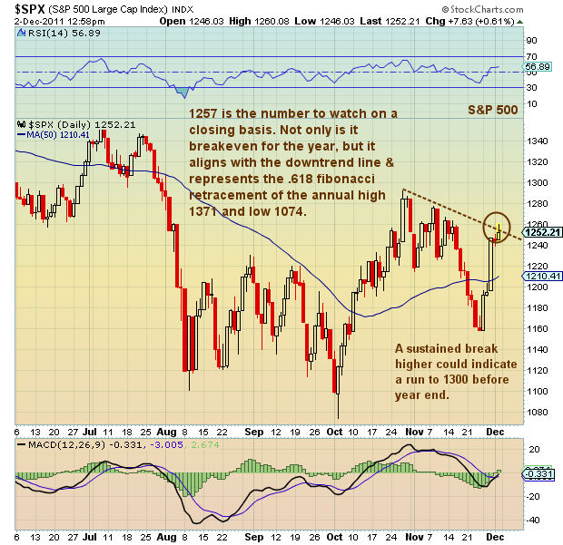
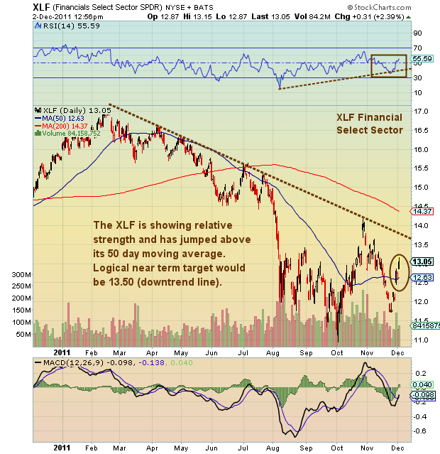
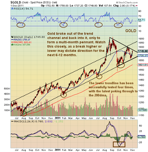
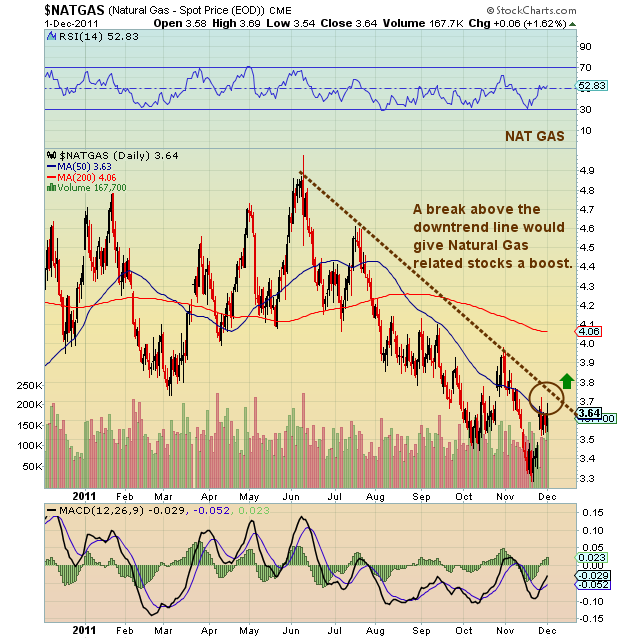
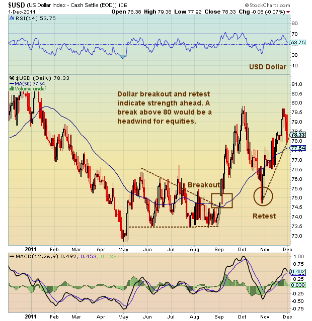
Over the past several months, investors have kept their eyes on a number of select charts to get a better feeling for where their investments may be headed. Beyond market indices like The S&P 500, investors have remained fixated on the USD (Dollar), Gold, The Energy Sector (i.e. Natural Gas), and Select Financials (XLF).
This makes sense, and here’s the breakdown for those of you interested in better understanding generic market correlations. When the dollar strengthens, it’s usually a headwind for the markets. When Gold rises, it usually indicates inflation or a greater sense of panic and uncertainty in the marketplace. Likewise, when energy prices rise, inflation alerts go up — but note that this can also signal stronger economic output (especially with Oil). Natural Gas, though, has been in a viscious bear market, so many are watching for a bottom. And finally, when the financials decide to play along and outperform, the market takes note. It’s been some time since the financials lead, so many are anxious to see if the relative outperformance keeps up. See annotated charts below.
Happy investing.
———————————————————
Your comments and emails are welcome. Readers can contact me directly at andrew@seeitmarket.com or follow me on Twitter on @andrewnyquist. For current news and updates, be sure to “Like” See It Market on Facebook. Thank you.
No positions in any of the securities mentioned at time of publication.
Any opinions expressed herein are solely those of the author, and do not in any way represent the views or opinions of his employer or any other person or entity.

