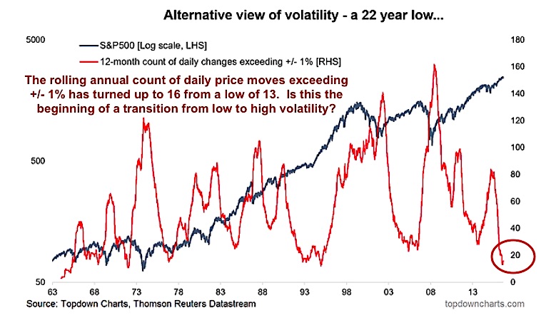
It’s not easy to see, so you have to look closely at the first chart below… but market volatility appears to be turning higher here (baby steps).
The chart highlights a long-followed (and favorite) measure of volatility in the marketplace. I wrote about this measure on my blog on Friday:
“[Its] the rolling annual count of daily price moves exceeding +/- 1%. The indicator had reached a 22-year low, and as I pointed out in a previous note on US equity volatility, when this indicator starts to turn upwards you want to pay attention.”
I also highlighted that “The key with this indicator, and many others for that matter, is to look for extremes first of all, and then to look for a turn from an extreme. This simple rule of thumb can be helpful as an extra piece of information in identifying market tops and bottoms.”
It’s probably too early to call for trend change, but it is worth noting that we are entering a seasonal period characterized by an uptick in volatility. So perhaps we are at the beginning of a new volatility cycle.
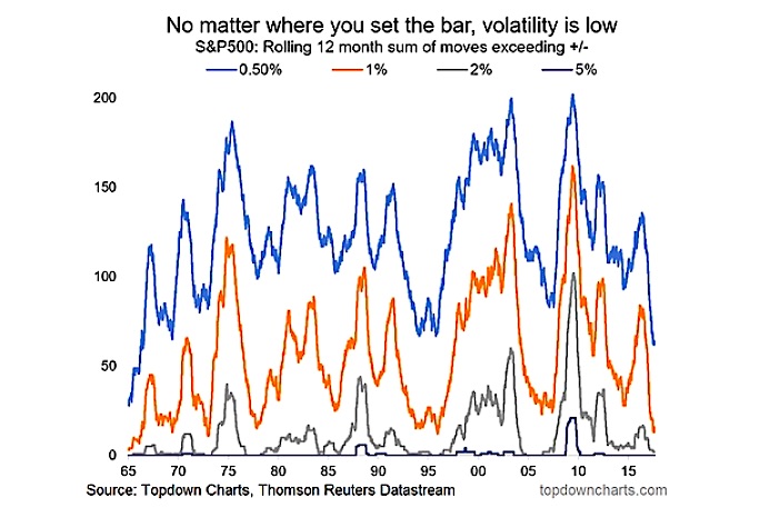
Here’s another look at indicator with a variety of thresholds. Either way you slice it, we are at an extreme in [low] volatility.
For more of my macro analysis, visit Top Down Charts. Thanks for reading.
Twitter: @Callum_Thomas
Any opinions expressed herein are solely those of the author, and do not in any way represent the views or opinions of any other person or entity.


