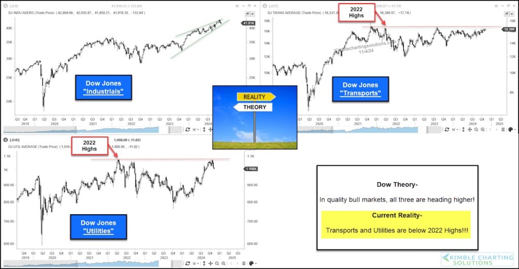
Dow Theory has been around for almost 80 years. The investing theory was made famous by Charles Dow in the 1940’s, using the industrial and transportation stocks.
Today, many like myself, add the Utilities to the mix.
Dow Theory suggests that strong bull markets see stocks in the Industrials, Transportation and Utilities sectors all moving higher together. Although the technology boom took away some of its luster, it remains a timeless treasure and continues to be used today in several aspects of market analysis.
Today we look at a five year charts for the Dow Jones Industrial Average, Dow Jones Transportation Average, and the Dow Jones Utilities Average.
Notice what’s missing here?
Currently, two of the three major averages are lower than price from three years ago! Only the Dow Industrials has made new highs. And currently, the Dow Industrials has formed a potentially bearish rising wedge pattern.
Dow theory suggests that the stock market isn’t quite as strong as it seems on this side of the ledger. Stay tuned!
Dow Theory Chart 3-Pack

Twitter: @KimbleCharting
The author may have a position in mentioned securities. Any opinions expressed herein are solely those of the author, and do not in any way represent the views or opinions of any other person or entity.


