Several indicators of investor sentiment are showing rising “greed” levels. And when investors get greedy, it tends to imply that we are nearing a top.
BUT, I am unsure why greed levels are so high, when so many assets have little to brag about over the past couple of years!
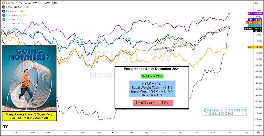
Today’s “weekly” chart mash-up shows the performance of 6 different instruments across various asset classes since December 2021… and gold has been the best performer at +13%. The others have literally gone nowhere. Basically flat.
So perhaps all this excitement is a bit overdone. And maybe investors need to be more selective in choosing assets with good risk/reward setups.
Multi-Asset Price Performance Comparison Chart

Note that KimbleCharting is offering a 2 week Free trial to See It Market readers. Just send me an email to services@kimblechartingsolutions.com for details to get set up.
Twitter: @KimbleCharting
The author may have a position in mentioned securities. Any opinions expressed herein are solely those of the author, and do not in any way represent the views or opinions of any other person or entity.


