 The collapse of the housing industry in America is one of the most disturbing economic storylines in recent American history. Every time I so much as glance at a chart depicting the drop from ’07 to ’09, I wince. Don’t look now, I’m wincing.
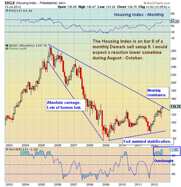
But one thing America has come to understand over the years is that time heals. Ultimately, we may need more time, but the chart of the Housing Index below underscores significant signs of life in the housing sector. On a near-term basis though, the index is overbought and nearing resistance. Furthermore, the sector may need some time to consolidate gains and pull in a bit.
Housing Index Chart:
More Charts here.
Housing index price chart with support and resistance, trend lines, and price analysis as of July 15, 2012. Housing sector and home sales and price indicator.
———————————————————
Twitter: @andrewnyquist and @seeitmarket Facebook: See It Market
No position in any of the securities mentioned at the time of publication.
Any opinions expressed herein are solely those of the author, and do not in any way represent the views or opinions of his employer or any other person or entity.


