If someone told you that the President of the United States in 2028 would be a Democrat and a woman from the state of New York, could you guess who it might be? We highly doubt it. In 1998, ten years before being elected president, Barack Obama had just been re-elected to the Illinois State Senate and was on no one’s radar as a Presidential candidate. In fact, had you been told at that time an African-American Democrat from Illinois would be president in 2008, it’s likely you would have assumed that two-time democratic presidential nominee Jesse Jackson would be the 44th President. In 1990, George W. Bush had just bought the Texas Rangers baseball club and was still four years from becoming Governor of Texas. In 1983, Bill Clinton was ten years out of law school and serving his second term as Governor of Arkansas. We could keep going down the line of presidents, and you would realize that even armed with some key details about the future, it would be extremely difficult to predict who a future president might be.
Stock investing is a little different. If you know the future level of three simple data points, you can calculate to the penny the price of any stock or index in the future and the exact holding period return. This precise prediction will hold up regardless of wars, economic activity, natural disasters, UFO landings or any other event you can dream up.
Unfortunately, those three data points are not readily available but can be inferred using historical trends, future expectations and logic to project them. With projections in hand, we can develop a range of price and return expectations for an index or an individual stock. In this paper, we provide an array of projections based on those factors and provide return expectations for the S&P 500 (INDEXSP:.INX) for the next ten years.
Investment Factor 1: Dividends
Dividends are an important and often overlooked component of stock returns. To emphasize this point, an investor guaranteed a 3% dividend yield based on the current price, receives a 30% gain (non-compounded) in ten years. In other words, the investor has at least a 30% cushion to guard against price declines over a ten-year period. That is what Warren Buffett refers to as a “moat,” and it is a wonderful benefit of investing in dividend-paying stocks.
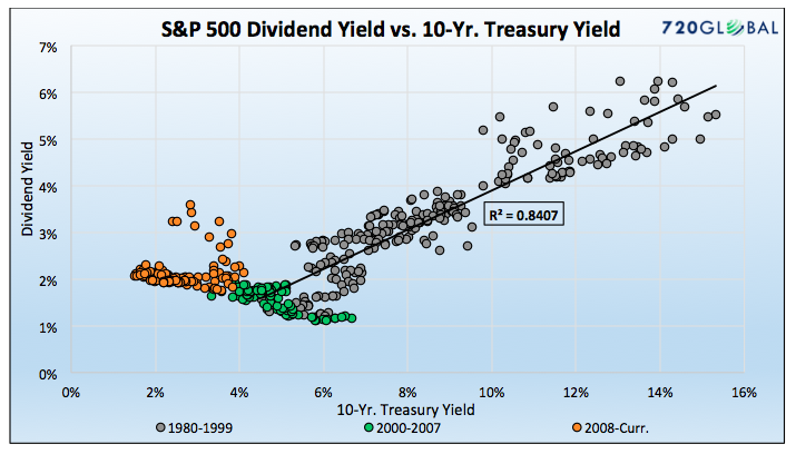
The scatter plot graphed below compares the S&P 500 dividend yield to the Ten-year U.S. Treasury Note yield since 1980. This historic backdrop helps project the S&P 500 dividend yield for the next ten years.
Data Courtesy: St. Louis Federal Reserve (FRED)
From 1980-1999, Treasury yields and dividend yields behaved alike. The trend line above, covering these years, has a statistically significant R-squared of 0.84 (84% of the move in dividend yields can be explained by moves in the 10-year yield). Since the year 2000, that relationship has all but disappeared. The R-squared for the post-financial crisis era is a meaningless .02.
Around the year 2000, dividend yields appear to have hit a floor ranging from 1-2%, despite a continued decline in Treasury yields. The reason for this is that many companies want to entice investors with higher dividend yields. As such, they raised dividends to keep the dividend yield relatively attractive. Had the regression of the 1980-1999 era held, dividend yields would be below 1% given current Treasury yields.
The graph above makes forecasting the future dividend yield relatively easy. As long as Ten-year U.S. Treasury yields stay below 5-6%, we expect dividend yields will range from 1-2%. Accordingly, we simplify this analysis and assume an optimistic 2% dividend yield for the next ten years.
Dividend Yield – Base/Optimistic/Pessimistic = 2%
Investment Factor 2: Earnings
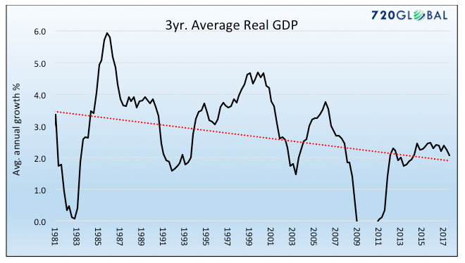
Over the long-term, earnings are well correlated to economic growth. Our ten-year analysis easily qualifies as long-term. Over shorter periods, there can be sharp variations due to a variety of influences such as regulatory policies and tax policies all of which influence profit margins. To arrive at reasonable expectations for earnings growth, we first consider economic growth. The following chart plots the declining trend in GDP growth since 1980. Given the burden of debt, weak productivity growth and the obvious headwinds from demographics, we think it is likely the trend lower continues.
Data Courtesy: St. Louis Federal Reserve (FRED)
Next, we consider S&P 500 earnings growth rates. Earnings growth over the last three years, ten years and since 1980 are as follows: 3.18%, 4.38%, and 5.93% respectively. Given the economic and earnings trends, we believe a 3% future earnings growth rate for the next ten years is fair, 5% is optimistic, and 1% is pessimistic.
Earnings Growth – Base/Optimistic/Pessimistic = 3.00%/5.00%/1.00%
Investment Factor 3: Valuations
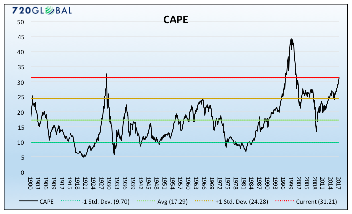
Robert Shiller’s Cyclically Adjusted Price-to-Earnings ratio (CAPE) is our preferred method of valuation as it averages earnings over ten year periods. In doing so, it avoids short-term volatility of earnings and provides a more consistent baseline reflective of a company’s or indexes true earnings potential. Currently, the CAPE of the S&P 500 sits in rare territory, as shown below. In fact, outside of the late 1990’s tech boom, there were only two months since 1881 when the Shiller CAPE was higher than today’s level – August and September of 1929.
CAPE has a history of extending well above and below its mean. Importantly, it also reverts to its mean after these long stretches of time. It does not seem unreasonable to expect that, over the next ten years, it will again revert to its mean since 1920 of 17.29. An optimistic scenario for 2028 is a CAPE reading of one standard deviation above the mean at 24.77. The pessimistic case is, likewise, one standard deviation below the mean at 9.70. Further, as shown below, we also present an outlook assuming CAPE stays at its current level of 31.21.
The graph below shows CAPE and the three forecasts along with the current level.
Data Courtesy: Robert Shiller https://www.econ.yale.edu/~shiller/data.htm
CAPE – Base/Optimistic/Pessimistic = 17.29/24.80/9.70
What does 2028 hold in store?
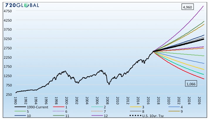
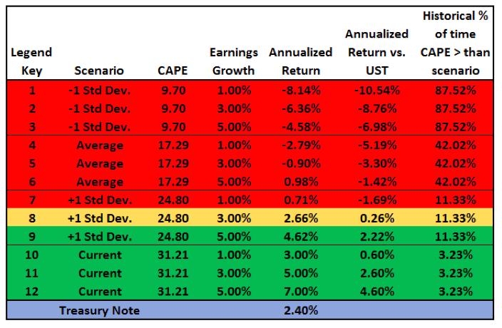
The following graph and table explore the range of outcomes that are possible given the scenarios outlined above. To help put context around the wide range of expected returns, we calculated an equity-equivalent price of the 10-year U.S. Treasury Note and added it to the graph as a black dotted line. Investors can use the line to weigh the risk and rewards of the S&P 500 versus the option to purchase a relatively risk-free U.S. Treasury Note. The table below the graph serves as a legend and reveals more information about the forecasts. The color shading on the table affords a sense of whether the respective scenario will produce a positive or negative return as compared to the U.S. Treasury Note. The far right column on the table indicates the percentage of observations since 1881 that CAPE has been higher than the respective scenarios.
Data Courtesy: Robert Shiller https://www.econ.yale.edu/~shiller/data.htm and 720Global/Real Investment Advice
As shown in the graph and table above, only scenarios 8 through 12 have a higher return than the ten year U.S. Treasury Note. Of those, three of the five assume that CAPE stays at current levels. Scenario 8, shaded yellow, has a negligible positive return differential.
Summary
The bottom line is that, unless one has a very optimistic view on earnings growth and expects valuations to remain elevated beyond what historical precedent argues is reasonable, the upside is limited, and the downside is troubling. The odds favor that a risk-free investment in a 10-year Treasury note will provide a better return through 2028 with less volatility. With current 10-year note yields at roughly 2.25%, that should emphasize the use of the term “troubling.”
The lines in the graph above are smooth, giving the appearance of identical returns each period. Markets do not work that way. These projections do not consider the path taken to achieve the expected total return and they most certainly will not be smooth. The best case scenario, and the one least likely to occur is for volatility to remain low. This would generate the most orderly path. Given that the post-crisis VIX (equity market volatility index – INDEXCBOE:VIX) has averaged 17.7, current single-digit levels are an aberration and it does not seem unreasonable to expect more volatility in the future.
Even if one of the scenarios plays out exactly as we describe, the path to that outcome would be very choppy. For instance, if the worst case scenario played out, an investor may lose 60-80% of value in a matter of one or two years. However they would most likely have better than expected annual returns in the years following.
In a follow up to this article we will take this thought a step further and discuss the so-called path of returns. We show you the expected and actual path of returns from 2005 to 2015 and argue that an investor armed with the three factors, and a little discipline, may have generated much better returns than those earned by investors using a buy and hold approach.
Twitter: @michaellebowitz
Any opinions expressed herein are solely those of the author, and do not in any way represent the views or opinions of any other person or entity.

