The recent gold decline has been swift. As I shared yesterday (and earlier this month), the Gold & Silver Mining Index had formed a bearish rising wedge pattern. And when prices fell out of that pattern into October, the decline accelerated. This price action comes at a critical time for Gold.
Today, I want to look at a couple of interesting charts of Gold.
I believe both charts explain the reaction we are currently seeing in gold. Each of them also offers insight into key levels to watch with a longer-term eye.
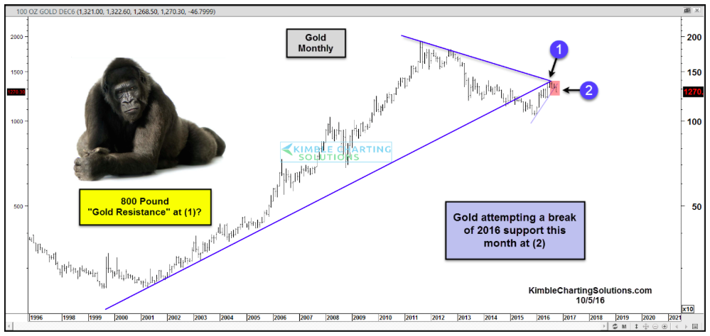
The first chart looks at the recent bull market in Gold prices – charting the price action from 1999 to 2016. The cross section of trend lines comes right at this fall’s highs (point 1). And if we zoom in a bit more, we can see the 2016 uptrend line that offered support this year. That was broken (point 2) after Gold failed to breakout at the intersection.
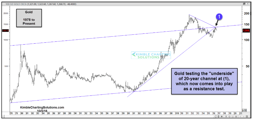
The next chart offers an even wider technical lens to investors. It charts gold prices from 1978 to 2016. Here we can see why this level is so important. Gold is testing the underside of a 20-year parallel price channel. Again this helps to explain why Gold prices are hitting resistance here.
At the same time, it’s fair to acknowledge that a strong move above this fall’s highs would be bullish. But until then, it’s best to remain patient.
It’s worth noting that other assets related to economic uncertainty are also getting hit: Utilities, Consumer Staples, and Bonds. David Fabian wrote about here. If this continues, it could signal a rotation back into risk-on equity assets.
Thanks for reading and have a great weekend!
Twitter: @KimbleCharting
The author may have positions in related securities at the time of publication. Any opinions expressed herein are solely those of the author, and do not in any way represent the views or opinions of any other person or entity.

