It’s been a really interesting time in the financial markets this past year. As this sideways range has been developing and persisting I have noticed some things I think are worth noting from a birds eye view.
Sentiment is diverging – with growing hatred on both sides. As prices have been showing extreme mean reversion behaviors some who would call themselves “the bulls” are calling for new highs and justify their stance diligently mainly because of positive breadth and common trend following indicators are bullish as of now (50/200 day mas, ichimoku, etc).
The bears voices are defiantly getting more angry as the days pass and the stock market refuse to go down. Fundamentals, earnings global economic numbers are all deteriorating faster and faster. Yet stocks rally back to almost new highs. From a scientific view point this is what COMPRESSIONS are made of. Universal indecision, equilibrium fighting and building up energy ready to break into a new direction.
Since in the past I have covered mainly 1 type of “Extremehurst” signal, “extensions” I wanted to also explain the other end of the spectrum and how that pertains to today’s current market environment and extreme mean reversion behavior.
What is a compression?
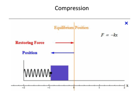
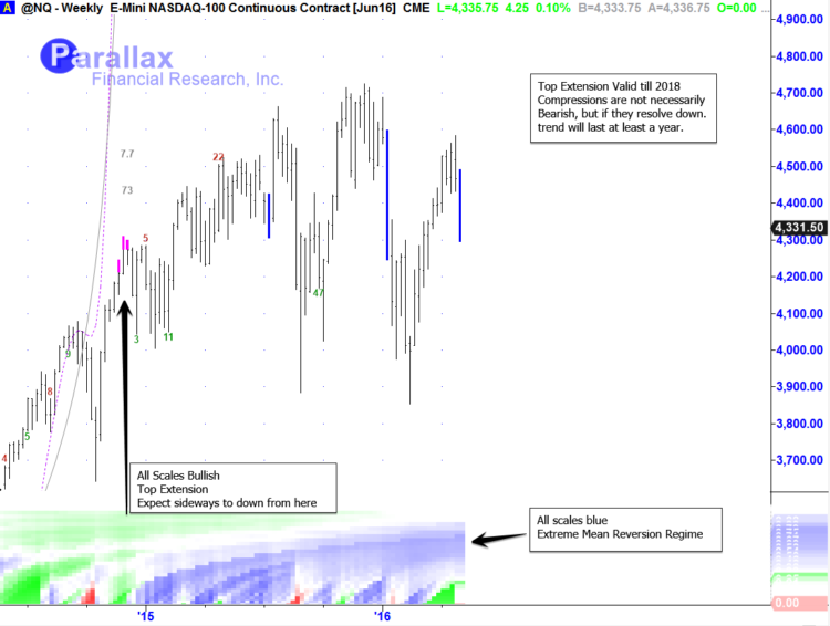
Compressions correspond to the levels of extreme mean reversion, or investor competition, on multiple scales. These signals mark the beginning of trends by finding when the vigorous competition between supply and demand has reached a critical point. Price is expected to move very rapidly away from its current price equilibrium. Another way to think of these signals is to envision a mass on a spring. When the spring is compressed, the system has high potential energy. When the mass is released, it will move very fast away from its starting position. In fact, it will then move too far. An extension occurs as the spring reaches its full extent, just before it settles back.
This is the market crowd affect that is being modeled. It universally exists in every market and on every time scale. We have been living in a building compression for over 1.5 years and as the days tick by the moment of release becomes much more imminent.
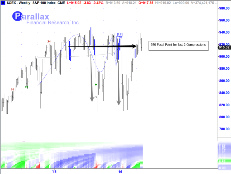
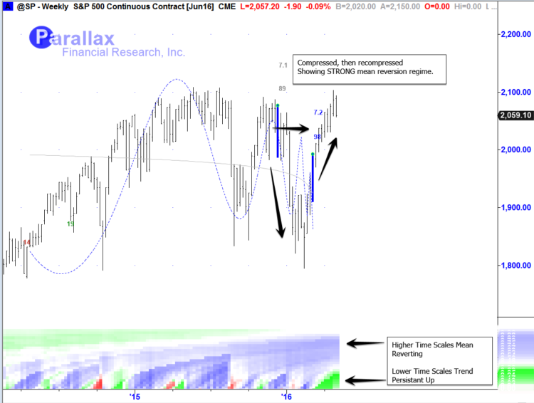
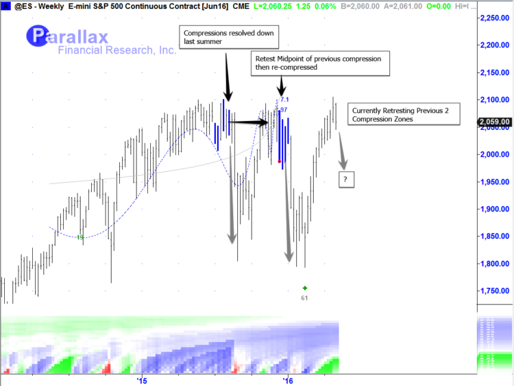
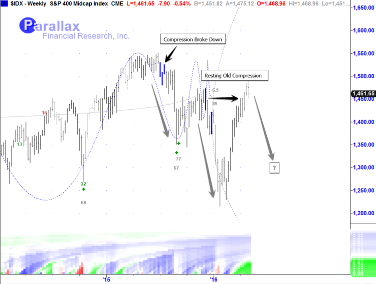
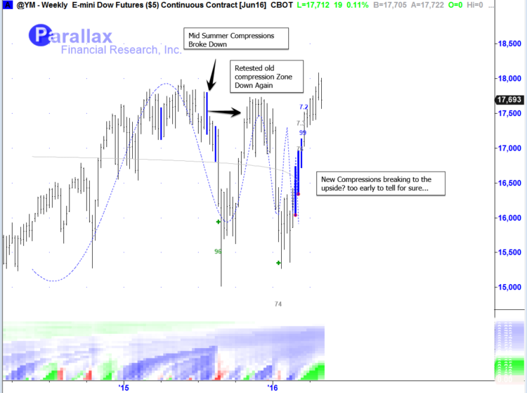
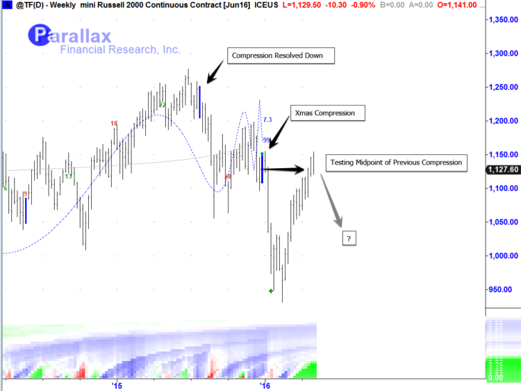
I noted many compressions before the stock market sell off last summer and again around last Christmas. Both of which had strong releases of persistent selling energy. Yet here we are right back where we started, Even though we were all expecting at least 30% decline. Why is this? The answer is, because we are still compressing! The daily and weekly time scale compressions indicate that new trends will begin and run for many weeks to many months, but the ones recently have yet to have that resolve. To me that doesn’t mean these signals failed or are “false breakouts” it just means that we are still in a very strong MEAN REVERSION type market regime that is building more energy over a higher timeframe. Considering we just had the 2nd longest and 4th largest bull run in history, its not unrealistic to expect this type of market behavior considering the data.
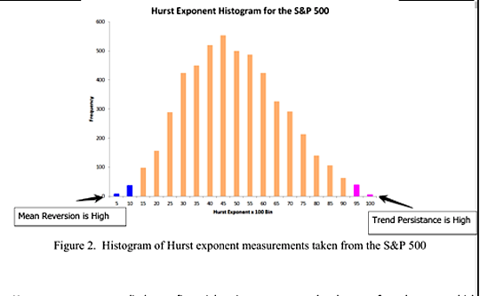
Note the image below. One major component of how extremehurst™ models the markets crowd effect is to view the market under the scope of the hurst exponent across all time scales. For example, If you took all the data possible that we have of the S&P 500 as a function of the hurst exponent, across all scales, And you organized it into bins as everyday as you noted what the hurst exponent was reading. Below is what you would have after you collected all the data.
You can see the pink bars, which represent the moments times collected that a market has a high hurst exponent across all scales of time (extreme trend persistence). As you can see this has a very low frequency of occurring in terms of all the data of the market. This is why this tool is so useful in signaling when a market has reached an extreme top or bottom and the current trend will end (not necessarily reverse) from these points, basically a phase shift. Again the same for Extreme LOW readings of the hurst exponent across all time scales, this state exists very infrequent in a grand scheme of all a markets regimes. Both states can provide an edge in forecasting what will happen next because it’s from these extreme states that we know markets change.
We have been currently living in a very low hurst regime and its been a very long time since this type of persistent mean reversion as engulfed the entire stock market for so long. The energy about to be released is very close to the final breaking point, and when it does, a new trend will persist for at least the same amount of time it took to build the compression. Remember the hurst exponent is only 1 element of how the extremehurst works, it also takes into account Log Periodic cycling behavior into specific events but that is a topic I will expand upon in future posts. Today I just I wanted to share this one KEY element of how to view the market and how to know, not guess, what regime a market is in currently and when that regime will change.
Below is a chart book of all the most notable compressions I have found as of this week. All of which are independent events, that together collectively tell us a lot about what different sections of the market are experiencing and what the entire equity space is about to do.
S&P 100 Index (OEX)
S&P 500 Continuous Contract (SP)
E-Mini S&P 500 Futures (ES)
S&P 400 Midcap Index (IDX)
E-mini Dow Jones Futures (YM)
Mini Russell 2000 Futures (TF)
E-Mini Nasdaq 100 Futures (NQ)
The reality of markets is never as simple as “green then up” or “red then down” to further understand what the market is doing and what it is likely to do really comes down to probabilities. The extreme mean reversion that we’ve seen over the past year plus (in both directions) has compressed the tape.
With this type of analysis, its proven that we know our probabilities are much better than 50/50 in certain situations. Additionally we know that those probabilities or “Edge” remains for a half-life, typically the amount of time it took to create the compression the market will begin a new trend and persist for about that same time. Averaging all the major compressions in play currently whichever way we do decide to break will persist for about 1.5 years or potentially longer.
The question always arises, well where do I get in then? At what point are you sure? That depends on your own risk management and time frames. I will try to provide an update on that at another time. Till then thanks for reading!
Twitter: @interestratearb
The author is currently long stock market equities with short equity index futures as hedges at the time of publication. Any opinions expressed herein are solely those of the author, and do not in any way represent the views or opinions of any other person or entity.

