Here’s a quote from a post I wrote this June about sector rotation:
“(T)he 20+ Year Treasury Bond ETF (TLT) is back at an important price support level. Stochastics has turned up. Typically, when long-term bond prices are rising, this indicates that interest rates or demand for financial products are declining. This would likely be bearish for financials, even if just seasonal.”
Following this article, Goldman Sachs (GS) peaked at a key Fibonacci resistance level (see my June article for reference). This signaled caution for bank stocks and the broader market. Then in mid-August, the US stock market entered bearish territory.
Now just three months later, it makes sense to ask if the story for bank stocks is changing once again.
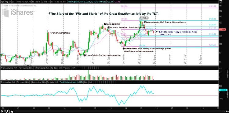
To answer help answer this question, let’s start by looking at the 20+Year Treasury Bond ETF (TLT) and the story of the TLT. Below is a weekly chart.
20+ Year Treasury Bond ETF (TLT) – Weekly Chart

TLT Monthy chart using Think or Swim
The Story of the 20+ Year Treasury Bond ETF (TLT)
The story of the Financial Crisis is best told by following the unwinding of the long term treasury bond ETF – ticker symbol TLT. Referring to the chart above, note the sharp rise of the TLT in Sep/Oct 2008, following Lehman’s bankruptcy and the cutting of Fed funds to 1% and the discount rate to 1.75%. Bank stocks some of the hardest hit in the financial crisis.
In response, money flowed into the relative safety of US Treasuries and out of stocks. While no one will forget the events of October 2008, the story does not end there. By early 2010, there was money flowing back into US Treasuries as the US contagion spread to Europe. The peak of the Euro Crisis as depicted through the TLT chart above came in the summer of 2012 during the Euro Summit.
In the United States, QE 3, the aggressive open-ended bond purchasing of mortgage-backed securities, began September 2012. Initially, the summer stock market rally following the Summit halted, and money began flowing back into the TLT; however by early 2013, cheap money aligned with an improving economic picture, resulted in what has come to be known as the Great Rotation from Bonds to Equities.
Unfortunately, the “fits and starts” of a secular (decades long) rotation is just as the name implies, jagged and uncertain. Following the TLT into the fall of 2013, we note the base-making price action in the bond market warning us the stock market euphoria with the Great Rotation had gotten ahead of the reality with Main Street, (see my October 2013 article warning about Anemic Wage Growth for reference). As a result, money began flowing back into Treasuries and Defensive sectors for much of 2014. Over the last year, global weakness demonstrated by Crude Oil’s nose dive for much of the year has been the main narrative for the Market.
Is There A Silver Lining For The Banking Sector?
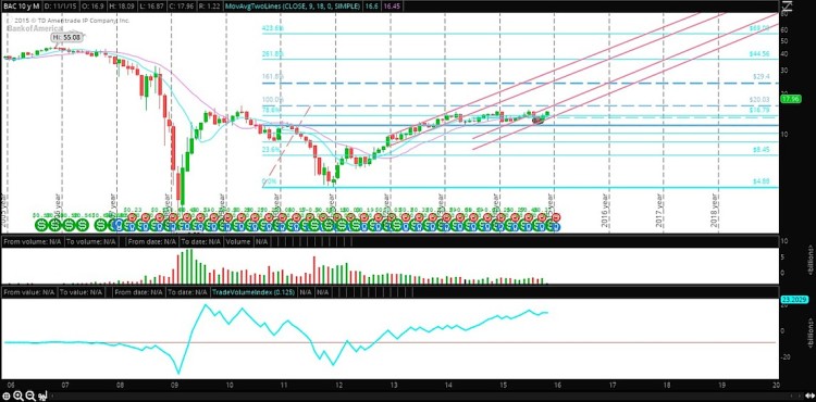
However, despite the sobering story of the global market as told by Crude Oil, the long-term treasury bond (TLT) tells a different story about demand and growth in the US. The peaking of the TLT earlier this year depicts that interest rates are rising, so demand for money by Main Street appears to be making a comeback. And this should be bullish for bank stocks. Take a look at the monthly chart of Bank of America (BAC) below.
As you can see, Bank of America stock (BAC) has been attempting to break through a years-long ceiling that formed since the Financial Crisis began. In my opinion, active investors should be watching the banking sector and select bank stocks for clues. Perhaps we’ll find a silver lining.
Bank of America (BAC) – Monthly Chart

BAC Monthly chart using Think or Swim
Thank you for reading.
Further reading from Maria: Market Rotation Update: Autos, Oil, and the US Consumer
Twitter: @rinehartmaria
No position in any of the mentioned securities at the time of publication. Any opinions expressed herein are solely those of the author, and do not in any way represent the views or opinions of any other person or entity.


