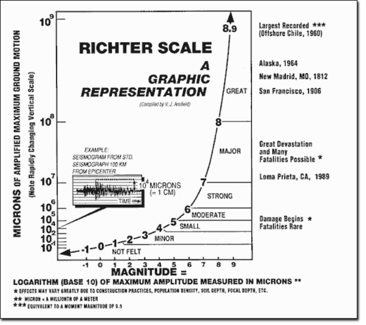
Why put so much importance on the logarithmic scale stock charts (i.e. log charts)? When mathematical properties of logs, anti-log and exponents are responsible for the British Foot System, Stonehenge, Great Pyramids and the Richter scale, I take notice…
It’s probably best to start with some background to provide context.
So let’s take a minute to jump into the time machine and transport ourselves back to 1614. At that time, you would find a newly minted book: Mirifici Logarithmorum Canosis Description (Description of the Wonderful Rule of Logarithms) by John Napier. In this book, Mr. Napier was trying to reduce multiplication to the addition of two numbers.
Here’s how Laura Smoller of UALR University (2001) described it:
Long before the calculator, logarithms were great mathematical labor-saving devices! … Napier lived during an age of great innovation in the world of astronomy. Copernicus had published his theory of the solar system in 1543, and many astronomers were eagerly involved in calculating and re-calculating planetary positions based in the wake of Copernicus’s ideas. Their calculations took up pages and pages and hours and hours of work. Johannes Kepler (1571-1630) still had to fill nearly 1000 large pages with dense arithmetical computations to obtain his famous laws of planetary motions! Napier’s logarithms helped ease that burden.
Because they are exponents, logarithms allow tedious calculations (like multiplying and dividing very large numbers) to be replaced by the simpler process of adding and subtracting the corresponding logarithms.
Just think of the pages of hand written notes that had to be produced to simply do the math. Since they can help keep track of very large numbers and their associated rates of change, logarithms are excellent to use on long term stock charts, parabolic moves and states of bearish/bullish stock market mania.
I’ve shown the importance of using long term logarithmic scale charts before. Here is one of my posts using the NASDAQ as an example as we approached the all-time highs a couple months ago: NASDAQ Trend Line Converging With 2000 High: Is A Breakout Coming?
So, as you can see, LOGS are a very important aspect of math and the market and, if you have read previous posts, you’ll see that “square roots” are responsible for a lot of the movements in the market. In fact, if you do some research, you’ll see that the Gann Square of Nine, the great pyramids and multiple other structures (Stonehenge, Easter Island, etc) are, in fact, logarithmic spirals calculators.
In the end, logarithmic angles are accurate and essential for keeping time and price over long distances. So let’s test out a thesis.
THESIS: if PATTERNS exist in the financial market then there must be 1) a logarithmic component and 2) a musical component.
So, let’s put some of this math to work.
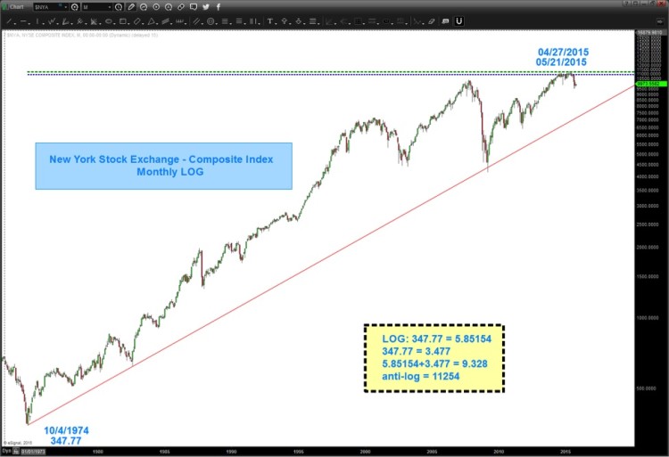
In prior posts we discussed that “decimal points” are just “things” and when using price point vibrations (i.e. the market) we can move/adjust the decimal point. Take for instance the all-time low on the NYSE Index at 347.77.
- PI = 3.142
- 3.142 = 31.42
- 31.42*347.77 = 10926.93 (see light blue dashed line on the chart below)
Of note, the amazing Martin Armstrong called for his ECM model to turn October 01, 2015. I suspect it might have something to do w/ PI and the decimal shift. You see the fateful top in 1929 was September 3rd, 1929.
- 10/01/2015 was 31,439 days ago OR 3.1429.
If we go back to long term logarithmic scale (LOG) charts you’ll see the power of connecting lows via trend lines (those are key cycles) but what we can also do is PROJECT price targets and time targets from the Log of all time high and lows.
Today, let’s just focus on PRICE and in this instance, the New York Stock Exchange Index (NYSE)
- All time low: 347.77
- Log (the LN key on calculator) 347.77 = 5.85154
- 347.77 = 3.477 (just shift the decimal point)
- 5.585154+3.477 = 9.32854
- anti-log 9.32854 = 11254
Is that the EXACT all-time high? Yes, pretty much.
IS IT THE HIGH? I don’t know but what I do know is everything is tied together and it’s all math…as an investor – I want/need to know where these key price levels present themselves.
So, if the above chart is an important example of the logs, numbers and vibrations that “might” be working in the market then one would think that there must be a musical component?
continue reading on the next page…


